

Font
Encyclopedia
In typography
, a font is traditionally defined as a quantity of sort
s composing a complete character set of a single size and style of a particular typeface
. For example, the complete set of all the characters for “9-point
Bulmer
” is called a font, and the “10-point Bulmer” would be another separate font, but part of the same font family, whereas “9-point Bulmer boldface” would be another font in a different font family of the same typeface.
One individual font character might be referred to as a “piece of font” or a “piece of type”.
Font nowadays is frequently used synonymously with the term typeface
, although they had clearly understood different meanings before the advent of digital typography
and desktop publishing
.
Beginning in the 1980s, with the introduction of computer font
s, a broader definition for the term “font” evolved, because different sizes of a single style—separate fonts in metal type—are now generated from a single computer font, because vector shapes can be scaled freely. “Bulmer”, the typeface, may include the fonts “Bulmer roman”, “Bulmer italic”, “Bulmer bold” and “Bulmer extended”, but there is no separate font for "9-point Bulmer italic" as opposed to "10-point Bulmer italic".
There are thousands of typefaces.
of the word fondue
, derives from Middle French
fonte, meaning "(something that has been) melt(ed)", referring to type produced by casting molten metal at a type foundry
. English-speaking printers have used the term fount for centuries to refer to the multi-part metal type used to assemble and print in a particular size and typeface.
that would be used to typeset
an entire page. Unlike a digital typeface it would not include a single definition of each character, but commonly used characters (such as vowels and periods) would have more physical type-pieces included. A font when bought new would often be sold as (for example in a Roman alphabet) 12pt 14A 34a, meaning that it would be a size 12-point font containing 14 uppercase 'A's, and 34 lowercase 'A's. The rest of the characters would be provided in quantities appropriate for the distribution
of letters in that language. Some metal type characters required in typesetting, such as dashes, spaces and line-height spacers, were not part of a specific font, but were generic pieces which could be used with any font. Line spacing is still often called "leading
", because the strips used for line spacing were made of lead
(rather than the harder alloy used for other pieces). The reason for this spacing strip being made from "lead" was because lead was a softer metal than the traditional forged metal type pieces (which was part lead, antimony and tin) and would compress more easily when "locked-up" in the printing "chase" (i.e. a carrier for holding all the type together).
In the 1880s–90s, "hot lead" typesetting was invented, in which type was cast as it was set, either piece by piece (as in the Monotype technology) or in entire lines of type at one time (as in the Linotype
technology).
(s) that the typeface supports. In European alphabetic scripts
, i.e. Latin
, Cyrillic
and Greek
, the main such properties are the stroke width, called weight, the style or angle and the character width.
The regular or standard font is sometimes labeled roman, both to distinguish it from bold or thin and from italic or oblique. The keyword for the default, regular case is often omitted for variants and never repeated, otherwise it would be Bulmer regular italic, Bulmer bold regular and even Bulmer regular regular. Roman can also refer to the language coverage of a font, acting as a shorthand for "Western European."
Different fonts of the same typeface
may be used in the same work for various degrees of readability and emphasis
.
A typeface may come in fonts of many weights, from ultra-light to extra-bold or black; four to six weights are not unusual, and a few typefaces have as many as a dozen. Many typefaces for office, Web and non-professional use come with just a normal and a bold weight. If no bold weight is provided, many renderers (browsers, word processors, graphic and DTP programs) support faking a bolder font by rendering the outline a second time at an offset, or just smearing it slightly at a diagonal angle.
The base weight differs among typefaces; that means one normal font may appear bolder than some other normal font. For example, fonts intended to be used in posters are often quite bold by default while fonts for long runs of text are rather light. Therefore weight designations in font names may differ in regard to the actual absolute stroke weight or density of glyphs in the font.
Attempts to systematize a range of weights led to a numerical classification first used by Adrian Frutiger
with the Univers
typeface: 35 Extra Light, 45 Light, 55 Medium or Regular, 65 Bold, 75 Extra Bold, 85 Extra Bold, 95 Ultra Bold or Black.
Deviants of these were the "6 series" (italics), e.g. 46 Light Italics etc., the "7 series" (condensed versions), e.g. 57 Medium Condensed etc., and the "8 series" (condensed italics), e.g. 68 Bold Condensed Italics.
From this brief numerical system it is easier to determine exactly what a font's characteristics are, for instance "Helvetica 67" (HE67) translates to "Helvetica Bold Condensed".
The TrueType
font format introduced a scale from 100 through 900, where 400 is regular, which also used in CSS and OpenType
. The first algorithmic description of fonts was perhaps made by Donald Knuth
in his Metafont
and TeX
system of programs.
There are many names used to describe the weight of a font in its name, differing among type foundries and designers, but their relative order is usually fixed, something like this:
The terms normal, regular and plain, sometimes also book, are being used for the standard weight font of a typeface. Where both appear and differ, book is often lighter than regular, but in some typefaces it is bolder.
or upright font is slanted—usually to the right in left-to-right scripts—the lowercase character shapes change slightly as well, approaching a more handwritten
, cursive
style. In this italic type
, character edges may even connect and ligatures are more common. In many typefaces uppercase letters are only slanted in italic fonts, but in some they change their appearance, too, e.g. by gaining swash
es.
Although rarely encountered, a typographic face may be accompanied by a matching calligraphic face (cursive, script), which might be considered a further font style of one typeface.
 In many sans-serif and some serif typefaces, especially in those with strokes of even thickness the characters of the italic fonts are only slanted, which is often done algorithmically, without otherwise changing their appearance. Such oblique
fonts are not true italics, because they lack the change in letter shapes which is part of the definition of an italic.
On the other hand, there are typefaces with upright characters that take a more cursive form without a change in angle. For example the Cyrillic minuscule ‘т’ may look like a smaller form of its majuscule ‘Т’ or more like a roman small ‘m’ as in its standard italic appearance; in this case the distinction between styles is also a matter of local preference.
In Frutiger’s nomenclature the second digit for upright fonts is a 5, for italic fonts a 6 and for condensed italic fonts a 8.
The two Japanese syllabaries
, katakana
and hiragana
, are sometimes seen as two styles or typographic variants of each other, but usually are considered separate character sets as a few of the characters have separate kanji
origins.
The gothic style
of the roman script with broken letter froms, on the other hand, is usually considered a mere typographic variant.
Cursive-only scripts such as Arabic
also have different styles, in this case for example Naskh
and Kufic
, although these often depend on application, area or era.
There are other aspects that can differ among font styles, but more often these are considered immanent features of the typeface.
These include the look of digits (text figures
) and the minuscules, which may be smaller versions of the capital letters (small caps
) although the script has developed characteristic shapes for them.
Some typefaces do not include separate glyphs for the cases at all, thereby abolishing the bicamerality
. While most of these use uppercase characters only, some labeled unicase
exist which choose either the majuscule or the minuscule glyph at a common height for both characters.
Narrower fonts are usually labeled compressed, condensed or narrow. In Frutiger’s system, the second digit of condensed fonts is a 7.
Wider fonts may be called wide, extended or expanded.
Both can be further classified by prepending extra, ultra or the like.
These separate fonts have to be distinguished from techniques that alter the letter-spacing to achieve narrower or smaller words, especially for justified text alignment
.
Most typefaces either have proportional or monospaced (i.e. typewriter-style) letter widths, if the script provides the possibility. There are, however, superfamilies covering both styles. East-Asian sinogram
s
Some fonts provide both proportional and fixed-width (tabular) digits, where the former usually coincide with lowercase text figures
and the latter with uppercase lining figures.
s. There are several naming schemes for such variant designs. One such scheme, invented and popularized by Adobe Systems
, refers to the variant fonts by the applications those are typically used for, with the exact point sizes intended varying slightly by typeface:
Poster: extremely large sizes, usually larger than 72 point
Display: large sizes, typically 19–72 point
Subhead: large text, typically about 14–18 point
(Regular): usually left unnamed, typically about 10–13 point
Small Text (SmText): typically about 8–10 point
Caption: very small, typically about 6–8 point
consisting of numeric values relating to size and space in the font overall, or in its individual glyphs. Font-wide metrics include cap height
, x-height, ascender height, descender
depth, and the font bounding box. Glyph-level metrics include the glyph bounding box, the advance width (total space for the glyph), and sidebearings (space that pads the glyph outline on either side).
s, there are superfamilies
that incorporate serif (antiqua) and sans-serif
(grotesque) or even intermediate slab serif
(Egyptian) or semi-serif fonts with the same base outlines.
A more common font variant, especially of serif typefaces, is that of alternate capitals. They can have swash
es to go with italic minuscules or they can be of a flourish design for use as initial
s (drop caps).
Typography
Typography is the art and technique of arranging type in order to make language visible. The arrangement of type involves the selection of typefaces, point size, line length, leading , adjusting the spaces between groups of letters and adjusting the space between pairs of letters...
, a font is traditionally defined as a quantity of sort
Sort (typesetting)
In typesetting by hand compositing, a sort is a piece of type representing a particular letter or symbol, cast from a matrix mould and assembled with other sorts bearing additional letters into lines of type to make up a forme from which a page is printed.-See also:* History of western typography*...
s composing a complete character set of a single size and style of a particular typeface
Typeface
In typography, a typeface is the artistic representation or interpretation of characters; it is the way the type looks. Each type is designed and there are thousands of different typefaces in existence, with new ones being developed constantly....
. For example, the complete set of all the characters for “9-point
Point (typography)
In typography, a point is the smallest unit of measure, being a subdivision of the larger pica. It is commonly abbreviated as pt. The point has long been the usual unit for measuring font size and leading and other minute items on a printed page....
Bulmer
Bulmer (typeface)
Bulmer is the name of transitional serif typeface originally designed by William Martin in 1792 for the Shakespeare Press. The types were used for printing the Boydell Shakespeare folio edition....
” is called a font, and the “10-point Bulmer” would be another separate font, but part of the same font family, whereas “9-point Bulmer boldface” would be another font in a different font family of the same typeface.
One individual font character might be referred to as a “piece of font” or a “piece of type”.
Font nowadays is frequently used synonymously with the term typeface
Typeface
In typography, a typeface is the artistic representation or interpretation of characters; it is the way the type looks. Each type is designed and there are thousands of different typefaces in existence, with new ones being developed constantly....
, although they had clearly understood different meanings before the advent of digital typography
Digital typography
Digital typography is the arrangement of type using computers.- See also :* Typography* Computer font* Web typography* Desktop publishing* Font rasterization...
and desktop publishing
Desktop publishing
Desktop publishing is the creation of documents using page layout software on a personal computer.The term has been used for publishing at all levels, from small-circulation documents such as local newsletters to books, magazines and newspapers...
.
Beginning in the 1980s, with the introduction of computer font
Computer font
A computer font is an electronic data file containing a set of glyphs, characters, or symbols such as dingbats. Although the term font first referred to a set of metal type sorts in one style and size, since the 1990s it is generally used to refer to a scalable set of digital shapes that may be...
s, a broader definition for the term “font” evolved, because different sizes of a single style—separate fonts in metal type—are now generated from a single computer font, because vector shapes can be scaled freely. “Bulmer”, the typeface, may include the fonts “Bulmer roman”, “Bulmer italic”, “Bulmer bold” and “Bulmer extended”, but there is no separate font for "9-point Bulmer italic" as opposed to "10-point Bulmer italic".
There are thousands of typefaces.
Etymology
The term font, a doubletDoublet (linguistics)
In etymology, two or more words in the same language are called doublets or etymological twins when they have different phonological forms but the same etymological root. Often, but not always, the variants have entered the language through different routes...
of the word fondue
Fondue
Fondue is a Swiss dish of melted cheese served in a communal pot over a spirit lamp , and eaten by dipping long-stemmed forks with bread into the cheese...
, derives from Middle French
French language
French is a Romance language spoken as a first language in France, the Romandy region in Switzerland, Wallonia and Brussels in Belgium, Monaco, the regions of Quebec and Acadia in Canada, and by various communities elsewhere. Second-language speakers of French are distributed throughout many parts...
fonte, meaning "(something that has been) melt(ed)", referring to type produced by casting molten metal at a type foundry
Type foundry
A type foundry is a company that designs or distributes typefaces. Originally, type foundries manufactured and sold metal and wood typefaces and matrices for line-casting machines like the Linotype and Monotype machines designed to be printed on letterpress printers...
. English-speaking printers have used the term fount for centuries to refer to the multi-part metal type used to assemble and print in a particular size and typeface.
Metal type
In a traditional manual printing (letterpress) house the word font would refer to a complete set of metal typeTypeface
In typography, a typeface is the artistic representation or interpretation of characters; it is the way the type looks. Each type is designed and there are thousands of different typefaces in existence, with new ones being developed constantly....
that would be used to typeset
Typesetting
Typesetting is the composition of text by means of types.Typesetting requires the prior process of designing a font and storing it in some manner...
an entire page. Unlike a digital typeface it would not include a single definition of each character, but commonly used characters (such as vowels and periods) would have more physical type-pieces included. A font when bought new would often be sold as (for example in a Roman alphabet) 12pt 14A 34a, meaning that it would be a size 12-point font containing 14 uppercase 'A's, and 34 lowercase 'A's. The rest of the characters would be provided in quantities appropriate for the distribution
Probability distribution
In probability theory, a probability mass, probability density, or probability distribution is a function that describes the probability of a random variable taking certain values....
of letters in that language. Some metal type characters required in typesetting, such as dashes, spaces and line-height spacers, were not part of a specific font, but were generic pieces which could be used with any font. Line spacing is still often called "leading
Leading
In typography, leading refers to the distance between the baselines of successive lines of type. The term originated in the days of hand-typesetting, when thin strips of lead were inserted into the formes to increase the vertical distance between lines of type...
", because the strips used for line spacing were made of lead
Lead
Lead is a main-group element in the carbon group with the symbol Pb and atomic number 82. Lead is a soft, malleable poor metal. It is also counted as one of the heavy metals. Metallic lead has a bluish-white color after being freshly cut, but it soon tarnishes to a dull grayish color when exposed...
(rather than the harder alloy used for other pieces). The reason for this spacing strip being made from "lead" was because lead was a softer metal than the traditional forged metal type pieces (which was part lead, antimony and tin) and would compress more easily when "locked-up" in the printing "chase" (i.e. a carrier for holding all the type together).
In the 1880s–90s, "hot lead" typesetting was invented, in which type was cast as it was set, either piece by piece (as in the Monotype technology) or in entire lines of type at one time (as in the Linotype
Linotype machine
The Linotype typesetting machine is a "line casting" machine used in printing. The name of the machine comes from the fact that it produces an entire line of metal type at once, hence a line-o'-type, a significant improvement over manual typesetting....
technology).
Font characteristics
In addition to the character height, when using the mechanical sense of the term, there are several characteristics which may distinguish fonts, though they would also depend on the scriptWriting system
A writing system is a symbolic system used to represent elements or statements expressible in language.-General properties:Writing systems are distinguished from other possible symbolic communication systems in that the reader must usually understand something of the associated spoken language to...
(s) that the typeface supports. In European alphabetic scripts
Alphabet
An alphabet is a standard set of letters—basic written symbols or graphemes—each of which represents a phoneme in a spoken language, either as it exists now or as it was in the past. There are other systems, such as logographies, in which each character represents a word, morpheme, or semantic...
, i.e. Latin
Latin alphabet
The Latin alphabet, also called the Roman alphabet, is the most recognized alphabet used in the world today. It evolved from a western variety of the Greek alphabet called the Cumaean alphabet, which was adopted and modified by the Etruscans who ruled early Rome...
, Cyrillic
Cyrillic alphabet
The Cyrillic script or azbuka is an alphabetic writing system developed in the First Bulgarian Empire during the 10th century AD at the Preslav Literary School...
and Greek
Greek alphabet
The Greek alphabet is the script that has been used to write the Greek language since at least 730 BC . The alphabet in its classical and modern form consists of 24 letters ordered in sequence from alpha to omega...
, the main such properties are the stroke width, called weight, the style or angle and the character width.
The regular or standard font is sometimes labeled roman, both to distinguish it from bold or thin and from italic or oblique. The keyword for the default, regular case is often omitted for variants and never repeated, otherwise it would be Bulmer regular italic, Bulmer bold regular and even Bulmer regular regular. Roman can also refer to the language coverage of a font, acting as a shorthand for "Western European."
Different fonts of the same typeface
Typeface
In typography, a typeface is the artistic representation or interpretation of characters; it is the way the type looks. Each type is designed and there are thousands of different typefaces in existence, with new ones being developed constantly....
may be used in the same work for various degrees of readability and emphasis
Emphasis (typography)
In typography, emphasis is the exaggeration of words in a text with a font in a different style from the rest of the text—to emphasize them.- Methods and use :...
.
Weight
The weight of a particular font is the thickness of the character outlines relative to their height.A typeface may come in fonts of many weights, from ultra-light to extra-bold or black; four to six weights are not unusual, and a few typefaces have as many as a dozen. Many typefaces for office, Web and non-professional use come with just a normal and a bold weight. If no bold weight is provided, many renderers (browsers, word processors, graphic and DTP programs) support faking a bolder font by rendering the outline a second time at an offset, or just smearing it slightly at a diagonal angle.
The base weight differs among typefaces; that means one normal font may appear bolder than some other normal font. For example, fonts intended to be used in posters are often quite bold by default while fonts for long runs of text are rather light. Therefore weight designations in font names may differ in regard to the actual absolute stroke weight or density of glyphs in the font.
Attempts to systematize a range of weights led to a numerical classification first used by Adrian Frutiger
Adrian Frutiger
Adrian Frutiger is one of the prominent typeface designers of the 20th century, who continues to influence the direction of digital typography in the 21st century; he is best known for creating the typefaces Univers and Frutiger.-Early life:Adrian Frutiger was born in Unterseen, Canton of Bern, as...
with the Univers
Univers
Univers is the name of a realist sans-serif typeface designed by Adrian Frutiger in 1954.Originally conceived and released by Deberny & Peignot in 1957, the type library was acquired in 1972 by Haas. Haas'sche Schriftgiesserei was later folded into the D...
typeface: 35 Extra Light, 45 Light, 55 Medium or Regular, 65 Bold, 75 Extra Bold, 85 Extra Bold, 95 Ultra Bold or Black.
Deviants of these were the "6 series" (italics), e.g. 46 Light Italics etc., the "7 series" (condensed versions), e.g. 57 Medium Condensed etc., and the "8 series" (condensed italics), e.g. 68 Bold Condensed Italics.
From this brief numerical system it is easier to determine exactly what a font's characteristics are, for instance "Helvetica 67" (HE67) translates to "Helvetica Bold Condensed".
The TrueType
TrueType
TrueType is an outline font standard originally developed by Apple Computer in the late 1980s as a competitor to Adobe's Type 1 fonts used in PostScript...
font format introduced a scale from 100 through 900, where 400 is regular, which also used in CSS and OpenType
OpenType
OpenType is a format for scalable computer fonts. It was built on its predecessor TrueType, retaining TrueType's basic structure and adding many intricate data structures for prescribing typographic behavior...
. The first algorithmic description of fonts was perhaps made by Donald Knuth
Donald Knuth
Donald Ervin Knuth is a computer scientist and Professor Emeritus at Stanford University.He is the author of the seminal multi-volume work The Art of Computer Programming. Knuth has been called the "father" of the analysis of algorithms...
in his Metafont
METAFONT
Metafont is a programming language used to define vector fonts. It is also the name of the interpreter that executes Metafont code, generating the bitmap fonts that can be embedded into e.g. PostScript...
and TeX
TeX
TeX is a typesetting system designed and mostly written by Donald Knuth and released in 1978. Within the typesetting system, its name is formatted as ....
system of programs.
There are many names used to describe the weight of a font in its name, differing among type foundries and designers, but their relative order is usually fixed, something like this:
- Hairline
- Thin
- Ultra-light
- Extra-light
- Light
- Book
- Normal / regular / roman / plain
- Medium
- Demi-bold / semi-bold
- Bold
- Extra-bold / extra
- Heavy
- Black
- Extra-black
- Ultra-black / ultra
The terms normal, regular and plain, sometimes also book, are being used for the standard weight font of a typeface. Where both appear and differ, book is often lighter than regular, but in some typefaces it is bolder.
Slope
In contemporary European typefaces, especially roman ones, the font style is usually connected to the angle. When the normal, romanRoman type
In typography, roman is one of the three main kinds of historical type, alongside blackletter and italic. Roman type was modelled from a European scribal manuscript style of the 1400s, based on the pairing of inscriptional capitals used in ancient Rome with Carolingian minuscules developed in the...
or upright font is slanted—usually to the right in left-to-right scripts—the lowercase character shapes change slightly as well, approaching a more handwritten
Handwriting
Handwriting is a person's particular & individual style of writing with pen or pencil, which contrasts with "Hand" which is an impersonal and formalised writing style in several historical varieties...
, cursive
Cursive
Cursive, also known as joined-up writing, joint writing, or running writing, is any style of handwriting in which the symbols of the language are written in a simplified and/or flowing manner, generally for the purpose of making writing easier or faster...
style. In this italic type
Italic type
In typography, italic type is a cursive typeface based on a stylized form of calligraphic handwriting. Owing to the influence from calligraphy, such typefaces often slant slightly to the right. Different glyph shapes from roman type are also usually used—another influence from calligraphy...
, character edges may even connect and ligatures are more common. In many typefaces uppercase letters are only slanted in italic fonts, but in some they change their appearance, too, e.g. by gaining swash
Swash (typography)
A swash is a typographical flourish on a glyph, like an exaggerated serif.Capital swash characters, which extended to the left, were historically often used to begin sentences. There were also minuscule swash characters, which came either extending to the left, to begin words, or to the right to...
es.
Although rarely encountered, a typographic face may be accompanied by a matching calligraphic face (cursive, script), which might be considered a further font style of one typeface.
Oblique type
Oblique type is a form of type that slants slightly to the right, used in the same manner as italic type. Unlike italic type, however, it does not use different glyph shapes; it uses the same glyphs as roman type, except distorted...
fonts are not true italics, because they lack the change in letter shapes which is part of the definition of an italic.
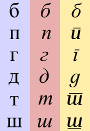
On the other hand, there are typefaces with upright characters that take a more cursive form without a change in angle. For example the Cyrillic minuscule ‘т’ may look like a smaller form of its majuscule ‘Т’ or more like a roman small ‘m’ as in its standard italic appearance; in this case the distinction between styles is also a matter of local preference.
In Frutiger’s nomenclature the second digit for upright fonts is a 5, for italic fonts a 6 and for condensed italic fonts a 8.
The two Japanese syllabaries
Kana
Kana are the syllabic Japanese scripts, as opposed to the logographic Chinese characters known in Japan as kanji and the Roman alphabet known as rōmaji...
, katakana
Katakana
is a Japanese syllabary, one component of the Japanese writing system along with hiragana, kanji, and in some cases the Latin alphabet . The word katakana means "fragmentary kana", as the katakana scripts are derived from components of more complex kanji. Each kana represents one mora...
and hiragana
Hiragana
is a Japanese syllabary, one basic component of the Japanese writing system, along with katakana, kanji, and the Latin alphabet . Hiragana and katakana are both kana systems, in which each character represents one mora...
, are sometimes seen as two styles or typographic variants of each other, but usually are considered separate character sets as a few of the characters have separate kanji
Kanji
Kanji are the adopted logographic Chinese characters hanzi that are used in the modern Japanese writing system along with hiragana , katakana , Indo Arabic numerals, and the occasional use of the Latin alphabet...
origins.
The gothic style
Blackletter
Blackletter, also known as Gothic script, Gothic minuscule, or Textura, was a script used throughout Western Europe from approximately 1150 to well into the 17th century. It continued to be used for the German language until the 20th century. Fraktur is a notable script of this type, and sometimes...
of the roman script with broken letter froms, on the other hand, is usually considered a mere typographic variant.
Cursive-only scripts such as Arabic
Arabic alphabet
The Arabic alphabet or Arabic abjad is the Arabic script as it is codified for writing the Arabic language. It is written from right to left, in a cursive style, and includes 28 letters. Because letters usually stand for consonants, it is classified as an abjad.-Consonants:The Arabic alphabet has...
also have different styles, in this case for example Naskh
Naskh (script)
Naskh is a specific calligraphic style for writing in the Arabic alphabet, thought to be invented by the Iranian calligrapher Ibn Muqlah Shirazi . The root of this Arabic term means "to copy". It either refers to the fact that it replaced its predecessor, Kufic script, or that this style allows...
and Kufic
Kufic
Kufic is the oldest calligraphic form of the various Arabic scripts and consists of a modified form of the old Nabataean script. Its name is derived from the city of Kufa, Iraq, although it was known in Mesopotamia at least 100 years before the foundation of Kufa. At the time of the emergence of...
, although these often depend on application, area or era.
There are other aspects that can differ among font styles, but more often these are considered immanent features of the typeface.
These include the look of digits (text figures
Text figures
Text figures are numerals typeset with varying heights in a fashion that resembles a typical line of running text, hence the name...
) and the minuscules, which may be smaller versions of the capital letters (small caps
Small caps
In typography, small capitals are uppercase characters set at the same height and weight as surrounding lowercase letters or text figures...
) although the script has developed characteristic shapes for them.
Some typefaces do not include separate glyphs for the cases at all, thereby abolishing the bicamerality
Letter case
In orthography and typography, letter case is the distinction between the larger majuscule and smaller minuscule letters...
. While most of these use uppercase characters only, some labeled unicase
Unicase
A unicase or unicameral alphabet is one that has no case for its letters. Tamil, Arabic, Old Hungarian, Hebrew, Georgian and Hangul are unicase alphabets, while Latin, Greek, Cyrillic and Armenian have two cases for each letter, e.g., B/b, Β/β, Б/б,...
exist which choose either the majuscule or the minuscule glyph at a common height for both characters.
Width
Some typefaces include fonts that vary the width of the characters (stretch).Narrower fonts are usually labeled compressed, condensed or narrow. In Frutiger’s system, the second digit of condensed fonts is a 7.
Wider fonts may be called wide, extended or expanded.
Both can be further classified by prepending extra, ultra or the like.
These separate fonts have to be distinguished from techniques that alter the letter-spacing to achieve narrower or smaller words, especially for justified text alignment
Justification (typesetting)
In typesetting, justification is the typographic alignment setting of text or images within a column or "measure" to align along both the left and right margin...
.
Most typefaces either have proportional or monospaced (i.e. typewriter-style) letter widths, if the script provides the possibility. There are, however, superfamilies covering both styles. East-Asian sinogram
Sinogram
Sinogram can mean,* a Chinese character even when used in a different language, such as Japanese , Korean or Vietnamese* a tetragram which follows the graphic conventions of Chinese characters, e.g...
s
Some fonts provide both proportional and fixed-width (tabular) digits, where the former usually coincide with lowercase text figures
Text figures
Text figures are numerals typeset with varying heights in a fashion that resembles a typical line of running text, hence the name...
and the latter with uppercase lining figures.
Optical size
Some professional digital typefaces include fonts that are optimised for certain sizes, e.g. by using ink trapInk trap
An ink trap is a feature of certain typefaces, where the corners or details are removed from the letterforms. When the type is printed, ink naturally spreads into the removed area. Without ink traps, the excess ink would blob and ruin the crisp edge....
s. There are several naming schemes for such variant designs. One such scheme, invented and popularized by Adobe Systems
Adobe Systems
Adobe Systems Incorporated is an American computer software company founded in 1982 and headquartered in San Jose, California, United States...
, refers to the variant fonts by the applications those are typically used for, with the exact point sizes intended varying slightly by typeface:
Poster: extremely large sizes, usually larger than 72 point
Display: large sizes, typically 19–72 point
Subhead: large text, typically about 14–18 point
(Regular): usually left unnamed, typically about 10–13 point
Small Text (SmText): typically about 8–10 point
Caption: very small, typically about 6–8 point
Metrics
Font metrics refers to metadataMetadata
The term metadata is an ambiguous term which is used for two fundamentally different concepts . Although the expression "data about data" is often used, it does not apply to both in the same way. Structural metadata, the design and specification of data structures, cannot be about data, because at...
consisting of numeric values relating to size and space in the font overall, or in its individual glyphs. Font-wide metrics include cap height
Cap height
In typography, cap height refers to the height of a capital letter above the baseline for a particular typeface. It specifically refers to the height of capital letters that are flat—such as H or I—as opposed to round letters such as O, or pointed letters like A, both of which may display...
, x-height, ascender height, descender
Descender
In typography, a descender is the portion of a letter that extends below the baseline of a font. The line that descenders reach down to is known as the beard line....
depth, and the font bounding box. Glyph-level metrics include the glyph bounding box, the advance width (total space for the glyph), and sidebearings (space that pads the glyph outline on either side).
Serifs
Although most typefaces are characterised by their use of serifSerif
In typography, serifs are semi-structural details on the ends of some of the strokes that make up letters and symbols. A typeface with serifs is called a serif typeface . A typeface without serifs is called sans serif or sans-serif, from the French sans, meaning “without”...
s, there are superfamilies
Font superfamily
In typography, a font superfamily or typeface superfamily is a font family containingfonts that fall into multiple classifications.Based on an identical character shape, class-specific features such as serifs are added...
that incorporate serif (antiqua) and sans-serif
Sans-serif
In typography, a sans-serif, sans serif or san serif typeface is one that does not have the small projecting features called "serifs" at the end of strokes. The term comes from the French word sans, meaning "without"....
(grotesque) or even intermediate slab serif
Slab serif
In typography, a slab serif typeface is a type of serif typeface characterized by thick, block-like serifs. Serif terminals may be either blunt and angular , or rounded . Slab serif typefaces generally have no bracket...
(Egyptian) or semi-serif fonts with the same base outlines.
A more common font variant, especially of serif typefaces, is that of alternate capitals. They can have swash
Swash (typography)
A swash is a typographical flourish on a glyph, like an exaggerated serif.Capital swash characters, which extended to the left, were historically often used to begin sentences. There were also minuscule swash characters, which came either extending to the left, to begin words, or to the right to...
es to go with italic minuscules or they can be of a flourish design for use as initial
Initial
In a written or published work, an initial is a letter at the beginning of a work, a chapter, or a paragraph that is larger than the rest of the text. The word is derived from the Latin initialis, which means standing at the beginning...
s (drop caps).
See also
- Computer fontComputer fontA computer font is an electronic data file containing a set of glyphs, characters, or symbols such as dingbats. Although the term font first referred to a set of metal type sorts in one style and size, since the 1990s it is generally used to refer to a scalable set of digital shapes that may be...
- Font embeddingFont embeddingFont embedding is inclusion of font files inside an electronic document. This has been possible with Portable Document Format , Microsoft Word for Windows and some other applications for many years...
- TrueTypeTrueTypeTrueType is an outline font standard originally developed by Apple Computer in the late 1980s as a competitor to Adobe's Type 1 fonts used in PostScript...
font - List of fonts
- Online office suite
- GraphicGraphicsGraphics are visual presentations on some surface, such as a wall, canvas, computer screen, paper, or stone to brand, inform, illustrate, or entertain. Examples are photographs, drawings, Line Art, graphs, diagrams, typography, numbers, symbols, geometric designs, maps, engineering drawings,or...
- Clip fontClip fontClip fonts or split fonts are outline fonts that assign glyphs representing partial characters of the Indian scripts, especially Devanagari, at code positions intended for characters of the Latin script. Clip fonts are also a technique in use in India to produce complex glyphs for which no...
- AmpersandAmpersandAn ampersand is a logogram representing the conjunction word "and". The symbol is a ligature of the letters in et, Latin for "and".-Etymology:...
Sources
- Blackwell, Lewis. 20th Century Type. Yale University Press: 2004. ISBN 0-300-10073-6.
- Fiedl, Frederich, Nicholas Ott and Bernard Stein. Typography: An Encyclopedic Survey of Type Design and Techniques Through History. Black Dog & Leventhal: 1998. ISBN 1-57912-023-7.
- Lupton, Ellen. Thinking with Type: A Critical Guide for Designers, Writers, Editors, & Students, Princeton Architectural Press: 2004. ISBN 1-5689-8448-0.
- Headley, Gwyn. The Encyclopaedia of Fonts. Cassell Illustrated: 2005. ISBN 1-84403-206-X.
- Macmillan, Neil. An A–Z of Type Designers. Yale University Press: 2006. ISBN 0-300-11151-7.