

Slab serif
Encyclopedia
In typography
, a slab serif (also called mechanistic, square serif or Egyptian) typeface
is a type of serif
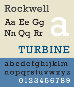
typeface characterized by thick, block-like serifs. Serif terminals may be either blunt and angular (Rockwell
), or rounded (Courier). Slab serif typefaces generally have no bracket (feature connecting the strokes to the serifs). Some consider slab serifs to be a subset of modern serif typefaces.
Because of their bold appearance, they are most commonly used in large headlines and advertisements but are seldom used in body text. The exception is in monospaced text, many fonts for which are modeled on the typefaces used in typewriters
, but that is declining in the wake of electronic publishing. Another recent exception is the typeface designed for The Guardian
newspaper in the UK which is an Egyptian used through the paper as body text.
 As printed material began to branch out from the familiar realm of books, new typefaces were needed for use in advertising, posters, and flyers. Slab serif printing type was first commercially introduced by Vincent Figgins
under the name Antique, with copies of specimen dated 1815 and 1817.
Following Napoleon's Egyptian campaign and dissemination of images and descriptions via publications like Description de l'Égypte
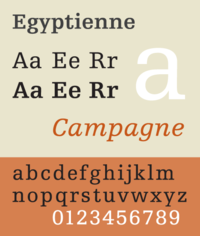
(1809) an intense cultural fascination with all things Egyptian followed. Suites of contemporary parlor furniture were produced resembling furniture found in tombs. Multicolored woodblock printed wallpaper could make a dining room in Edinburgh or Chicago feel like Luxor. While there was no relationship between Egyptian writing systems and slab serif types, either shrewd marketing or honest confusion led to slab serifs often being called Egyptians, and many early ones are named for the subject: Cairo, Karnak, and Memphis. The common metonym "Egyptian" is derived from a craze for Egyptian artifacts in Europe and North America in the early nineteenth century, which led typefounders producing Slab Serifs after Figgins' work to call their designs Egyptian. However, the term Egyptian had previously been used to describe sans-serif types in England, so the term 'Antique' was used by British and American typefounders. The term Egyptian was adopted by French and German foundries, where it became Egyptienne.
and Egyptienne
.
fonts. Examples include Rockwell
and Memphis.
appearance, likely as a result of their frequent use in western-era posters.
. These faces originated in monospaced format with fixed-width, meaning that every character takes up exactly the same amount of horizontal space. This feature is necessitated by the nature of the typewriter apparatus. Examples include Courier and Courier New (both Neo-grotesque model) and Prestige Elite
(Clarendon model).
Typography
Typography is the art and technique of arranging type in order to make language visible. The arrangement of type involves the selection of typefaces, point size, line length, leading , adjusting the spaces between groups of letters and adjusting the space between pairs of letters...
, a slab serif (also called mechanistic, square serif or Egyptian) typeface
Typeface
In typography, a typeface is the artistic representation or interpretation of characters; it is the way the type looks. Each type is designed and there are thousands of different typefaces in existence, with new ones being developed constantly....
is a type of serif
Serif
In typography, serifs are semi-structural details on the ends of some of the strokes that make up letters and symbols. A typeface with serifs is called a serif typeface . A typeface without serifs is called sans serif or sans-serif, from the French sans, meaning “without”...
typeface characterized by thick, block-like serifs. Serif terminals may be either blunt and angular (Rockwell
Rockwell (typeface)
Rockwell is a serif typeface belonging to the classification slab serif, or Egyptian, where the serifs are unbracketed and similar in weight to the horizontal strokes of the letters. The typeface was designed at the Monotype foundry's in-house design studio in 1934. The project was supervised by...
), or rounded (Courier). Slab serif typefaces generally have no bracket (feature connecting the strokes to the serifs). Some consider slab serifs to be a subset of modern serif typefaces.
Because of their bold appearance, they are most commonly used in large headlines and advertisements but are seldom used in body text. The exception is in monospaced text, many fonts for which are modeled on the typefaces used in typewriters
Typewriter
A typewriter is a mechanical or electromechanical device with keys that, when pressed, cause characters to be printed on a medium, usually paper. Typically one character is printed per keypress, and the machine prints the characters by making ink impressions of type elements similar to the pieces...
, but that is declining in the wake of electronic publishing. Another recent exception is the typeface designed for The Guardian
The Guardian
The Guardian, formerly known as The Manchester Guardian , is a British national daily newspaper in the Berliner format...
newspaper in the UK which is an Egyptian used through the paper as body text.
History
Vincent Figgins
Vincent Figgins born in Peckham, England. He was a British punch-cutter and type-founder. He started his career as an apprentice to Joseph Jackson from 1782 until Jackson's death in 1792. Figgins was expected to take over Jackson's foundry, but due financial restraints he could not afford it. The...
under the name Antique, with copies of specimen dated 1815 and 1817.
Following Napoleon's Egyptian campaign and dissemination of images and descriptions via publications like Description de l'Égypte
Description de l'Egypte (1809)
The Description de l'Égypte was a series of publications, appearing first in 1809 and continuing until the final volume appeared in 1829, which offered a comprehensive scientific description of ancient and modern Egypt as well as its natural history...
(1809) an intense cultural fascination with all things Egyptian followed. Suites of contemporary parlor furniture were produced resembling furniture found in tombs. Multicolored woodblock printed wallpaper could make a dining room in Edinburgh or Chicago feel like Luxor. While there was no relationship between Egyptian writing systems and slab serif types, either shrewd marketing or honest confusion led to slab serifs often being called Egyptians, and many early ones are named for the subject: Cairo, Karnak, and Memphis. The common metonym "Egyptian" is derived from a craze for Egyptian artifacts in Europe and North America in the early nineteenth century, which led typefounders producing Slab Serifs after Figgins' work to call their designs Egyptian. However, the term Egyptian had previously been used to describe sans-serif types in England, so the term 'Antique' was used by British and American typefounders. The term Egyptian was adopted by French and German foundries, where it became Egyptienne.
Clarendon model
Clarendon typefaces, unlike other slab serifs, actually have some bracketing and some contrast in size in the actual serif. Examples include ClarendonClarendon (typeface)
Clarendon is an English slab-serif typeface that was created in England by Robert Besley for Thorowgood and Co. , a type company formerly known as the Fann Street Foundry until approximately 1838. The font was published in 1845 after Besley, an employee of the foundry since 1826, was made a partner...
and Egyptienne
Egyptienne
For the Royal Navy Frigate, see HMS Egyptienne Egyptienne is a serif typeface belonging to the classification slab serif, or Egyptian, where the serifs are unbracketed and similar in weight to the horizontal strokes of the letters...
.
Neo-grotesque model
The most common slab serif typefaces, Neo-grotesque have no bracketing and evenly weighted stems and serifs. The letterforms are similar to neo-grotesque or realist sans-serifSans-serif
In typography, a sans-serif, sans serif or san serif typeface is one that does not have the small projecting features called "serifs" at the end of strokes. The term comes from the French word sans, meaning "without"....
fonts. Examples include Rockwell
Rockwell (typeface)
Rockwell is a serif typeface belonging to the classification slab serif, or Egyptian, where the serifs are unbracketed and similar in weight to the horizontal strokes of the letters. The typeface was designed at the Monotype foundry's in-house design studio in 1934. The project was supervised by...
and Memphis.
Italienne model
In the Italienne model, the serifs are even heavier than the stems, forging a dramatic, attention-drawing effect. Some Italienne slab serifs, such as Playbill, have a characteristic WesternWestern (genre)
The Western is a genre of various visual arts, such as film, television, radio, literature, painting and others. Westerns are devoted to telling stories set primarily in the latter half of the 19th century in the American Old West, hence the name. Some Westerns are set as early as the Battle of...
appearance, likely as a result of their frequent use in western-era posters.
Typewriter typefaces
Typewriter slab serif typefaces are named for their use in strike-on typewritingTypewriter
A typewriter is a mechanical or electromechanical device with keys that, when pressed, cause characters to be printed on a medium, usually paper. Typically one character is printed per keypress, and the machine prints the characters by making ink impressions of type elements similar to the pieces...
. These faces originated in monospaced format with fixed-width, meaning that every character takes up exactly the same amount of horizontal space. This feature is necessitated by the nature of the typewriter apparatus. Examples include Courier and Courier New (both Neo-grotesque model) and Prestige Elite
Prestige Elite
Prestige Elite, also known simply as Prestige, is a monospaced typeface.It was created by Clayton Smith in 1953 for IBM. Along with Courier, it was extremely popular for use in electric typewriters, especially the IBM Selectric...
(Clarendon model).