In
typographyTypography is the art and technique of arranging type in order to make language visible. The arrangement of type involves the selection of typefaces, point size, line length, leading , adjusting the spaces between groups of letters and adjusting the space between pairs of letters...
,
leading (icon) refers to the distance between the
baselineIn European and West Asian typography and penmanship, the baseline is the line upon which most letters "sit" and below which descenders extend.In the example to the right, the letter 'p' has a descender; the other letters sit on the baseline....
s of successive lines of type. The term originated in the days of hand-
typesettingTypesetting is the composition of text by means of types.Typesetting requires the prior process of designing a font and storing it in some manner...
, when thin strips of
leadLead is a main-group element in the carbon group with the symbol Pb and atomic number 82. Lead is a soft, malleable poor metal. It is also counted as one of the heavy metals. Metallic lead has a bluish-white color after being freshly cut, but it soon tarnishes to a dull grayish color when exposed...
were inserted into the formes to increase the vertical distance between lines of type. The term is still used in modern
page layoutPage layout is the part of graphic design that deals in the arrangement and style treatment of elements on a page.- History and development :...
software such as
QuarkXPressQuarkXPress is a computer application for creating and editing complex page layouts in a WYSIWYG environment. It runs on Mac OS X and Windows. It was first released by Quark, Inc...
and
Adobe InDesignAdobe InDesign is a software application produced by Adobe Systems. It can be used to create works such as posters, flyers, brochures, magazines, newspapers and books. In conjunction with Adobe Digital Publishing Suite InDesign can publish content suitable for tablet devices...
In consumer-oriented word processing software, this concept is usually referred to as "
line spacing" or "
interline spacing."
Origins
The word comes from
leadLead is a main-group element in the carbon group with the symbol Pb and atomic number 82. Lead is a soft, malleable poor metal. It is also counted as one of the heavy metals. Metallic lead has a bluish-white color after being freshly cut, but it soon tarnishes to a dull grayish color when exposed...
strips that were put between set lines. When type was set by hand in
printing pressA printing press is a device for applying pressure to an inked surface resting upon a print medium , thereby transferring the ink...
es, slugs or strips of
leadLead is a main-group element in the carbon group with the symbol Pb and atomic number 82. Lead is a soft, malleable poor metal. It is also counted as one of the heavy metals. Metallic lead has a bluish-white color after being freshly cut, but it soon tarnishes to a dull grayish color when exposed...
(reglets) of appropriate thicknesses were inserted between lines of type to add vertical space, to fill available space on the page.
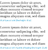
Text set "solid" (no leading) appears cramped, with ascenders almost touching
descenderIn typography, a descender is the portion of a letter that extends below the baseline of a font. The line that descenders reach down to is known as the beard line....
s from the previous line. The lack of white space between lines makes it difficult for the eye to track from one line to the next, and hampers
readabilityReadability is the ease in which text can be read and understood. Various factors to measure readability have been used, such as "speed of perception," "perceptibility at a distance," "perceptibility in peripheral vision," "visibility," "the reflex blink technique," "rate of work" , "eye...
.
The following block of text has no leading:
Typography (Greek: typos "form", graphein "to write") is the art and technique of setting written subject matter in type using a combination of typeface styles, point sizes, line lengths, line leading, character spacing, and word spacing to produce typeset artwork in physical or digital form.
This block of text set with 50% leading is easier to read:
Typography (Greek: typos "form", graphein "to write") is the art and technique of setting written subject matter in type using a combination of typeface styles, point sizes, line lengths, line leading, character spacing, and word spacing to produce typeset artwork in physical or digital form.
This block of text at 100% leading is harder to read and makes less efficient use of vertical page space:
Typography (Greek: typos "form", graphein "to write") is the art and technique of setting written subject matter in type using a combination of typeface styles, point sizes, line lengths, line leading, character spacing, and word spacing to produce typeset artwork in physical or digital form.
In
CSSCascading Style Sheets is a style sheet language used to describe the presentation semantics of a document written in a markup language...
, leading is implemented by creating a difference between the content height and the value of the
line-height property. Half the leading is called the half-leading. User agents center glyphs vertically in an inline box, which adds half-leading on the top and bottom. For example, if a piece of text is '12px' high and the line-height value is '14px', 2pxs of extra space should be added: 1px above and 1px below the letters. (This applies to empty boxes as well, as if the empty box contained an infinitely narrow letter.)
Feathering
The leading may be increased to align the bottom line of text on a page in a process known as feathering, carding, or vertical justification.
The source of this article is
wikipedia, the free encyclopedia. The text of this article is licensed under the
GFDL.