

Typeface
Encyclopedia
Typography
Typography is the art and technique of arranging type in order to make language visible. The arrangement of type involves the selection of typefaces, point size, line length, leading , adjusting the spaces between groups of letters and adjusting the space between pairs of letters...
, a typeface is the artistic representation or interpretation of character
Character
- Art and entertainment :* Character , an agent in a work of art, including literature, drama, cinema, opera, etc.* Character , a 1997 Dutch film, based on the novel by Dutch author Ferdinand Bordewijk* Character , by Dark Tranquillity...
s; it is the way the type looks. Each type is designed and there are thousands of different typefaces in existence, with new ones being developed constantly.
The art and craft of designing typefaces is called type design
Type design
Type design is the art of designing typefaces.- History :Although the technology of printing text using movable type was invented in China, and despite the esteem which calligraphy held in that civilization, the vast number of Chinese characters meant that few distinctive, complete fonts could be...
. Designers of typefaces are called type designers, and often typographers. In digital typography, type designers are also known as font developers or font designers. Refer to the list of typographers of notable typographers around the world.
Typeface is the design of glyph
Glyph
A glyph is an element of writing: an individual mark on a written medium that contributes to the meaning of what is written. A glyph is made up of one or more graphemes....
s which is the looks of characters. The same glyph may be used for characters from different scripts, e.g. Roman uppercase A
A
A is the first letter and a vowel in the basic modern Latin alphabet. It is similar to the Ancient Greek letter Alpha, from which it derives.- Origins :...
looks the same as Cyrillic uppercase А and Greek uppercase alpha
Alpha
Alpha is the first letter of the Greek alphabet. Alpha or ALPHA may also refer to:-Science:*Alpha , the highest ranking individuals in a community of social animals...
, and there are typefaces tailored for special applications, such as map-making or astrology
Astrology
Astrology consists of a number of belief systems which hold that there is a relationship between astronomical phenomena and events in the human world...
and mathematics
Mathematics
Mathematics is the study of quantity, space, structure, and change. Mathematicians seek out patterns and formulate new conjectures. Mathematicians resolve the truth or falsity of conjectures by mathematical proofs, which are arguments sufficient to convince other mathematicians of their validity...
.
The term typeface is frequently confused with term font
Font
In typography, a font is traditionally defined as a quantity of sorts composing a complete character set of a single size and style of a particular typeface...
or used as a synonym. Before the advent of digital typography
Digital typography
Digital typography is the arrangement of type using computers.- See also :* Typography* Computer font* Web typography* Desktop publishing* Font rasterization...
and desktop publishing
Desktop publishing
Desktop publishing is the creation of documents using page layout software on a personal computer.The term has been used for publishing at all levels, from small-circulation documents such as local newsletters to books, magazines and newspapers...
the two terms had a more clearly understood meaning. See font
Font
In typography, a font is traditionally defined as a quantity of sorts composing a complete character set of a single size and style of a particular typeface...
for a complete definition of that term.
Terminology
In professional typography, the term typeface is not interchangeable with the word fontFont
In typography, a font is traditionally defined as a quantity of sorts composing a complete character set of a single size and style of a particular typeface...
, which was historically defined as a given alphabet and its associated characters in a single size. For example, 8-point Caslon Italic was one font, and 10-point Caslon Italic was another. Historically, fonts came in specific sizes determining the size of characters, and in quantities of sort
Sort (typesetting)
In typesetting by hand compositing, a sort is a piece of type representing a particular letter or symbol, cast from a matrix mould and assembled with other sorts bearing additional letters into lines of type to make up a forme from which a page is printed.-See also:* History of western typography*...
s or number of each letter provided. The design of characters in a font took into account all these factors.
As the range of typeface designs increased and requirements of publishers broadened over the centuries, fonts of specific weight (blackness or lightness) and stylistic variants (most commonly regular or roman
Roman type
In typography, roman is one of the three main kinds of historical type, alongside blackletter and italic. Roman type was modelled from a European scribal manuscript style of the 1400s, based on the pairing of inscriptional capitals used in ancient Rome with Carolingian minuscules developed in the...
as distinct to italic
Italic type
In typography, italic type is a cursive typeface based on a stylized form of calligraphic handwriting. Owing to the influence from calligraphy, such typefaces often slant slightly to the right. Different glyph shapes from roman type are also usually used—another influence from calligraphy...
, as well as condensed) have led to font families, collections of closely related typeface designs that can include hundreds of styles. A font family is typically a group of related fonts which vary only in weight, orientation, width, etc., but not design. For example, Times
Times
The Times is a UK daily newspaper, the original English language newspaper titled "Times". Times may also refer to:In newspapers:*The Times , went defunct in 2005*The Times *The Times of Northwest Indiana...
is a font family, whereas Times Roman, Times Italic and Times Bold are individual fonts making up the Times family. Font families typically include several fonts, though some, such as Helvetica
Helvetica
Helvetica is a widely used sans-serif typeface developed in 1957 by Swiss typeface designer Max Miedinger with Eduard Hoffmann.-Visual distinctive characteristics:Characteristics of this typeface are:lower case:square dot over the letter i....
, may consist of dozens of fonts.
The distinction between font and typeface is that a font designates a specific member of a type family such as roman, boldface, or italic type
Italic type
In typography, italic type is a cursive typeface based on a stylized form of calligraphic handwriting. Owing to the influence from calligraphy, such typefaces often slant slightly to the right. Different glyph shapes from roman type are also usually used—another influence from calligraphy...
, while typeface designates a consistent visual appearance or style which can be a "family" or related set of fonts. For example, a given typeface such as Arial
Arial
Arial, sometimes marketed or displayed in software as Arial MT, is a sans-serif typeface and set of computer fonts. Fonts from the Arial family are packaged with Microsoft Windows, some other Microsoft software applications, Apple Mac OS X and many PostScript 3 computer printers...
may include roman, bold, and italic fonts. In the metal type era, a font also meant a specific point size, but with digital scalable outline fonts this distinction is no longer valid, as a single font may be scaled to any size.
The first "extended" font families, which included a wide range of widths and weights in the same general style emerged in the early 1900s, starting with ATF
American Type Founders
American Type Founders was a business trust created in 1892 by the merger of 23 type foundries, representing about 85% of all type manufactured in the United States...
's Cheltenham
Cheltenham (typeface)
Cheltenham is a display typeface, designed in 1896 by architect Bertram Goodhue and Ingalls Kimball, director of the Cheltenham Press. The original drawings were known as Boston Old Style and were made about 14" high. These drawings were then turned over to Morris Fuller Benton at American Type...
(1902–1913), with an initial design by Bertram Grosvenor Goodhue, and many additional faces designed by Morris Fuller Benton
Morris Fuller Benton
Morris Fuller Benton was an influential American typeface designer who headed the design department of the American Type Founders , for which he was the chief type designer from 1900 to 1937...
. Later examples include Futura
Futura (typeface)
In typography, Futura is a geometric sans-serif typeface designed in 1927 by Paul Renner. It is based on geometric shapes that became representative visual elements of the Bauhaus design style of 1919–1933...
, Lucida
Lucida
Lucida is an extended family of related typefaces designed by Charles Bigelow and Kris Holmes in 1985.There are many variants called Lucida, including scripts , serif , and sans-serif .Bigelow & Holmes, together with the TeX vendor Y&Y, extended the Lucida family with a full...
, ITC Officina. Some became superfamilies as a result of revival, such as Linotype Syntax
Syntax (typeface)
The Syntax font families are designed by Hans Eduard Meier. Originally started with sans-serif fonts, it was expanded to include serif designs.-Syntax:...
, Linotype Univers
Univers
Univers is the name of a realist sans-serif typeface designed by Adrian Frutiger in 1954.Originally conceived and released by Deberny & Peignot in 1957, the type library was acquired in 1972 by Haas. Haas'sche Schriftgiesserei was later folded into the D...
; while others have alternate styling designed as compatible replacements of each other, such as Compatil
Compatil
Compatil is the name of a large typeface family designed for interchangeable fonts while maintaining identical document metrics.- History :Development of the Compatil typefaces took place from 1999 to 2001 at Linotype Library GmbH...
, Generis
Generis (typeface)
Generis is the name of a typeface designed by type designer Erik Faulhaber. Generis was first published in November 2006 by Linotype.The Generis is a type system consisting of four type families compatible both in style and metrics. It consists of 28 fonts in 6 weights. OpenType features include...
.
Typeface superfamilies began to emerge when foundries began to include typefaces with significant structural differences, but some design relationship, under the same general family name. Arguably the first superfamily was created when Morris Fuller Benton created Clearface Gothic for ATF in 1910, a sans serif companion to the existing (serifed) Clearface. The superfamily label does not include quite different designs given the same family name for what would seem to be purely marketing, rather than design, considerations: Caslon Antique
Caslon Antique
Caslon Antique is a decorative American typeface that was designed in 1894 by Berne Nadall. It was originally called "Fifteenth Century", but was renamed "Caslon Antique" by Nadall's foundry, Barnhart Bros. & Spindler, in the mid-1920s....
, Futura
Futura (typeface)
In typography, Futura is a geometric sans-serif typeface designed in 1927 by Paul Renner. It is based on geometric shapes that became representative visual elements of the Bauhaus design style of 1919–1933...
Black and Futura Display are structurally unrelated to the Caslon and Futura families, respectively, and are generally not considered part of those families by typographers, despite their names.
Additional or supplemental glyphs intended to match a main typeface have been in use for centuries. In some formats they have been marketed as separate fonts. In the early 1990s, the Adobe Systems type group
Adobe Type
Adobe Systems’ division of typography is an innovator in font technology and design, Adobe was a forerunner in the development of PostScript Type 1 and Type 3 font formats and OpenType technology, as well as being an established digital type foundry....
introduced the idea of expert set fonts, which had a standardized set of additional glyphs, including small caps
Small caps
In typography, small capitals are uppercase characters set at the same height and weight as surrounding lowercase letters or text figures...
, old style figures, and additional superior letters, fractions and ligatures not found in the main fonts for the typeface. Supplemental fonts have also included alternate letters such as swashes
Swash (typography)
A swash is a typographical flourish on a glyph, like an exaggerated serif.Capital swash characters, which extended to the left, were historically often used to begin sentences. There were also minuscule swash characters, which came either extending to the left, to begin words, or to the right to...
, dingbat
Dingbat
A dingbat is an ornament, character or spacer used in typesetting, sometimes more formally known as a "printer's ornament" or "printer's character"....
s, and alternate character sets, complementing the regular fonts under the same family. However, with introduction of font formats such as OpenType
OpenType
OpenType is a format for scalable computer fonts. It was built on its predecessor TrueType, retaining TrueType's basic structure and adding many intricate data structures for prescribing typographic behavior...
, those supplemental glyphs were merged into the main fonts, relying on specific software capabilities to access the alternate glyphs.
Since Apple's and Microsoft's operating systems supported different character sets in the platform related fonts, some foundries used expert fonts in a different way. These fonts included the characters which were missing on either Macintosh or Windows computers, e.g. fractions, ligatures or some accented glyphs. The goal was to deliver the whole character set to the customer regardless of which operating system was used.
The size of typefaces and font
Font
In typography, a font is traditionally defined as a quantity of sorts composing a complete character set of a single size and style of a particular typeface...
s is traditionally measured in points
Point (typography)
In typography, a point is the smallest unit of measure, being a subdivision of the larger pica. It is commonly abbreviated as pt. The point has long been the usual unit for measuring font size and leading and other minute items on a printed page....
; point has been defined differently at different times, but now the most popular is the Desktop Publishing point of in (0.0139 in (0.35306 mm)). When specified in typographic sizes (points, kyus), the height of an em-square, an invisible box which is typically a bit larger than the distance from the tallest ascender to the lowest descender
Descender
In typography, a descender is the portion of a letter that extends below the baseline of a font. The line that descenders reach down to is known as the beard line....
, is scaled to equal the specified size. For example, when setting Helvetica
Helvetica
Helvetica is a widely used sans-serif typeface developed in 1957 by Swiss typeface designer Max Miedinger with Eduard Hoffmann.-Visual distinctive characteristics:Characteristics of this typeface are:lower case:square dot over the letter i....
at 12 point, the em square defined in the Helvetica font is scaled to 12 points or in (0.17 in (4.3 mm)). Yet no particular element of 12-point Helvetica need measure exactly 12 points.
Frequently measurement in non-typographic units (feet, inches, meters) will be of the cap-height, the height of the capital letters. Font size is also commonly measured in millimeters (mm) and qs (a quarter of a millimeter, kyu in romanized Japanese) and inches.
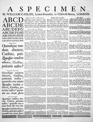
History
Type foundries have cast fonts in leadLead
Lead is a main-group element in the carbon group with the symbol Pb and atomic number 82. Lead is a soft, malleable poor metal. It is also counted as one of the heavy metals. Metallic lead has a bluish-white color after being freshly cut, but it soon tarnishes to a dull grayish color when exposed...
alloys from the 1450s until the present, although wood
Wood
Wood is a hard, fibrous tissue found in many trees. It has been used for hundreds of thousands of years for both fuel and as a construction material. It is an organic material, a natural composite of cellulose fibers embedded in a matrix of lignin which resists compression...
served as the material for some large fonts called wood type during the 19th century, particularly in the United States
United States
The United States of America is a federal constitutional republic comprising fifty states and a federal district...
. In the 1890s the mechanization of typesetting allowed automated casting of fonts on the fly as lines of type in the size and length needed. This was known as continuous casting, and remained profitable and widespread until its demise in the 1970s. The first machine of this type was the Linotype machine
Linotype machine
The Linotype typesetting machine is a "line casting" machine used in printing. The name of the machine comes from the fact that it produces an entire line of metal type at once, hence a line-o'-type, a significant improvement over manual typesetting....
, invented by Ottmar Mergenthaler
Ottmar Mergenthaler
Ottmar Mergenthaler was an inventor who has been called a second Gutenberg because of his invention of the Linotype machine, the first device that could easily and quickly set complete lines of type for use in printing presses...
.
During a brief transitional period (c. 1950s – 1990s), photographic technology, known as phototypesetting
Phototypesetting
Phototypesetting was a method of setting type, rendered obsolete with the popularity of the personal computer and desktop publishing software, that uses a photographic process to generate columns of type on a scroll of photographic paper...
, utilized tiny high-resolution images of individual glyphs on a film strip (in the form of a film negative, with the letters as clear areas on an opaque black background). A high-intensity light source behind the film strip projected the image of each glyph through an optical system, which focused the desired letter onto the light-sensitive phototypesetting paper at a specific size and position. This photographic typesetting process permitted optical scaling
Scaling (geometry)
In Euclidean geometry, uniform scaling is a linear transformation that enlarges or shrinks objects by a scale factor that is the same in all directions. The result of uniform scaling is similar to the original...
, allowing designers to produce multiple sizes from a single font, although physical constraints on the reproduction system used still required design changes at different sizes; for example, ink trap
Ink trap
An ink trap is a feature of certain typefaces, where the corners or details are removed from the letterforms. When the type is printed, ink naturally spreads into the removed area. Without ink traps, the excess ink would blob and ruin the crisp edge....
s and spikes to allow for spread of ink
Ink
Ink is a liquid or paste that contains pigments and/or dyes and is used to color a surface to produce an image, text, or design. Ink is used for drawing and/or writing with a pen, brush, or quill...
encountered in the printing stage. Manually operated photocomposition systems using fonts on filmstrips allowed fine kerning
Kerning
In typography, kerning is the process of adjusting the spacing between characters in a proportional font, usually to achieve a visually pleasing result. Kerning is the adjustment of the space between individual letter forms vs. tracking which is the uniform adjustment of spacing applied over a...
between letters without the physical effort of manual typesetting, and spawned an enlarged type design industry in the 1960s and 1970s.
The mid-1970s saw all of the major typeface technologies and all their fonts in use: letterpress, continuous casting machines, phototypositors, computer-controlled phototypesetters, and the earliest digital typesetters—hulking machines with tiny processors and CRT outputs. From the mid-1980s, as digital typography has grown, users have almost universally adopted the American spelling font, which nowadays nearly always means a computer file
Computer file
A computer file is a block of arbitrary information, or resource for storing information, which is available to a computer program and is usually based on some kind of durable storage. A file is durable in the sense that it remains available for programs to use after the current program has finished...
containing scalable outline letterforms (digital font), in one of several common formats. Some typefaces, such as Verdana
Verdana
Verdana is a humanist sans-serif typeface designed by Matthew Carter for Microsoft Corporation, with hand-hinting done by Thomas Rickner, then at Monotype. Demand for such a typeface was recognized by Virginia Howlett of Microsoft's typography group...
, are designed primarily for use on computer screens.
Digital type
Digital fonts store the image of each character either as a bitmapBitmap
In computer graphics, a bitmap or pixmap is a type of memory organization or image file format used to store digital images. The term bitmap comes from the computer programming terminology, meaning just a map of bits, a spatially mapped array of bits. Now, along with pixmap, it commonly refers to...
in a bitmap font, or by mathematical description of lines and curves in an outline font, also called a vector font. When an outline font is used, a rasterizing routine
Raster graphics
In computer graphics, a raster graphics image, or bitmap, is a data structure representing a generally rectangular grid of pixels, or points of color, viewable via a monitor, paper, or other display medium...
(in the application software, operating system or printer) renders the character outlines, interpreting the vector instructions to decide which pixels should be black and which ones white. Rasterization is straightforward at high resolutions such as those used by laser printer
Laser printer
A laser printer is a common type of computer printer that rapidly produces high quality text and graphics on plain paper. As with digital photocopiers and multifunction printers , laser printers employ a xerographic printing process, but differ from analog photocopiers in that the image is produced...
s and in high-end publishing systems. For computer screen
Computer display
A monitor or display is an electronic visual display for computers. The monitor comprises the display device, circuitry, and an enclosure...
s, where each individual pixel can mean the difference between legible and illegible characters, some digital fonts use hinting algorithms
Font hinting
Font hinting is the use of mathematical instructions to adjust the display of an outline font so that it lines up with a rasterized grid. At low screen resolutions, hinting is critical for producing a clear, legible text...
to make readable bitmaps at small sizes.
Digital fonts may also contain data representing the metrics used for composition, including kerning pairs, component creation data for accented characters, glyph substitution rules for Arabic typography and for connecting script faces, and for simple everyday ligature
Ligature (typography)
In writing and typography, a ligature occurs where two or more graphemes are joined as a single glyph. Ligatures usually replace consecutive characters sharing common components and are part of a more general class of glyphs called "contextual forms", where the specific shape of a letter depends on...
s like fl. Common font formats include TrueType
TrueType
TrueType is an outline font standard originally developed by Apple Computer in the late 1980s as a competitor to Adobe's Type 1 fonts used in PostScript...
, OpenType
OpenType
OpenType is a format for scalable computer fonts. It was built on its predecessor TrueType, retaining TrueType's basic structure and adding many intricate data structures for prescribing typographic behavior...
and PostScript
PostScript
PostScript is a dynamically typed concatenative programming language created by John Warnock and Charles Geschke in 1982. It is best known for its use as a page description language in the electronic and desktop publishing areas. Adobe PostScript 3 is also the worldwide printing and imaging...
Type 1, while METAFONT
METAFONT
Metafont is a programming language used to define vector fonts. It is also the name of the interpreter that executes Metafont code, generating the bitmap fonts that can be embedded into e.g. PostScript...
is still used by TeX
TeX
TeX is a typesetting system designed and mostly written by Donald Knuth and released in 1978. Within the typesetting system, its name is formatted as ....
and its variants. Applications using these font formats, including the rasterizers, appear in Microsoft and Apple Computer operating system
Operating system
An operating system is a set of programs that manage computer hardware resources and provide common services for application software. The operating system is the most important type of system software in a computer system...
s, Adobe Systems
Adobe Systems
Adobe Systems Incorporated is an American computer software company founded in 1982 and headquartered in San Jose, California, United States...
products and those of several other companies. Digital fonts are created with font editors such as FontForge
FontForge
FontForge is a typeface editor program developed by George Williams. FontForge is free software and is distributed under the BSD license. FontForge is available for several operating systems and is localized in several languages.- Features :Fontforge supports many font formats, including...
, RoboFont, Glyphs, Fontlab
FontLab
FontLab is both the name of a company, FontLab Ltd, and the former name of their flagship font editor product, now called FontLab Studio. Since the early 2000s, FontLab Studio has been the dominant software tool for commercial/retail digital font development. This is partly because the...
's TypeTool, FontLab Studio, Fontographer, or AsiaFont Studio.
Typeface anatomy
Typographers have developed a comprehensive vocabulary for describing the many aspects of typefaces and typography. Some vocabulary applies only to a subset of all scriptsWriting system
A writing system is a symbolic system used to represent elements or statements expressible in language.-General properties:Writing systems are distinguished from other possible symbolic communication systems in that the reader must usually understand something of the associated spoken language to...
. Serifs, for example, are a purely decorative characteristic of typefaces used for European scripts, whereas the glyphs used in Arabic or East Asian scripts have characteristics (such as stroke width) that may be similar in some respects but cannot reasonably be called serifs and may not be purely decorative.
Serifs
 |
Sans serif font |
 |
Serif font |
 |
Serif font with serifs highlighted in red |
Typefaces can be divided into two main categories: serif
Serif
In typography, serifs are semi-structural details on the ends of some of the strokes that make up letters and symbols. A typeface with serifs is called a serif typeface . A typeface without serifs is called sans serif or sans-serif, from the French sans, meaning “without”...
and sans serif. Serif
Serif
In typography, serifs are semi-structural details on the ends of some of the strokes that make up letters and symbols. A typeface with serifs is called a serif typeface . A typeface without serifs is called sans serif or sans-serif, from the French sans, meaning “without”...
s comprise the small features at the end of strokes within letters. The printing industry refers to typeface without serifs as sans serif (from French sans, meaning without), or as grotesque (or, in German
German language
German is a West Germanic language, related to and classified alongside English and Dutch. With an estimated 90 – 98 million native speakers, German is one of the world's major languages and is the most widely-spoken first language in the European Union....
, grotesk).
Great variety exists among both serif and sans serif typefaces. Both groups contain faces designed for setting large amounts of body text, and others intended primarily as decorative. The presence or absence of serifs forms is only one of many factors to consider when choosing a typeface.
Typefaces with serifs are often considered easier to read in long passages than those without. Studies on the matter are ambiguous, suggesting that most of this effect is due to the greater familiarity of serif typefaces. As a general rule, printed works such as newspapers and books almost always use serif typefaces, at least for the text body. Web sites do not have to specify a font and can simply respect the browser settings of the user. But of those web sites that do specify a font, most use modern sans serif fonts, because it is commonly believed that, in contrast to the case for printed material, sans serif fonts are easier than serif fonts to read on the low-resolution computer screen.
Proportion
A proportional typeface contains glyphs of varying widths, while a monospaced (non-proportional or fixed-width) typeface uses a single standard width for all glyphs in the font.Most people generally find proportional typefaces nicer-looking and easier to read, and thus they appear more commonly in professionally published printed material. For the same reason, GUI
Gui
Gui or guee is a generic term to refer to grilled dishes in Korean cuisine. These most commonly have meat or fish as their primary ingredient, but may in some cases also comprise grilled vegetables or other vegetarian ingredients. The term derives from the verb, "gupda" in Korean, which literally...
computer applications (such as word processor
Word processor
A word processor is a computer application used for the production of any sort of printable material....
s and web browser
Web browser
A web browser is a software application for retrieving, presenting, and traversing information resources on the World Wide Web. An information resource is identified by a Uniform Resource Identifier and may be a web page, image, video, or other piece of content...
s) typically use proportional fonts. However, many proportional fonts contain fixed-width (tabular) figures so that columns of numbers stay aligned.
Monospaced typefaces function better for some purposes because their glyphs line up in neat, regular columns. No glyph is given any more weight than another. Most manually-operated typewriter
Typewriter
A typewriter is a mechanical or electromechanical device with keys that, when pressed, cause characters to be printed on a medium, usually paper. Typically one character is printed per keypress, and the machine prints the characters by making ink impressions of type elements similar to the pieces...
s and text-only computer displays use monospaced fonts. Most computer programs which have a text-based interface (terminal emulator
Terminal emulator
A terminal emulator, terminal application, term, or tty for short, is a program that emulates a video terminal within some other display architecture....
s, for example) use only monospaced fonts (or add additional spacing to proportional fonts to fit them in monospaced cells) in their configuration. Monospaced fonts are commonly used by computer programmers for displaying and editing source code
Source code
In computer science, source code is text written using the format and syntax of the programming language that it is being written in. Such a language is specially designed to facilitate the work of computer programmers, who specify the actions to be performed by a computer mostly by writing source...
so that certain characters (for example parentheses used to group arithmetic expressions) are easy to see. Monospaced fonts may also come as a benefit to machines doing automatic recognition of text (cf. Optical Character Recognition
Optical character recognition
Optical character recognition, usually abbreviated to OCR, is the mechanical or electronic translation of scanned images of handwritten, typewritten or printed text into machine-encoded text. It is widely used to convert books and documents into electronic files, to computerize a record-keeping...
).
ASCII art
ASCII art
ASCII art is a graphic design technique that uses computers for presentation and consists of pictures pieced together from the 95 printable characters defined by the ASCII Standard from 1963 and ASCII compliant character sets with proprietary extended characters...
usually requires a monospaced font for proper viewing, with the exception of Shift JIS art
Shift JIS art
Shift_JIS art is artwork created from characters within the Shift JIS character set, a superset of ASCII intended for Japanese usage. Naturally there are many similarities between Shift_JIS artwork and ASCII art....
which takes advantage of the proportional characters in the MS PGothic font.. In a web page
Web page
A web page or webpage is a document or information resource that is suitable for the World Wide Web and can be accessed through a web browser and displayed on a monitor or mobile device. This information is usually in HTML or XHTML format, and may provide navigation to other web pages via hypertext...
, the <tt> </tt>,
<code> </code> or <pre> </pre> HTMLHTML
HyperText Markup Language is the predominant markup language for web pages. HTML elements are the basic building-blocks of webpages....
tags most commonly specify monospaced fonts. In LaTeX
LaTeX
LaTeX is a document markup language and document preparation system for the TeX typesetting program. Within the typesetting system, its name is styled as . The term LaTeX refers only to the language in which documents are written, not to the editor used to write those documents. In order to...
, the verbatim environment or the Teletype
Teletype Corporation
The Teletype Corporation, a part of American Telephone and Telegraph Company's Western Electric manufacturing arm since 1930, came into being in 1928 when the Morkrum-Kleinschmidt Company changed its name to the name of its trademark equipment...
font family (e.g., \texttt{...} or {\ttfamily ...}) uses monospaced fonts (in TeX
TeX
TeX is a typesetting system designed and mostly written by Donald Knuth and released in 1978. Within the typesetting system, its name is formatted as ....
, use {\tt ...}).
Any two lines of text with the same number of characters in each line in a monospaced typeface should display as equal in width, while the same two lines in a proportional typeface may have radically different widths. This occurs because in a proportional font, glyph widths vary, such that wider glyphs (typically those for characters such as W, Q, Z, M, D, O, H, and U) use more space, and narrower glyphs (such as those for the characters i, t, l, and 1) use less space than the average.
In the publishing industry, it was once the case that editors read manuscript
Manuscript
A manuscript or handwrite is written information that has been manually created by someone or some people, such as a hand-written letter, as opposed to being printed or reproduced some other way...
s in monospaced fonts (typically Courier) for ease of editing and word count estimates, and it was considered discourteous to submit a manuscript in a proportional font. This has become less universal in recent years, such that authors need to check with editors as to their preference, though monospaced fonts are still the norm.
Font metrics
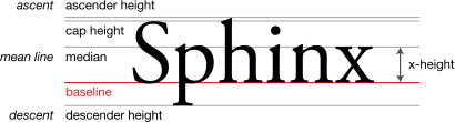
Most scripts share the notion of a baseline
Baseline (typography)
In European and West Asian typography and penmanship, the baseline is the line upon which most letters "sit" and below which descenders extend.In the example to the right, the letter 'p' has a descender; the other letters sit on the baseline....
: an imaginary horizontal line on which characters rest. In some scripts, parts of glyphs lie below the baseline. The descent spans the distance between the baseline and the lowest descending glyph in a typeface, and the part of a glyph that descends below the baseline has the name descender
Descender
In typography, a descender is the portion of a letter that extends below the baseline of a font. The line that descenders reach down to is known as the beard line....
. Conversely, the ascent spans the distance between the baseline and the top of the glyph that reaches farthest from the baseline. The ascent and descent may or may not include distance added by accents or diacritical marks.
In the Latin, Greek and Cyrillic (sometimes collectively referred to as LGC) scripts, one can refer to the distance from the baseline to the top of regular lowercase glyphs (mean line
Mean line
In typography, the mean line, also known as midline, is the line that determines where non-ascending lowercase letters terminate in a typeface...
) as the x-height
X-height
In typography, the x-height or corpus size refers to the distance between the baseline and the mean line in a typeface. Typically, this is the height of the letter x in the font , as well as the u, v, w, and z...
, and the part of a glyph rising above the x-height as the ascender. The distance from the baseline to the top of the ascent or a regular uppercase glyphs (cap line) is also known as the cap height. The height of the ascender can have a dramatic effect on the readability and appearance of a font. The ratio between the x-height and the ascent or cap height often serves to characterize typefaces.
Typefaces with the same metrics (i.e., with the same glyph dimensions) are said to be "metric-compatible", that is, they can be substituted for one another in a document without changing the document's text flow. Several typefaces have been created to be metric-compatible with widely used proprietary typefaces to allow the editing of documents set in such typefaces in digital typesetting environments where these typefaces are not available. For instance, the open-source Liberation fonts
Liberation fonts
Liberation is the collective name of four TrueType font families: Liberation Sans, Liberation Sans Narrow, Liberation Serif and Liberation Mono...
have been designed as metric-compatible substitutes for widely used Microsoft
Microsoft
Microsoft Corporation is an American public multinational corporation headquartered in Redmond, Washington, USA that develops, manufactures, licenses, and supports a wide range of products and services predominantly related to computing through its various product divisions...
fonts.
Types of typefaces

Roman type
In typography, roman is one of the three main kinds of historical type, alongside blackletter and italic. Roman type was modelled from a European scribal manuscript style of the 1400s, based on the pairing of inscriptional capitals used in ancient Rome with Carolingian minuscules developed in the...
s are in the most widespread use today, and are sub-classified as serif, sans serif, ornamental, and script types. Historically, the first European fonts were blackletter, followed by Roman serif, then sans serif and then the other types. The use of Gaelic faces was restricted to the Irish language, though these form a unique if minority class. Typefaces may be monospaced regardless of whether they are Roman, Blackletter, or Gaelic. Symbol typefaces are non-alphabetic. The Cyrillic script comes in two varieties, Roman type (called гражданский шрифт graždanskij šrift) and traditional Slavonic type (called славянский шрифт slavjanskij šrift).
Serif typefaces
Serif, or Roman, typefaces are named for the features at the ends of their strokes. Times RomanTimes Roman
Times New Roman is a serif typeface commissioned by the British newspaper The Times in 1931, created by Victor Lardent at the English branch of Monotype. It was commissioned after Stanley Morison had written an article criticizing The Times for being badly printed and typographically antiquated...
and Garamond
Garamond
Garamond is the name given to a group of old-style serif typefaces named after the punch-cutter Claude Garamond . Most of the Garamond faces are more closely related to the work of a later punch-cutter, Jean Jannon...
are common examples of serif typefaces. Serif fonts are probably the most used class in printed materials, including most books, newspapers and magazines. Serif fonts are often classified into three subcategories: Old Style, Transitional, and Modern. Old Style typefaces are influenced by early Italian lettering design. Though some argument exists as to whether Transitional fonts exist as a discrete category among serif fonts, Transitional fonts lie somewhere between Old Style and Modern style typefaces. Transitional fonts exhibit a marked increase in the variation of stroke weight and a more horizontal serif compared to Old Style, but not as extreme as Modern. Lastly, Modern fonts often exhibit a bracketed serif and a substantial difference in weight within the strokes.

Times Roman
Times New Roman is a serif typeface commissioned by the British newspaper The Times in 1931, created by Victor Lardent at the English branch of Monotype. It was commissioned after Stanley Morison had written an article criticizing The Times for being badly printed and typographically antiquated...
, New Baskerville
Baskerville
Baskerville is a transitional serif typeface designed in 1757 by John Baskerville in Birmingham, England. Baskerville is classified as a transitional typeface, positioned between the old style typefaces of William Caslon, and the modern styles of Giambattista Bodoni and Firmin Didot.The...
, and Bodoni
Bodoni
-Cold Type versions:As it had been a standard type for many years, Bodoni was widely available in cold type. Alphatype, Autologic, Berthold, Compugraphic, Dymo, Harris, Mergenthaler, MGD Graphic Systems, and Varityper, Hell AG, Monotype, all sold the face under the name ‘’Bodoni, while Graphic...
, respectively.
Roman, italic, and oblique are also terms used to differentiate between upright and italicized variations of a typeface. The difference between italic and oblique is that the term italic usually applies to serif faces, where the letter forms are redesigned.
Sans serif typefaces
Sans serif (lit. without serif) designs appeared relatively recently in the history of type design. The evolution of the sans serif font very likely stemmed from the slab serif font. The earliest slab serif font, Antique, later renamed Egyptian, designed in 1815 by the English typefounder Vincent Figgins was succeeded one year later by the first sans serif font, created by William Caslon IV. The evidence of this is clearly shown in the uniform strokes in the letter forms. Sans serif fonts are commonly but not exclusively used for display typography such as signage, headings, and other situations demanding legibility above high readability. The text on electronic media offers an exception to print: most web pages and digitized media are laid out in sans serif typefaces because serifs often detract from readability at the low resolution of displaysComputer display
A monitor or display is an electronic visual display for computers. The monitor comprises the display device, circuitry, and an enclosure...
.
A well-known and popular sans serif font is Max Miedinger
Max Miedinger
Max Miedinger was a Swiss typeface designer. He was famous for creating Helvetica in 1957...
's Helvetica
Helvetica
Helvetica is a widely used sans-serif typeface developed in 1957 by Swiss typeface designer Max Miedinger with Eduard Hoffmann.-Visual distinctive characteristics:Characteristics of this typeface are:lower case:square dot over the letter i....
, popularized for desktop publishing by inclusion with Apple Computer
Apple Computer
Apple Inc. is an American multinational corporation that designs and markets consumer electronics, computer software, and personal computers. The company's best-known hardware products include the Macintosh line of computers, the iPod, the iPhone and the iPad...
's LaserWriter laserprinter and having been one of the first readily available digital typefaces. Arial
Arial
Arial, sometimes marketed or displayed in software as Arial MT, is a sans-serif typeface and set of computer fonts. Fonts from the Arial family are packaged with Microsoft Windows, some other Microsoft software applications, Apple Mac OS X and many PostScript 3 computer printers...
, popularized by Microsoft, is a widely used sans serif font that is often compared to and substituted for Helvetica. Other fonts such as Futura
Futura (typeface)
In typography, Futura is a geometric sans-serif typeface designed in 1927 by Paul Renner. It is based on geometric shapes that became representative visual elements of the Bauhaus design style of 1919–1933...
, Gill Sans
Gill Sans
Gill Sans is a sans-serif typeface designed by Eric Gill.The original design appeared in 1926 when Douglas Cleverdon opened a bookshop in his home town of Bristol, where Eric Gill painted the fascia over the window in sans-serif capitals that would later be known as Gill Sans...
, Univers
Univers
Univers is the name of a realist sans-serif typeface designed by Adrian Frutiger in 1954.Originally conceived and released by Deberny & Peignot in 1957, the type library was acquired in 1972 by Haas. Haas'sche Schriftgiesserei was later folded into the D...
and Frutiger
Frutiger
Frutiger is a series of typefaces named after its designer, Adrian Frutiger. Initially available as a sans serif, it was later expanded to include ornamental and serif typefaces.-Distinctive characteristics:Characteristics of this typeface are:...
have also remained popular over many decades.
Script typefaces
Script typefaces imitate handwriting or calligraphyCalligraphy
Calligraphy is a type of visual art. It is often called the art of fancy lettering . A contemporary definition of calligraphic practice is "the art of giving form to signs in an expressive, harmonious and skillful manner"...
. They do not lend themselves to quantities of body text
Body text
Body text is the term for the text forming the main content of a book, magazine, web page or other printed matter. This is as a contrast to both the headings on each page, and also the pages of front matter that form the introduction to a book....
, as people find them harder to read than many serif and sans-serif typefaces; they are typically used for logos or invitations. Examples include Coronet
Coronet (typeface)
Coronet is an American typeface designed in 1937 by R. Hunter Middleton. It is also sometimes known as "Ribbon 131".-Uses in Popular Culture:*Andy Warhol's "signature" on the cover of Velvet Underground and Nico is done in this font....
and Zapfino
Zapfino
Zapfino is a calligraphic typeface designed for Linotype by typeface designer Hermann Zapf in 1998. It is based on an alphabet Zapf originally penned in 1944...
.
Ornamental typefaces
Ornamental (also known as novelty or sometimes display) typefaces are used exclusively for decorative purposes, and are not suitable for body text. They have the most distinctive designs of all fonts, and may even incorporate pictures of objects, animals, etc. into the character designs. They usually have very specific characteristics (e.g., evoking the Wild West, Christmas, horror films, etc.) and hence very limited uses. See below for the historical definition of display typeface.Mimicry typefaces
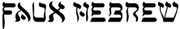
Writing system
A writing system is a symbolic system used to represent elements or statements expressible in language.-General properties:Writing systems are distinguished from other possible symbolic communication systems in that the reader must usually understand something of the associated spoken language to...
. This group includes typefaces designed to appear as Arabic, Chinese character
Chinese character
Chinese characters are logograms used in the writing of Chinese and Japanese , less frequently Korean , formerly Vietnamese , or other languages...
s, Cyrillic
Cyrillic alphabet
The Cyrillic script or azbuka is an alphabetic writing system developed in the First Bulgarian Empire during the 10th century AD at the Preslav Literary School...
, Indic scripts, Greek
Greek alphabet
The Greek alphabet is the script that has been used to write the Greek language since at least 730 BC . The alphabet in its classical and modern form consists of 24 letters ordered in sequence from alpha to omega...
, Hebrew
Hebrew alphabet
The Hebrew alphabet , known variously by scholars as the Jewish script, square script, block script, or more historically, the Assyrian script, is used in the writing of the Hebrew language, as well as other Jewish languages, most notably Yiddish, Ladino, and Judeo-Arabic. There have been two...
, Kana
Kana
Kana are the syllabic Japanese scripts, as opposed to the logographic Chinese characters known in Japan as kanji and the Roman alphabet known as rōmaji...
, or Thai
Thai alphabet
Thai script , is used to write the Thai language and other, minority, languages in Thailand. It has forty-four consonants , fifteen vowel symbols that combine into at least twenty-eight vowel forms, and four tone marks ....
. These are used largely for the purpose of novelty to make something appear foreign.
Blackletter typefaces
Blackletter fonts, the earliest typefaces used with the invention of the printing pressPrinting press
A printing press is a device for applying pressure to an inked surface resting upon a print medium , thereby transferring the ink...
, resemble the blackletter calligraphy of that time. Many people refer to them as gothic script. Various forms exist including textualis, rotunda
Rotunda (script)
The Rotunda is a specific medieval blackletter script. It originates in Carolingian minuscule. Sometimes, it is not considered a blackletter script, but a script on its own. It was used mainly in southern Europe.-Characteristics:...
, schwabacher
Schwabacher
The German word Schwabacher refers to a specific blackletter typeface. The term derives from the town of Schwabach.-Characteristics:The small-letter g and the capital-letter H have particularly distinctive forms.-History:...
, and fraktur
Fraktur (typeface)
Fraktur is a calligraphic hand and any of several blackletter typefaces derived from this hand. The word derives from the past participle fractus of Latin frangere...
.
Gaelic typefaces
Gaelic fonts were first used for the Irish languageIrish language
Irish , also known as Irish Gaelic, is a Goidelic language of the Indo-European language family, originating in Ireland and historically spoken by the Irish people. Irish is now spoken as a first language by a minority of Irish people, as well as being a second language of a larger proportion of...
in 1571, and were used regularly for Irish until the early 1960s, though they continue to be used in display type and type for signage. Their use was effectively confined to Ireland, though Gaelic typefaces were designed and produced in France, Belgium, and Italy. Gaelic typefaces make use of insular
Insular script
Insular script was a medieval script system originally used in Ireland, then Great Britain, that spread to continental Europe under the influence of Celtic Christianity. Irish missionaries also took the script to continental Europe, where they founded monasteries such as Bobbio. The scripts were...
letterforms, and early fonts made use of a variety of abbreviations deriving from the manuscript tradition. Early fonts used for the Anglo-Saxon language, also using insular letterforms, can be classified as Gaelic typefaces, distinct from Roman
Roman type
In typography, roman is one of the three main kinds of historical type, alongside blackletter and italic. Roman type was modelled from a European scribal manuscript style of the 1400s, based on the pairing of inscriptional capitals used in ancient Rome with Carolingian minuscules developed in the...
or Antiqua typefaces. Various forms exist, including manuscript, traditional, and modern styles, chiefly distinguished as having angular or uncial features.
Monospaced typefaces
Monospaced fonts are typefaces in which every glyph is the same width (as opposed to variable-width fonts, where the w and m are wider than most letters, and the i is narrower). The first monospaced typefaces were designed for typewriters, which could only move the same distance forward with each letter typed. Their use continued with early computers, which could only display a single font. Although modern computers can display any desired typeface, monospaced fonts are still important for computer programmingComputer programming
Computer programming is the process of designing, writing, testing, debugging, and maintaining the source code of computer programs. This source code is written in one or more programming languages. The purpose of programming is to create a program that performs specific operations or exhibits a...
, terminal emulation, and for laying out tabulated data in plain text
Plain text
In computing, plain text is the contents of an ordinary sequential file readable as textual material without much processing, usually opposed to formatted text....
documents. Examples of monospaced typefaces are Courier
Courier (typeface)
Courier is a monospaced slab serif typeface designed to resemble the output from a strike-on typewriter. The typeface was designed by Howard "Bud" Kettler in 1955...
, Prestige Elite
Prestige Elite
Prestige Elite, also known simply as Prestige, is a monospaced typeface.It was created by Clayton Smith in 1953 for IBM. Along with Courier, it was extremely popular for use in electric typewriters, especially the IBM Selectric...
, Fixedsys
Fixedsys
Fixedsys is a family of raster monospaced fonts. The name means fixed system, although it is often pronounced "fixed size" because its glyphs are monospace or fixed-width...
, and Monaco
Monaco (typeface)
Monaco is a monospaced sans-serif typeface designed by Susan Kare and Kris Holmes. The face shipped with all versions of Mac OS X and was already present with previous versions of the Mac operating system...
. There exist Roman, Blackletter, and Gaelic monospaced typefaces.
Symbol typefaces
Symbol, or Dingbat, typefaces consist of symbols (such as decorative bullets, clock faces, railroad timetable symbols, CD-index, or TV-channel enclosed numbers) rather than normal text characters. Examples include Zapf DingbatsZapf Dingbats
Zapf Dingbats is one of the more common dingbat typefaces. It was designed by the typographer Hermann Zapf in 1978 and licensed by International Typeface Corporation....
, Sonata, and Wingdings
Wingdings
Wingdings are a series of dingbat fonts which render letters as a variety of symbols. They were originally developed in 1990 by Microsoft by combining glyphs from Lucida Icons, Arrows, and Stars licensed from Charles Bigelow and Kris Holmes...
.
Display type
Display type refers to the use of type at large sizes, perhaps 30 points or larger. Some typefaces are considered useful solely at display sizes, and hence are known as display faces. For typefaces used across a wide range of sizes, in the days of metal type, each size was cut individually, or even if pantographically scaled would often have adjustments made to the design for larger or smaller sizes, making a "display" face have distinct differences.In metal type, if present in smaller sizes, ink trap
Ink trap
An ink trap is a feature of certain typefaces, where the corners or details are removed from the letterforms. When the type is printed, ink naturally spreads into the removed area. Without ink traps, the excess ink would blob and ruin the crisp edge....
s (small indentations at the junctions of letter strokes) would be eliminated at display sizes. In smaller point sizes, these ink traps were intended to fill up when the letterpress was over-inked, providing some latitude in press operation while maintaining the intended appearance of the type design. At larger sizes, these ink traps were not necessary, so display faces did not have them. Today's digital typefaces are most often used for offset lithography, electrophotographic printing or other processes that are not subject to the ink supply variations of letterpress, so ink traps have largely disappeared from use.
When digital fonts feature a display variation, it is to accommodate other stylistic differences that may benefit type used at larger point sizes. Such differences, which were standard in metal type, are rare in digital type, outside of the very high end of type design. They can include: a lower x-height
X-height
In typography, the x-height or corpus size refers to the distance between the baseline and the mean line in a typeface. Typically, this is the height of the letter x in the font , as well as the u, v, w, and z...
, higher contrast between thick and thin strokes, less space between letters, and slightly more condensed letter shapes.
Decades into the desktop publishing revolution, few typographers with metal foundry type experience are still working, and few digital typefaces are optimized specifically for different sizes, so the misuse of the term display typeface as a synonym for ornamental type has become widespread; properly speaking, ornamental typefaces are a subcategory of display typefaces.
Texts used to demonstrate typefaces
A sentence that uses all of the alphabet (a pangramPangram
A pangram , or holoalphabetic sentence, is a sentence using every letter of the alphabet at least once. Pangrams have been used to display typefaces, test equipment, and develop skills in handwriting, calligraphy, and keyboarding...
), such as "The quick brown fox jumps over the lazy dog
The quick brown fox jumps over the lazy dog
"The quick brown fox jumps over the lazy dog" is an English-language pangram, that is, a phrase that contains all of the letters of the alphabet. It has been used to test typewriters and computer keyboards, and in other applications involving all of the letters in the English alphabet...
", is often used as a design aesthetic tool to demonstrate the personality of a typeface's characters in a setting (because it displays all the letters of the alphabet). For extended settings of typefaces graphic designers often use nonsense text (commonly referred to as greeking
Greeking
Greeking is a style of displaying or rendering text or symbols, not always from the Greek alphabet. Greeking obscures portions of a work for the purpose of either emphasizing form over details or displaying placeholders for unavailable content...
), such as lorem ipsum
Lorem ipsum
In publishing and graphic design, lorem ipsum[p] is placeholder text commonly used to demonstrate the graphics elements of a document or visual presentation, such as font, typography, and layout...
or Latin
Latin
Latin is an Italic language originally spoken in Latium and Ancient Rome. It, along with most European languages, is a descendant of the ancient Proto-Indo-European language. Although it is considered a dead language, a number of scholars and members of the Christian clergy speak it fluently, and...
text such as the beginning of Cicero
Cicero
Marcus Tullius Cicero , was a Roman philosopher, statesman, lawyer, political theorist, and Roman constitutionalist. He came from a wealthy municipal family of the equestrian order, and is widely considered one of Rome's greatest orators and prose stylists.He introduced the Romans to the chief...
's In Catilinam. Greeking is used in typography to determine a typeface's colour
Type color
In typography, type color refers to the weight or boldness of a typeface and is used by designers and typographers to describe the visual tone of a mass of text on a page. The type color of a particular typeface affects the amount of ink on the page, also known as its blackness...
, or weight and style, and to demonstrate an overall typographic aesthetic prior to actual type setting.
Intellectual property
In Eltra Corp. v. RingerEltra Corp. v. Ringer
Eltra Corp. v. Ringer was a case in the United States Court of Appeals for the Fourth Circuit which determined that typefaces were not eligible for protection under U.S. copyright law. The United States Copyright Office had refused to register a typeface design owned by Eltra Corporation, who filed...
, the Court of Appeals for the Fourth Circuit held that typeface designs are not subject to copyright
Copyright
Copyright is a legal concept, enacted by most governments, giving the creator of an original work exclusive rights to it, usually for a limited time...
. However, novel and non-obvious typeface designs are subject to protection by design patent
Design patent
In the United States, a design patent is a patent granted on the ornamental design of a functional item. Design patents are a type of industrial design right. Ornamental designs of jewelry, furniture, beverage containers and computer icons are examples of objects that are covered by design...
s. Digital fonts that embody a particular design are often subject to copyright as computer program
Computer program
A computer program is a sequence of instructions written to perform a specified task with a computer. A computer requires programs to function, typically executing the program's instructions in a central processor. The program has an executable form that the computer can use directly to execute...
s. The names of the typefaces can become trademark
Trademark
A trademark, trade mark, or trade-mark is a distinctive sign or indicator used by an individual, business organization, or other legal entity to identify that the products or services to consumers with which the trademark appears originate from a unique source, and to distinguish its products or...
ed. As a result of these various means of legal protection, sometimes the same typeface exists in multiple names and implementations.
Some elements of the software engines used to display fonts on computers have or had software patent
Software patent
Software patent does not have a universally accepted definition. One definition suggested by the Foundation for a Free Information Infrastructure is that a software patent is a "patent on any performance of a computer realised by means of a computer program".In 2005, the European Patent Office...
s associated with them. In particular, Apple Inc. patented some of the hinting
Font hinting
Font hinting is the use of mathematical instructions to adjust the display of an outline font so that it lines up with a rasterized grid. At low screen resolutions, hinting is critical for producing a clear, legible text...
algorithm
Algorithm
In mathematics and computer science, an algorithm is an effective method expressed as a finite list of well-defined instructions for calculating a function. Algorithms are used for calculation, data processing, and automated reasoning...
s for TrueType, requiring open source
Open source
The term open source describes practices in production and development that promote access to the end product's source materials. Some consider open source a philosophy, others consider it a pragmatic methodology...
alternatives such as FreeType
FreeType
FreeType is a software library written in C that implements a font rasterization engine. It is used to render text on to bitmaps and provides support for other font-related operations.-Details:...
to use different algorithms. However, Apple's TrueType hinting patents expired in May 2010.
Although typeface design is not subject to copyright in the United States under the 1976 Copyright Act, the United States District Court for the Northern District of California in Adobe Systems, Inc. v. Southern Software, Inc.
Adobe Systems, Inc. v. Southern Software, Inc.
Adobe Systems, Inc. v. Southern Software, Inc. was a case in the United States District Court for the Northern District of California regarding the copyrightability of digitized typefaces . The case is notable since typeface designs in general are not protected under United States copyright law, as...
(No. C95-20710 RMW, N.D. Cal. January 30, 1998) found that there was original authorship in the placement of points on a computer font's outline; i.e., because a given outline can be expressed in myriad ways, a particular selection and placement of points has sufficient originality to qualify for copyright.
Many western countries extend copyright protection to typeface designs. However, this has no impact on protection in the United States, because all of the major copyright treaties and agreements to which the U.S. is a party (such as the Berne Convention
Berne Convention for the Protection of Literary and Artistic Works
The Berne Convention for the Protection of Literary and Artistic Works, usually known as the Berne Convention, is an international agreement governing copyright, which was first accepted in Berne, Switzerland in 1886.- Content :...
, the WIPO Copyright Treaty
World Intellectual Property Organization Copyright Treaty
The World Intellectual Property Organization Copyright Treaty, abbreviated as the WIPO Copyright Treaty, is an international treaty on copyright law adopted by the member states of the World Intellectual Property Organization in 1996...
, and TRIPS
Agreement on Trade-Related Aspects of Intellectual Property Rights
The Agreement on Trade Related Aspects of Intellectual Property Rights is an international agreement administered by the World Trade Organization that sets down minimum standards for many forms of intellectual property regulation as applied to nationals of other WTO Members...
) operate under the principle of national treatment
National treatment
National treatment is a principle in international law vital to many treaty regimes. It essentially means treating foreigners and locals equally. Under national treatment, if a state grants a particular right, benefit or privilege to its own citizens, it must also grant those advantages to the...
, under which a country is obligated to provide no greater or lesser protection to works from other countries than it provides to domestically produced works.
See also
External links
- ABC typography - Introduction to the most famous typefaces
- Named parts of a letter: Type Anatomy 1.0
- Nwalsh.com, comp.fonts FAQ