
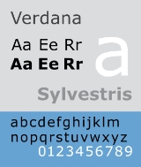
Verdana
Encyclopedia
Verdana is a humanist sans-serif typeface
designed by Matthew Carter
for Microsoft Corporation
, with hand-hinting
done by Thomas Rickner
, then at Monotype
. Demand for such a typeface was recognized by Virginia Howlett
of Microsoft's typography
group. The name "Verdana" is based on a portmanteau of verdant (something green), and Ana (the name of Howlett's eldest daughter).
lower case:
square dot over the letter i.
double storey a.
upper case:
the capital Q's tail is centered under the figure, the uppercase J has a slight hook, and there are two versions of uppercase R, one with a straight tail and one with a curved tail.
figures:
s such as Frutiger
, Verdana was designed to be readable at small sizes on a computer screen. The lack of serifs, large x-height
, wide proportions, loose letter-spacing, large counters
, and emphasized distinctions between similarly-shaped characters are chosen to increase legibility.
As an example of the attention given to making similar characters easily distinguishable, the digit 1 (one) in Verdana was given a horizontal base and a hook in the upper left to distinguish it from lowercase l
(L) and uppercase I
(i). This is similar to the digit 1 found in Morris Fuller Benton's
typefaces News Gothic
and Franklin Gothic
which are sans-serif like Verdana.
operating system
, as well as their Office
and Internet Explorer
software on both Windows and Mac OS
. In addition, up until 2002 it was available for download from Microsoft's web site as a freeware
(".exe" files for Microsoft Windows and in ".sit.hqx" archives for Mac OS X) under a proprietary license imposing some restrictions on usage and distribution, allowing it to be used by end users in any system supporting installation of "exe" or ".sit.hqx" files and supporting TrueType
fonts. The downloadable files are still available legally from a third-party web sites; see the External links section. However, these files include only old versions of Verdana and updated versions are not available as a freeware. Verdana is also one of the bundled book-reading fonts on the iPad
.
According to one long-running survey, the availability of Verdana is 99.70% on Windows, 98.05% on computers running Mac OS, and 67.91% on free
operating systems like Linux
.
MS Reference Sans Serif is a derivative of Verdana Ref with bold and italic fonts. This font family is included with Microsoft Encarta.
Tahoma
is similar to Verdana but with tighter letterspacing. Nina, a Windows Mobile
core font, is a more condensed version of Tahoma and Verdana.
Verdana Pro is a new and paid extension of Verdana.
-encoded text such as Cyrillic
or Greek
. This bug didn't usually reveal itself with Latin letters
. This is because some font display engines substitute sequences of base character + combining character with a precomposed character
glyph
. This bug was subsequently fixed in the version issued with Windows Vista
. It is also fixed in Verdana version 5.01 font on Windows XP
by installing the European Union Expansion Font Update from Microsoft. On some platforms the Opera
browser automatically fixes this Verdana bug.
U+201C and U+2018: The official "normal" German closing quotation mark (“) and the single German closing quotation mark (‘) descend from top left to bottom right. This downward stroke generates an extremely awkward reading experience in German texts because it is absolutely unusual in German typesetting, typographically inharmonious and also orthographically incorrect. Other common web fonts like Arial etc. contain the orthographically correct ascending form.
's The Culture Show
on January 26, 2006.
caused a flap in the graphic design
world in 2009 when it changed the typeface
used in its catalog from Futura
to Verdana, expressing a desire to unify its branding between print and web media. The controversy has been attributed to the perception of Verdana as a symbol of homogeneity in popular typography. Time magazine and the Associated Press ran articles on the controversy including a brief interview with an IKEA representative, focusing on the opinions of typographers and designers. Design and advertising industry-focused publications such as Business Week joined the fray of online posts. The branding critic blog, Brand New, was one of those using the Verdanagate name. The Australian online daily news site Crikey also published an article on the controversy. The Guardian ran an article asking "Ikea is changing its font to Verdana – causing outrage among typomaniacs. Should the rest of us care? Absolutely." The New York Times said the change to Verdana "is so offensive to many because it seems like a slap at the principles of design by a company that has been hailed for its adherence to them."
Typeface
In typography, a typeface is the artistic representation or interpretation of characters; it is the way the type looks. Each type is designed and there are thousands of different typefaces in existence, with new ones being developed constantly....
designed by Matthew Carter
Matthew Carter
Matthew Carter is a type designer. He lives in Cambridge, Massachusetts, United States. Carter's career in type design has witnessed the transition from physical metal type to digital type...
for Microsoft Corporation
Microsoft
Microsoft Corporation is an American public multinational corporation headquartered in Redmond, Washington, USA that develops, manufactures, licenses, and supports a wide range of products and services predominantly related to computing through its various product divisions...
, with hand-hinting
Font hinting
Font hinting is the use of mathematical instructions to adjust the display of an outline font so that it lines up with a rasterized grid. At low screen resolutions, hinting is critical for producing a clear, legible text...
done by Thomas Rickner
Thomas Rickner
Thomas Rickner is an American type designer who, while Lead Typographer at Apple Inc., supervised the production of the first TrueType fonts released in 1991 as part of Apple’s System 7 operating system for the Macintosh...
, then at Monotype
Monotype Corporation
Monotype Imaging Holdings is a Delaware corporation based in Woburn, Massachusetts and specializing in typesetting and typeface design as well as text and imaging solutions for use with consumer electronics devices. Monotype Imaging Holdings is the owner of Monotype Imaging Inc., Linotype,...
. Demand for such a typeface was recognized by Virginia Howlett
Virginia Howlett
Virginia Howlett is a designer and painter.With an MFA in Painting from The Art Institute of Chicago, Howlett was one of the first designers hired into Microsoft in 1985. While there, she built the company's first user interface design team. She led the team that designed the 3D graphic...
of Microsoft's typography
Typography
Typography is the art and technique of arranging type in order to make language visible. The arrangement of type involves the selection of typefaces, point size, line length, leading , adjusting the spaces between groups of letters and adjusting the space between pairs of letters...
group. The name "Verdana" is based on a portmanteau of verdant (something green), and Ana (the name of Howlett's eldest daughter).
Distinctive Visual Identifiable Characteristics
Characteristics of this typeface are:lower case:
square dot over the letter i.
double storey a.
upper case:
the capital Q's tail is centered under the figure, the uppercase J has a slight hook, and there are two versions of uppercase R, one with a straight tail and one with a curved tail.
figures:
Description
Bearing similarities to humanist sans-serif typefaceTypeface
In typography, a typeface is the artistic representation or interpretation of characters; it is the way the type looks. Each type is designed and there are thousands of different typefaces in existence, with new ones being developed constantly....
s such as Frutiger
Frutiger
Frutiger is a series of typefaces named after its designer, Adrian Frutiger. Initially available as a sans serif, it was later expanded to include ornamental and serif typefaces.-Distinctive characteristics:Characteristics of this typeface are:...
, Verdana was designed to be readable at small sizes on a computer screen. The lack of serifs, large x-height
X-height
In typography, the x-height or corpus size refers to the distance between the baseline and the mean line in a typeface. Typically, this is the height of the letter x in the font , as well as the u, v, w, and z...
, wide proportions, loose letter-spacing, large counters
Counter (typography)
In typography, a counter or aperture is an area entirely or partially enclosed by a letter form or a symbol . Letters containing closed counters include A, B, D, O, P, Q, R, a, b, d, e, g, o, p, and q. Letters containing open counters include c, f, h, i, s etc. The digits 0, 4, 6, 8, and 9 also...
, and emphasized distinctions between similarly-shaped characters are chosen to increase legibility.
As an example of the attention given to making similar characters easily distinguishable, the digit 1 (one) in Verdana was given a horizontal base and a hook in the upper left to distinguish it from lowercase l
L
Ł or ł, described in English as L with stroke, is a letter of the Polish, Kashubian, Sorbian, Łacinka , Łatynka , Wilamowicean, Navajo, Dene Suline, Inupiaq, Zuni, Hupa, and Dogrib alphabets, several proposed alphabets for the Venetian language, and the ISO 11940 romanization of the Thai alphabet...
(L) and uppercase I
I
I is the ninth letter and a vowel in the basic modern Latin alphabet.-History:In Semitic, the letter may have originated in a hieroglyph for an arm that represented a voiced pharyngeal fricative in Egyptian, but was reassigned to by Semites, because their word for "arm" began with that sound...
(i). This is similar to the digit 1 found in Morris Fuller Benton's
Morris Fuller Benton
Morris Fuller Benton was an influential American typeface designer who headed the design department of the American Type Founders , for which he was the chief type designer from 1900 to 1937...
typefaces News Gothic
News Gothic
News Gothic is a realist sans-serif typeface designed by Morris Fuller Benton, and released by the American Type Founders in 1908. The typeface was originally drawn in two lighter weights, a medium text weight using the title News Gothic, and a closely related light weight marketed under the name...
and Franklin Gothic
Franklin Gothic
Franklin Gothic and its related faces are realist sans-serif typefaces originated by Morris Fuller Benton in 1902. “Gothic” is an increasingly archaic term meaning sans-serif. Franklin Gothic has been used in many advertisements and headlines in newspapers. The typeface continues to maintain a...
which are sans-serif like Verdana.
Prevalence
Released in 1996, Verdana was bundled with subsequent versions of the WindowsMicrosoft Windows
Microsoft Windows is a series of operating systems produced by Microsoft.Microsoft introduced an operating environment named Windows on November 20, 1985 as an add-on to MS-DOS in response to the growing interest in graphical user interfaces . Microsoft Windows came to dominate the world's personal...
operating system
Operating system
An operating system is a set of programs that manage computer hardware resources and provide common services for application software. The operating system is the most important type of system software in a computer system...
, as well as their Office
Microsoft Office
Microsoft Office is a non-free commercial office suite of inter-related desktop applications, servers and services for the Microsoft Windows and Mac OS X operating systems, introduced by Microsoft in August 1, 1989. Initially a marketing term for a bundled set of applications, the first version of...
and Internet Explorer
Internet Explorer
Windows Internet Explorer is a series of graphical web browsers developed by Microsoft and included as part of the Microsoft Windows line of operating systems, starting in 1995. It was first released as part of the add-on package Plus! for Windows 95 that year...
software on both Windows and Mac OS
Mac OS
Mac OS is a series of graphical user interface-based operating systems developed by Apple Inc. for their Macintosh line of computer systems. The Macintosh user experience is credited with popularizing the graphical user interface...
. In addition, up until 2002 it was available for download from Microsoft's web site as a freeware
Freeware
Freeware is computer software that is available for use at no cost or for an optional fee, but usually with one or more restricted usage rights. Freeware is in contrast to commercial software, which is typically sold for profit, but might be distributed for a business or commercial purpose in the...
(".exe" files for Microsoft Windows and in ".sit.hqx" archives for Mac OS X) under a proprietary license imposing some restrictions on usage and distribution, allowing it to be used by end users in any system supporting installation of "exe" or ".sit.hqx" files and supporting TrueType
TrueType
TrueType is an outline font standard originally developed by Apple Computer in the late 1980s as a competitor to Adobe's Type 1 fonts used in PostScript...
fonts. The downloadable files are still available legally from a third-party web sites; see the External links section. However, these files include only old versions of Verdana and updated versions are not available as a freeware. Verdana is also one of the bundled book-reading fonts on the iPad
IPad
The iPad is a line of tablet computers designed, developed and marketed by Apple Inc., primarily as a platform for audio-visual media including books, periodicals, movies, music, games, and web content. The iPad was introduced on January 27, 2010 by Apple's then-CEO Steve Jobs. Its size and...
.
According to one long-running survey, the availability of Verdana is 99.70% on Windows, 98.05% on computers running Mac OS, and 67.91% on free
Free and open source software
Free and open-source software or free/libre/open-source software is software that is liberally licensed to grant users the right to use, study, change, and improve its design through the availability of its source code...
operating systems like Linux
Linux
Linux is a Unix-like computer operating system assembled under the model of free and open source software development and distribution. The defining component of any Linux system is the Linux kernel, an operating system kernel first released October 5, 1991 by Linus Torvalds...
.
Variants
Verdana Ref is a custom version of Verdana for use with Microsoft Reference. It is used in Microsoft Bookshelf 2000, Encarta Encyclopedia Deluxe 99, Encarta Virtual Globe 99, Office 2000 Premium, Publisher 2000.MS Reference Sans Serif is a derivative of Verdana Ref with bold and italic fonts. This font family is included with Microsoft Encarta.
Tahoma
Tahoma (typeface)
Tahoma is a humanist sans-serif typeface designed by Matthew Carter for the Microsoft Corporation in 1994 with initial distribution along with Verdana for Windows 95....
is similar to Verdana but with tighter letterspacing. Nina, a Windows Mobile
Windows Mobile
Windows Mobile is a mobile operating system developed by Microsoft that was used in smartphones and Pocket PCs, but by 2011 was rarely supplied on new phones. The last version is "Windows Mobile 6.5.5"; it is superseded by Windows Phone, which does not run Windows Mobile software.Windows Mobile is...
core font, is a more condensed version of Tahoma and Verdana.
Verdana Pro is a new and paid extension of Verdana.
Combining characters bug
In the past Verdana (v. 2.43) used to have an incorrect position for combining diacritical marks, causing them to display on the following character instead of the preceding. This made it unsuitable for UnicodeUnicode
Unicode is a computing industry standard for the consistent encoding, representation and handling of text expressed in most of the world's writing systems...
-encoded text such as Cyrillic
Cyrillic alphabet
The Cyrillic script or azbuka is an alphabetic writing system developed in the First Bulgarian Empire during the 10th century AD at the Preslav Literary School...
or Greek
Greek alphabet
The Greek alphabet is the script that has been used to write the Greek language since at least 730 BC . The alphabet in its classical and modern form consists of 24 letters ordered in sequence from alpha to omega...
. This bug didn't usually reveal itself with Latin letters
Latin alphabet
The Latin alphabet, also called the Roman alphabet, is the most recognized alphabet used in the world today. It evolved from a western variety of the Greek alphabet called the Cumaean alphabet, which was adopted and modified by the Etruscans who ruled early Rome...
. This is because some font display engines substitute sequences of base character + combining character with a precomposed character
Precomposed character
A precomposed character is a Unicode entity that can be defined as a combination of two or more other characters. A precomposed character may typically represent a letter with a diacritical mark, such as é...
glyph
Glyph
A glyph is an element of writing: an individual mark on a written medium that contributes to the meaning of what is written. A glyph is made up of one or more graphemes....
. This bug was subsequently fixed in the version issued with Windows Vista
Windows Vista
Windows Vista is an operating system released in several variations developed by Microsoft for use on personal computers, including home and business desktops, laptops, tablet PCs, and media center PCs...
. It is also fixed in Verdana version 5.01 font on Windows XP
Windows XP
Windows XP is an operating system produced by Microsoft for use on personal computers, including home and business desktops, laptops and media centers. First released to computer manufacturers on August 24, 2001, it is the second most popular version of Windows, based on installed user base...
by installing the European Union Expansion Font Update from Microsoft. On some platforms the Opera
Opera (web browser)
Opera is a web browser and Internet suite developed by Opera Software with over 200 million users worldwide. The browser handles common Internet-related tasks such as displaying web sites, sending and receiving e-mail messages, managing contacts, chatting on IRC, downloading files via BitTorrent,...
browser automatically fixes this Verdana bug.
Compatibility with German typography
Verdana contains a design bug in UnicodeUnicode
Unicode is a computing industry standard for the consistent encoding, representation and handling of text expressed in most of the world's writing systems...
U+201C and U+2018: The official "normal" German closing quotation mark (“) and the single German closing quotation mark (‘) descend from top left to bottom right. This downward stroke generates an extremely awkward reading experience in German texts because it is absolutely unusual in German typesetting, typographically inharmonious and also orthographically incorrect. Other common web fonts like Arial etc. contain the orthographically correct ascending form.
Awards
The typeface was nominated for the Best Of British Design Award on BBC TwoBBC Two
BBC Two is the second television channel operated by the British Broadcasting Corporation in the United Kingdom. It covers a wide range of subject matter, but tending towards more 'highbrow' programmes than the more mainstream and popular BBC One. Like the BBC's other domestic TV and radio...
's The Culture Show
The Culture Show
The Culture Show is a weekly BBC Two Arts magazine programme. It is broadcast in the UK on Thursday nights at 7pm, focusing on the best of the week's arts and culture news, covering books, art, film, architecture, music, visual fashion and the performing arts...
on January 26, 2006.
Usage
IKEAIKEA
IKEA is a privately held, international home products company that designs and sells ready-to-assemble furniture such as beds and desks, appliances and home accessories. The company is the world's largest furniture retailer...
caused a flap in the graphic design
Graphic design
Graphic design is a creative process – most often involving a client and a designer and usually completed in conjunction with producers of form – undertaken in order to convey a specific message to a targeted audience...
world in 2009 when it changed the typeface
Typeface
In typography, a typeface is the artistic representation or interpretation of characters; it is the way the type looks. Each type is designed and there are thousands of different typefaces in existence, with new ones being developed constantly....
used in its catalog from Futura
Futura (typeface)
In typography, Futura is a geometric sans-serif typeface designed in 1927 by Paul Renner. It is based on geometric shapes that became representative visual elements of the Bauhaus design style of 1919–1933...
to Verdana, expressing a desire to unify its branding between print and web media. The controversy has been attributed to the perception of Verdana as a symbol of homogeneity in popular typography. Time magazine and the Associated Press ran articles on the controversy including a brief interview with an IKEA representative, focusing on the opinions of typographers and designers. Design and advertising industry-focused publications such as Business Week joined the fray of online posts. The branding critic blog, Brand New, was one of those using the Verdanagate name. The Australian online daily news site Crikey also published an article on the controversy. The Guardian ran an article asking "Ikea is changing its font to Verdana – causing outrage among typomaniacs. Should the rest of us care? Absolutely." The New York Times said the change to Verdana "is so offensive to many because it seems like a slap at the principles of design by a company that has been hailed for its adherence to them."
External links
- Verdana font information (Microsoft typography)
- Verdana Ref font information (Microsoft typography)
- Channel Verdana (Microsoft typography)
- Downloadable version of Verdana (Core fonts for the WebCore fonts for the WebCore fonts for the Web was a project begun by Microsoft in 1996 to make a standard pack of fonts for the Internet. It was terminated in 2002. It included the proprietary fonts Andale Mono, Arial, Arial Black, Comic Sans MS, Courier New, Georgia, Impact, Times New Roman, Trebuchet MS, Verdana and...
)