

Pie chart
Encyclopedia
Circle
A circle is a simple shape of Euclidean geometry consisting of those points in a plane that are a given distance from a given point, the centre. The distance between any of the points and the centre is called the radius....
chart
Chart
A chart is a graphical representation of data, in which "the data is represented by symbols, such as bars in a bar chart, lines in a line chart, or slices in a pie chart"...
divided into sector
Circular sector
A circular sector or circle sector, is the portion of a disk enclosed by two radii and an arc, where the smaller area is known as the minor sector and the larger being the major sector. In the diagram, θ is the central angle in radians, r the radius of the circle, and L is the arc length of the...
s, illustrating proportion. In a pie chart, the arc length
Arc length
Determining the length of an irregular arc segment is also called rectification of a curve. Historically, many methods were used for specific curves...
of each sector (and consequently its central angle
Central angle
A central angle is an angle which vertex is the center of a circle, and whose sides pass through a pair of points on the circle, thereby subtending an arc between those two points whose angle is equal to the central angle itself...
and area
Area
Area is a quantity that expresses the extent of a two-dimensional surface or shape in the plane. Area can be understood as the amount of material with a given thickness that would be necessary to fashion a model of the shape, or the amount of paint necessary to cover the surface with a single coat...
), is proportional
Proportionality (mathematics)
In mathematics, two variable quantities are proportional if one of them is always the product of the other and a constant quantity, called the coefficient of proportionality or proportionality constant. In other words, are proportional if the ratio \tfrac yx is constant. We also say that one...
to the quantity it represents. When angles are measured with 1 turn
Turn (geometry)
A turn is an angle equal to a 360° or 2 radians or \tau radians. A turn is also referred to as a revolution or complete rotation or full circle or cycle or rev or rot....
as unit then a number of percent is identified with the same number of centiturns. Together, the sectors create a full disk. It is named for its resemblance to a pie
Pie
A pie is a baked dish which is usually made of a pastry dough casing that covers or completely contains a filling of various sweet or savoury ingredients....
which has been sliced. The earliest known pie chart is generally credited to William Playfair's
William Playfair
William Playfair was a Scottish engineer and political economist, the founder of graphical methods of statistics....
Statistical Breviary of 1801.
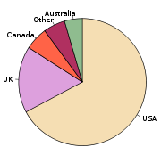
The pie chart is perhaps the most widely used statistical chart in the business world and the mass media. However, it has been criticized, and some recommend avoiding it, pointing out in particular that it is difficult to compare different sections of a given pie chart, or to compare data across different pie charts. Pie charts can be an effective way of displaying information in some cases, in particular if the intent is to compare the size of a slice with the whole pie, rather than comparing the slices among them. Pie charts work particularly well when the slices represent 25 to 50% of the data, but in general, other plots such as the bar chart
Bar chart
A bar chart or bar graph is a chart with rectangular bars with lengths proportional to the values that they represent. The bars can be plotted vertically or horizontally....
or the dot plot
Dot plot (statistics)
A dot chart or dot plot is a statistical chart consisting of data points plotted on a simple scale, typically using filled in circles. There are two common, yet very different, versions of the dot chart. The first is described by Wilkinson as a graph that has been used in hand-drawn graphs to...
, or non-graphical methods such as table
Table (information)
A table is a means of arranging data in rows and columns.Production % of goalNorth 4087102%South 4093110% The use of tables is pervasive throughout all communication, research and data analysis. Tables appear in print media, handwritten notes, computer software, architectural...
s, may be more adapted for representing certain information. It also shows the frequency within certain groups of information.
Example
The following example chart is based on preliminary results of the election for the European Parliament in 2004European Parliament election, 2004
Elections to the European Parliament were held from 10 June 2004 to 13 June 2004 in the 25 member states of the European Union, using varying election days according to local custom...
. The table lists the number of seats allocated to each party group, along with the derived percentage of the total that they each make up. The values in the last column, the derived central angle of each sector, is found by multiplying the percentage by 360°.
| Group | Seats | Percent (%) | Central angle (°) |
|---|---|---|---|
| EUL European United Left–Nordic Green Left European United Left/Nordic Green Left is a left-wing political group with seats in the European Parliament since 1995.-Position:According to its 1994 constituent declaration, the group is opposed to the present European political structure, but committed to integration... |
39 | 5.3 | 19.2 |
| PES Party of European Socialists The Party of European Socialists is a European political party led by Sergei Stanishev, former Prime Minister of Bulgaria. The PES comprises social-democratic national-level political parties primarily from Member state of the European Union, as well as other nations of the European continent. The... |
200 | 27.3 | 98.4 |
| EFA European Free Alliance The European Free Alliance is a European political party. It consists of various national-level political parties in Europe which advocate either full political independence , or some form of devolution or self-governance for their country or region... |
42 | 5.7 | 20.7 |
| EDD Europe of Democracies and Diversities Europe of Democracies and Diversities was a euro-sceptic political group with seats in the European Parliament between 1999 and 2004. Following the elections in 2004, the former MEPs of the group took MEPs from the new member countries on board and together, they registered the new group... |
15 | 2.0 | 7.4 |
| ELDR European Liberal Democrat and Reform Party The European Liberal Democrat and Reform Party is a European political party mainly active in the European Union, composed of 56 national-level liberal and liberal-democratic parties from across Europe... |
67 | 9.2 | 33.0 |
| EPP European People's Party The European People's Party is a pro-European centre-right European political party. The EPP was founded in 1976 by Christian democratic parties, but later it increased its membership to include conservative parties and parties of other centre-right perspectives.The EPP is the most influential of... |
276 | 37.7 | 135.7 |
| UEN Union for Europe of the Nations Union for Europe of the Nations was a political group of the European Parliament between 1999 and 2009.-History:UEN was formed on 20 July 1999, supplanting the earlier Union for Europe. Its member parties Fianna Fáil and National Alliance were the driving forces behind the group, despite their... |
27 | 3.7 | 13.3 |
| Other | 66 | 9.0 | 32.5 |
| Total | 732 | 99.9* | 360.2* |
The size of each central angle is proportional to the size of the corresponding quantity, here the number of seats. Since the sum of the central angles has to be 360°, the central angle for a quantity that is a fraction Q of the total is 360Q degrees.
In the example, the central angle for the largest group (European People's Party (EPP)) is 135.7° because 0.377 times 360, rounded to one decimal place(s), equals 135.7.
Use, effectiveness and visual perception
Stevens' power law
Stevens' power law is a proposed relationship between the magnitude of a physical stimulus and its perceived intensity or strength. It is often considered to supersede the Weber–Fechner law on the basis that it describes a wider range of sensations, although critics argue that the validity of the...
states that visual area is perceived with a power of 0.7, compared to a power of 1.0 for length. This suggests that length is a better scale to use, since perceived differences would be linearly related to actual differences.
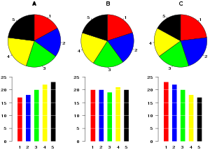
Further, in research performed at AT&T Bell Laboratories, it was shown that comparison by angle was less accurate than comparison by length. This can be illustrated with the diagram to the right, showing three pie charts, and, below each of them, the corresponding bar chart representing the same data. Most subjects have difficulty ordering the slices in the pie chart by size; when the bar chart is used the comparison is much easier. Similarly, comparisons between data sets are easier using the bar chart. However, if the goal is to compare a given category (a slice of the pie) with the total (the whole pie) in a single chart and the multiple is close to 25 or 50 percent, then a pie chart can often be more effective than a bar graph.
However, the research of Spence and Lewandowsky did not find pie charts to be inferior. Participants were able to estimate values with pie charts just as well as with other presentation forms.
Exploded pie chart
Polar area diagram
The polar area diagram is used to plot cyclic phenomena (e.g., count of deaths by month).
For example, if the count of deaths in each month for a year are to be plotted then there will be 12 sectors (one per month) all with the same angle of 30 degrees each. The radius of each sector would be proportional to the square root of the death count for the month, so the area of a sector represents the number of deaths in a month.
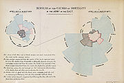
If the death count in each month is subdivided by cause of death, it is possible to make multiple comparisons on one diagram, as is clearly seen in the form of polar area diagram famously developed by Florence Nightingale
Florence Nightingale
Florence Nightingale OM, RRC was a celebrated English nurse, writer and statistician. She came to prominence for her pioneering work in nursing during the Crimean War, where she tended to wounded soldiers. She was dubbed "The Lady with the Lamp" after her habit of making rounds at night...
.
The first known use of polar area diagrams was by André-Michel Guerry
André-Michel Guerry
André-Michel Guerry was a French lawyer and amateur statistician. Together with Adolphe Quetelet he may be regarded as the founder of moral statistics which led to the development of criminology, sociology and ultimately, modern social science.- Early life and education :Guerry was born in Tours,...
, which he called courbes circulaires, in an 1829 paper showing seasonal and daily variation in wind direction over the year and births and deaths by hour of the day. Léon Lalanne later used a polar diagram to show the frequency of wind directions around compass points in 1843. The wind rose is still used by meteorologists. Nightingale published her rose diagram in 1858. The name "coxcomb" is sometimes used erroneously: this was the name Nightingale used to refer to a book containing the diagrams rather than the diagrams themselves. It has been suggested that most of Nightingale's early reputation was built on her ability to give clear and concise presentations of data.
Spie chart
A useful variant of the polar area chart is the spie chart designed by Feitelson.
This superimposes a normal pie chart with a modified polar area chart to permit the comparison of a set of data at two different states. For the first state's budget distribution, this is useful for visualizing hazards for population groups (e.g. the distribution of age and gener groups among road casualties compared with these groups's sizes in the general population). The R Graph Gallery provides an example.
Multi-level Pie, Radial tree, or Ring chart
Multi-level pie chart, also known as a radial tree chart is used to visualize hierarchical data, depicted by concentric circles. The circle in the centre represents the root node, with the hierarchy moving outward from the center. A segment of the inner circle bears a hierarchical relationship to those segments of the outer circle which lie within the angular sweep of the parent segment.3-D pie chart
A perspective (3D) pie chart is used to give the chart a 3DThree-dimensional space
Three-dimensional space is a geometric 3-parameters model of the physical universe in which we live. These three dimensions are commonly called length, width, and depth , although any three directions can be chosen, provided that they do not lie in the same plane.In physics and mathematics, a...
look. Often used for aesthetic reasons, the third dimension does not improve the reading of the data; on the contrary, these plots are difficult to interpret because of the distorted effect of perspective
Perspective (visual)
Perspective, in context of vision and visual perception, is the way in which objects appear to the eye based on their spatial attributes; or their dimensions and the position of the eye relative to the objects...
associated with the third dimension. The use of superfluous dimensions not used to display the data of interest is discouraged for charts in general, not only for pie charts.
Doughnut chart
A doughnut chart (also spelled donut) is functionally identical to a pie chart, with the exception of a blank center and the ability to support multiple statistics as one.History
The earliest known pie chart is generally credited to William PlayfairWilliam Playfair
William Playfair was a Scottish engineer and political economist, the founder of graphical methods of statistics....
's Statistical Breviary of 1801, in which two such graphs are used.Spence (2005) This invention was not widely used at first; the French engineer Charles Joseph Minard
Charles Joseph Minard
Charles Joseph Minard was a French civil engineer noted for his inventions in the field of information graphics.- Biography :...
was one of the first to use it in 1858, in particular in maps where he needs to add information in a third dimension.