

Bar chart
Encyclopedia
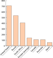
Chart
A chart is a graphical representation of data, in which "the data is represented by symbols, such as bars in a bar chart, lines in a line chart, or slices in a pie chart"...
with rectangular
Rectangle
In Euclidean plane geometry, a rectangle is any quadrilateral with four right angles. The term "oblong" is occasionally used to refer to a non-square rectangle...
bars with length
Length
In geometric measurements, length most commonly refers to the longest dimension of an object.In certain contexts, the term "length" is reserved for a certain dimension of an object along which the length is measured. For example it is possible to cut a length of a wire which is shorter than wire...
s proportional to the values that they represent. The bars can be plotted vertically or horizontally.
Bar charts are used for marking clear data which has learned values. Some examples of discontinuous data include 'shoe size' or 'eye color', for which you would use a bar chart. In contrast, some examples of continuous data would be 'height' or 'weight'. A bar chart is very useful if you are trying to record certain information whether it is continuous or not continuous data. Bar charts also look a lot like a histogram.They are often mistaken for each other.
See also
- HistogramHistogramIn statistics, a histogram is a graphical representation showing a visual impression of the distribution of data. It is an estimate of the probability distribution of a continuous variable and was first introduced by Karl Pearson...
- Gantlet chart
- Open-high-low-close chartOpen-high-low-close chartAn open-high-low-close chart is a type of chart typically used to illustrate movements in the price of a financial instrument over time. Each vertical line on the chart shows the price range over one unit of time, e.g. one day or one hour...
- Candlestick chartCandlestick chartA candlestick chart is a style of bar-chart used primarily to describe price movements of a security, derivative, or currency over time.It is a combination of a line-chart and a bar-chart, in that each bar represents the range of price movement over a given time interval. It is most often used in...
- Pie chartPie chartA pie chart is a circular chart divided into sectors, illustrating proportion. In a pie chart, the arc length of each sector , is proportional to the quantity it represents. When angles are measured with 1 turn as unit then a number of percent is identified with the same number of centiturns...
- List of information graphics software#Plotting programs (graphing programs)
- Commons:Chart and graph resources
- commons:Bar chart - many free bar chart examples organized by type.compares data easy.
External links
- How to Construct Bad Charts and Graphs
- Directory of graph software and online tools (many can handle bar charts)
- Create A Graph. Free online graph creation tool at the website for the National Center for Education StatisticsNational Center for Education StatisticsThe National Center for Education Statistics is the part of the United States Department of Education's Institute of Education Sciences that collects, analyzes, and publishes statistics on education and public school district finance information in the United States...
(NCES)