
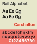
Rail Alphabet
Encyclopedia
Typeface
In typography, a typeface is the artistic representation or interpretation of characters; it is the way the type looks. Each type is designed and there are thousands of different typefaces in existence, with new ones being developed constantly....
designed by Jock Kinneir
Jock Kinneir
Richard 'Jock' Kinneir was a typographer and graphic designer who, with colleague Margaret Calvert, designed many of the road signs used throughout the United Kingdom. Their system has become a model for modern road signage....
and Margaret Calvert
Margaret Calvert
Margaret Calvert is a typographer and graphic designer who, with colleague Jock Kinneir, designed many of the road signs used throughout Great Britain, as well as the Transport font used on road signs and the Rail Alphabet font used on the British railway system and an early version of the signs...
for British Railways. First used by them in signing tests at London's Liverpool Street Station
Liverpool Street station
Liverpool Street railway station, also known as London Liverpool Street or simply Liverpool Street, is both a central London railway terminus and a connected London Underground station in the north-eastern corner of the City of London, England...
, it was then adopted by the Design Research Unit
Design Research Unit
The Design Research Unit was one of the first generation of British design consultancies combining expertise in architecture, graphics and industrial design. It was founded by the managing director of Stuart's Advertising Agency, Marcus Brumwell with Misha Black and Milner Gray in 1943...
(DRU) as part of their comprehensive 1965 rebranding of the company.
Rail Alphabet is similar, but not identical, to a bold weight of Helvetica
Helvetica
Helvetica is a widely used sans-serif typeface developed in 1957 by Swiss typeface designer Max Miedinger with Eduard Hoffmann.-Visual distinctive characteristics:Characteristics of this typeface are:lower case:square dot over the letter i....
(and, not quite as similar, Akzidenz Grotesk
Akzidenz Grotesk
Akzidenz-Grotesk is a grotesque typeface originally released by the Berthold Type Foundry in 1896 under the name Accidenz-Grotesk...
or Arial
Arial
Arial, sometimes marketed or displayed in software as Arial MT, is a sans-serif typeface and set of computer fonts. Fonts from the Arial family are packaged with Microsoft Windows, some other Microsoft software applications, Apple Mac OS X and many PostScript 3 computer printers...
). Akzidenz Grotesk had earlier also provided the same designers the broad inspiration for the Transport
Transport (typeface)
Transport is a sans serif typeface designed for road signs in the United Kingdom. It was created between 1957 and 1963 by Jock Kinneir and Margaret Calvert as part of their work as designers for the Department of Transport's Anderson and Worboys committees....
typeface used for all road signs in the United Kingdom.
British Rail
The DRU's 1965 rebranding of British Rail included a new logo (the double arrow), a shortened name British RailBritish Rail
British Railways , which from 1965 traded as British Rail, was the operator of most of the rail transport in Great Britain between 1948 and 1997. It was formed from the nationalisation of the "Big Four" British railway companies and lasted until the gradual privatisation of British Rail, in stages...
, and the total adoption of Rail Alphabet on station signage, corporate communications, advertising material, trackside signs, fixed notices and signs inside trains and train liveries. Key elements of the rebranding were still being used during much of the 1980s and Rail Alphabet was also used as part of the livery of Sealink
Sealink
Sealink was a ferry company based in the United Kingdom from 1970 to 1984, operating services to France, Belgium, the Netherlands, Channel Islands, Isle of Wight and Ireland....
ships until that company's privatisation in the late 1980s.
By the end of the 1980s, British Rail's various business units were developing their own individual brands and identities
British Rail brand names
British Rail was the brand image of the nationalised railway owner and operator in Great Britain, the British Railways Board, used from 1965 until its breakup and sell-off from 1993 onwards....
with use of Rail Alphabet declining as a consequence. The typeface remained in near-universal use for signage at railway stations but began to be replaced with alternatives in other areas, such as in InterCity
InterCity (British Rail)
InterCity was introduced by British Rail in 1966 as a brand-name for its long-haul express passenger services ....
's 1989 'Mark 4' passenger carriages
British Rail Mark 4
British Rail's fourth design of passenger carriages was designated Mark 4, designed for use in InterCity 225 sets on the newly-electrified East Coast Main Line between London, Leeds, and Edinburgh.-History and construction:...
which made use of Frutiger
Frutiger
Frutiger is a series of typefaces named after its designer, Adrian Frutiger. Initially available as a sans serif, it was later expanded to include ornamental and serif typefaces.-Distinctive characteristics:Characteristics of this typeface are:...
for much of their interior signage.
The privatisation of British Rail
Privatisation of British Rail
The privatisation of British Rail was set in motion when the Conservative government enacted, on 19 January 1993, the British Coal and British Rail Act 1993 . This enabled the relevant Secretary of State to issue directions to the relevant Board...
from 1994 accelerated the decline in use of the typeface on the railway network with most of the privatised train operating companies who now manage individual stations choosing to use the fonts associated with their own corporate identities for station signage and publicity. More recently, the custom Brunel typeface introduced by Railtrack
Railtrack
Railtrack was a group of companies that owned the track, signalling, tunnels, bridges, level crossings and all but a handful of the stations of the British railway system from its formation in April 1994 until 2002...
for signage at major stations has been recommended as a new national standard for station signage, while Helvetica Medium has replaced Rail Alphabet as the industry's preferred typeface for safety notices within passenger trains due to the ready availability of the former and for consistency with British Standards
British Standards
British Standards are the standards produced by BSI Group which is incorporated under a Royal Charter...
on general safety signage.
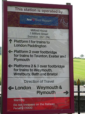
Some of the privatised train operators, such as Arriva Trains Wales
Arriva Trains Wales
Arriva Trains Wales is a train operating company, owned by Arriva, that operates urban and inter urban passenger services in Wales and the Welsh Marches...
, First Great Western
First Great Western
First Great Western is the operating name of First Greater Western Ltd, a British train operating company owned by FirstGroup that serves Greater London, the South East, South West and West Midlands regions of England, and South Wales....
and Merseyrail
Merseyrail
Merseyrail is a train operating company and commuter rail network in the United Kingdom, centred on Liverpool, Merseyside. The network is predominantly electric with diesel trains running on the City Line. Two City Line branches are currently being electrified on the overhead wire AC system with...
have continued to use the typeface for station signage and its use is still prescribed for trackside warning signs and safety/operating notices.
Other uses
The National Health ServiceNational Health Service
The National Health Service is the shared name of three of the four publicly funded healthcare systems in the United Kingdom. They provide a comprehensive range of health services, the vast majority of which are free at the point of use to residents of the United Kingdom...
in England and Wales adopted Rail Alphabet for its signage and it is still the dominant typeface used in signage in and around hospitals. It ceased to be used in new builds in the late 1990s. The English NHS now uses Frutiger
Frutiger
Frutiger is a series of typefaces named after its designer, Adrian Frutiger. Initially available as a sans serif, it was later expanded to include ornamental and serif typefaces.-Distinctive characteristics:Characteristics of this typeface are:...
while NHS Scotland
NHS Scotland
NHS Scotland is the publicly funded healthcare system of Scotland. Although they are separate bodies the organisational separation between NHS Scotland and the other three healthcare organisations each commonly called the National Health Service in the United Kingdom tends to be hidden from its...
uses Stone Sans.
Rail Alphabet was also widely used for signage by the British Airports Authority and by Danish railway company DSB.
New Rail Alphabet
In 2009, a newly-digitised version of the typeface was publicly released. Created by Henrik Kubel of A2/SW/HK in close collaboration with Margaret Calvert, New Rail Alphabet features six weights: off white, white, light, medium, bold and black, with non-aligning numerals, corresponding italics and a set of Eastern European characters.See also
- Gill SansGill SansGill Sans is a sans-serif typeface designed by Eric Gill.The original design appeared in 1926 when Douglas Cleverdon opened a bookshop in his home town of Bristol, where Eric Gill painted the fascia over the window in sans-serif capitals that would later be known as Gill Sans...
- the predecessor typeface to Rail Alphabet, used until 1965. - Johnston TypefaceJohnston (typeface)Johnston is a humanist sans-serif typeface designed by and named after Edward Johnston. It is well known for its use by Transport for London....
- The typeface used by London UndergroundLondon UndergroundThe London Underground is a rapid transit system serving a large part of Greater London and some parts of Buckinghamshire, Hertfordshire and Essex in England...
, designed by Edward Johnston. - Public signage typefaces
- Transport TypefaceTransport (typeface)Transport is a sans serif typeface designed for road signs in the United Kingdom. It was created between 1957 and 1963 by Jock Kinneir and Margaret Calvert as part of their work as designers for the Department of Transport's Anderson and Worboys committees....
- Another typeface designed by Kinneir & Calvert for use on UK road signs.
External links
- Flickr photos of Rail Alphabet in use