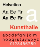
All Topics  
Helvetica


   Email Print
   Bookmark   Link


Helvetica


Helvetica is a widely used sans-serif
Sans-serif

In typography, a sans-serif or sans serif typeface is one that does not have the small features called "serifs" at the end of strokes. The term comes from the French word sans, meaning "without"....
 typeface
Typeface

In typography, a typeface is a set of one or more fonts, in one or more sizes, designed with stylistic unity, each comprising a coordinated set of glyphs....
 developed in 1957 by Swiss typeface designer Max Miedinger
Max Miedinger

Max Miedinger was a Switzerland typography. He was famous for creating Helvetica in 1957. Marketed as a symbol of cutting-edge Swiss technology, Helvetica went global at once....
.

etica was developed in 1957 by Max Miedinger with Eduard Hoffmann at the Haas'sche Schriftgiesserei (Haas type foundry
Type foundry

A type foundry is a company that Type design and/or distributes typefaces. Originally, type foundries manufactured and sold metal and wood typefaces and Matrix for line-casting machines like the Linotype machine and Monotyping machines designed to be printed on Letterpress printing printers....
) of Münchenstein
Münchenstein

M?nchenstein is a Municipalities of Switzerland in the district of Arlesheim in the Cantons of Switzerland of Basel-Country in Switzerland....
, Switzerland
Switzerland

Switzerland is a landlocked Swiss Alps country of roughly 7.7 million people in Western Europe with an area of 41,285 km?. Switzerland is a federal republic consisting of 26 states called Cantons of Switzerland....
. Haas set out to design a new sans-serif typeface that could compete with Akzidenz-Grotesk in the Swiss market. Originally called Neue Haas Grotesk, it was created based on Schelter-Grotesk.


Discussion
Ask a question about 'Helvetica'
Start a new discussion about 'Helvetica'
Answer questions from other users
Full Discussion Forum


Encyclopedia


Helvetica is a widely used sans-serif
Sans-serif

In typography, a sans-serif or sans serif typeface is one that does not have the small features called "serifs" at the end of strokes. The term comes from the French word sans, meaning "without"....
 typeface
Typeface

In typography, a typeface is a set of one or more fonts, in one or more sizes, designed with stylistic unity, each comprising a coordinated set of glyphs....
 developed in 1957 by Swiss typeface designer Max Miedinger
Max Miedinger

Max Miedinger was a Switzerland typography. He was famous for creating Helvetica in 1957. Marketed as a symbol of cutting-edge Swiss technology, Helvetica went global at once....
.

History

Helvetica was developed in 1957 by Max Miedinger with Eduard Hoffmann at the Haas'sche Schriftgiesserei (Haas type foundry
Type foundry

A type foundry is a company that Type design and/or distributes typefaces. Originally, type foundries manufactured and sold metal and wood typefaces and Matrix for line-casting machines like the Linotype machine and Monotyping machines designed to be printed on Letterpress printing printers....
) of Münchenstein
Münchenstein

M?nchenstein is a Municipalities of Switzerland in the district of Arlesheim in the Cantons of Switzerland of Basel-Country in Switzerland....
, Switzerland
Switzerland

Switzerland is a landlocked Swiss Alps country of roughly 7.7 million people in Western Europe with an area of 41,285 km?. Switzerland is a federal republic consisting of 26 states called Cantons of Switzerland....
. Haas set out to design a new sans-serif typeface that could compete with Akzidenz-Grotesk in the Swiss market. Originally called Neue Haas Grotesk, it was created based on Schelter-Grotesk. The aim of the new design was to create a neutral typeface that had great clarity, had no intrinsic meaning in its form, and could be used on a wide variety of signage.

When Linotype adopted the Neue Haas Grotesk, the whole design was reworked because it was never planned as a full range of mechanical and hot-metal typefaces. After the success of Univers
Univers

Univers is the name of a realist sans-serif typeface designed by Adrian Frutiger in 1954.Originally conceived and released by Deberny & Peignot in 1957, the type library was acquired in 1972 by Haas....
, Arthur Ritzel of Stempel redesigned Neue Haas Grotesk into a larger family.

In 1960, the typeface's name was changed by Haas' German parent company Stempel
Stempel

Stempel is the Name of the following people:* Herbert Stempel, a television game show contestant* Robert Stempel, a Manager and ChairmanStempel may also refer to the D. Stempel AG type foundry....
 to Helvetica — derived from Confoederatio Helvetica, the Latin name for Switzerland — in order to make it more marketable internationally.

Variations of Helvetica


Digital versions

Linotype distributes various versions of the typeface, including those containing only fractions (numbers and percentages), characters for Central European languages, Cyrillic, Greek, Hebrew, and Arabic.

The Cyrillic version was designed in-house in the 1970s at D. Stempel AG, then critiqued and redesigned in 1992 under the advice of Jovica Veljovic.

Helvetica Light was designed by Stempel's artistic director Erich Schultz-Anker, in conjunction with Arthur Ritzel.

Matthew Carter designed the Helvetica Greek, Helvetica Compressed (including Helvetica Extra Compressed, Helvetica Ultra Compressed).

Helvetica Textbook

Helvetica Textbook is an alternate design of the typeface. Some characters such as 1, 4, 6, 9, I, J, a, f, j, q, µ, and
Pilcrow

The pilcrow , also called the paragraph sign or the alinea , is a typographical character commonly used to denote individual paragraphs....
 are drawn differently from the original version.

Helvetica Inserat

Helvetica Inserat is a version designed in 1957 primarily for use in the advertising industry. Sharing similar metric as Helvetica Black Condensed, the design gives the glyphs a more squared appearance, similar to Impact
Impact (typeface)

Impact is a realist sans-serif typeface designed by Geoffrey Lee in 1965 and released by the Stephenson Blake foundry. Its ultra-thick strokes, compressed letterspacing, and minimal interior counterform are specifically aimed, as its name suggests, to "impact." Impact has a high x-height, reaching nearly to three-quarters the capital line....
 and Haettenschweiler
Haettenschweiler

Haettenschweiler is a realist sans-serif typeface based on an uppercase metal-cast type called Schmalfette Grotesk . The face is named for Walter Haettenschweiler, who with Armin Haab, published the book Lettera which uses Schmalfette Grotesk....
. Strike with strokes in $, ¢ are replaced by non-strikethrough version. 4 is opened at top.

Cyrillic characters were added in 1970s at D. Stempel AG, then critiqued and redesigned in 1992 under the advice of Jovica Veljovic.

Helvetica Compressed

Designed by Matthew Carter, they are narrow variants that are tighter than the Helvetica Condensed. It shares some design elements with Helvetica Inserat, but using curved tail in Q, downward pointing branch in r, tilde bottom £,

Helvetica Rounded (1978)

Helvetica Rounded is a version containing rounded stroke terminators. Only bold, bold oblique, black, black oblique, bold condensed, bold condensed, bold outline fonts were made, with outline font not issued in digital form by Linotype.

Helvetica Narrow

Helvetica Narrow is a version where its width is between Helvetica Compressed and Helvetica Condensed. However, the width is scaled in a way what is optically consistent with the widest width fonts.

The font was developed when printer ROM space was very scarce, so it was created by mathematically squashing Helvetica by 18% (to 82% of the original width), resulting in distorted letterforms and thin vertical strokes next to thicker horizontals.

OpenType version was not produced by Adobe under the distortion reasoning, and recommended Helvetica Condensed instead. However, in Linotype's OpenType version of Helvetica Narrow, the distortions found in the Adobe fonts are non-existent.

Neue Helvetica (1983)

Neue Helvetica is a reworking of the typeface with a more structurally unified set of heights and widths. It was developed at D. Stempel AG, Linotype's daughter company. The studio manager was Wolfgang Schimpf, and his assistant was Reinhard Haus; the manager of the project was René Kerfante. Erik Spiekermann
Erik Spiekermann

Erik Spiekermann is a Germany typography and designer. He is a professor at the University of the Arts Bremen.Spiekermann studied art history at Berlin's Free University of Berlin, funding himself by running a hot metal printing press in the basement of his house....
 was the design consultant and designed the literature for the launch in 1983.

Other redesigns include improved legibility, heavier punctuation marks, increased spacing in numbers.

Neue Helvetica uses a numerical design classification scheme, like Univers
Univers

Univers is the name of a realist sans-serif typeface designed by Adrian Frutiger in 1954.Originally conceived and released by Deberny & Peignot in 1957, the type library was acquired in 1972 by Haas....
. Neue Helvetica also comes in Outline, but not Textbook or Rounded fonts. The font family includes 51 fonts, which includes fonts in 9 weights in 3 widths (8, 9, 8 in normal, condensed, extended widths respectively), and an outline font based on Helvetica 75 Bold Outline. Linotype distribute Neue Helvetica on CD. Neue Helvetica, too, comes in variants for Central European and Cyrillic text.

Helvetica World

Also called Helvetica Linotype, Helvetica World supports Arabic, Cyrillic, Greek, Hebrew, and Vietnamese scripts.

The family consists of 4 fonts in 2 weights and 1 width, with complementary italics.

The Arabic glyphs were based on a redesigned Yakout font family from Linotype. Latin kerning and spacing were redesigned to have consistent spacing.

John Hudson of Tiro Typeworks designed the Hebrew glyphs for the font family, as well as the Cyrillic, and Greek letters.

Similar typefaces

Generic versions of Helvetica have been made by various vendors, including Monotype Imaging (CG Triumvirate), ParaType
Paratype

Zoology In zoological nomenclature, a paratype is officially defined as a "Each specimen of a type series other than the holotype"In turn, this does depend on the definition of "type series." A type series is the material that was cited in the original publication of the new species or subspecies, and was not excluded from being type...
 (Pragmatica), Bitstream
Bitstream Inc.

Bitstream Inc. is a type foundry that produces digital typefaces . Founded in 1981 by Matthew Carter and Mike Parker among others, it claims to be the oldest such company....
 (Swiss 721).

Monotype
Monotype Corporation

Monotype Imaging Inc. is a typesetting and typeface design company responsible for many developments in printing technology — in particular the Monotype machine which was the first fully mechanical typesetter — and the design and production of typefaces in the 19th and 20th centuries....
's Arial
Arial

Arial, sometimes marketed as Arial MT, is a sans-serif typeface and computer font packaged with Microsoft Windows, other Microsoft computer software applications, Apple Computer Mac OS X, and many PostScript computer printers....
, designed in 1982, while different from Helvetica in some few details, has identical character widths, and is indistinguishable by most non-specialists. The capital letters C, G, and R, as well as the lowercase letters a, e, r, and t, are useful for quickly distinguishing Arial and Helvetica. Differences include:
  • Helvetica's strokes are typically cut either horizontally or vertically. This is especially visible in the t, r, and C. Arial employs slanted stroke cuts.
  • Helvetica's G has a well-defined spur; Arial does not.
  • The tails of the R glyphs and the a glyphs are different.


Nimbus Sans, another similar font family that incorporates fonts designed in 1940 (Nimbus Sans bold condensed, Nimbus Sans bold condensed (D)) and 1946 (Nimbus Sans Black Condensed, Nimbus Sans Black Condensed (D)), is produced by URW. Nimbus Sans L fonts were released under the GNU General Public License
GNU General Public License

The GNU General Public License is a widely used free software license, originally written by Richard Stallman for the GNU project. The GPL is the most popular and well-known example of the type of strong copyleft license that requires derived works to be available under the same copyleft....
.

"Helv", later known as "MS Sans Serif
MS Sans Serif

MS Sans Serif is a proportional raster font introduced in Windows 1.0 as "Helv". It changed to its current name starting with Windows 3.1. It is the default system typeface on Windows 3.1, Windows 95, Windows NT 4.0, Windows 98, Windows 98 Second Edition, and Windows ME....
", is a sans-serif typeface that shares many key characteristics to Helvetica, including the horizontally and vertically-aligned stroke terminators and more uniformed stroke widths within a glyph.

Usage

Bwywalk0505 Station8thstbroadway
Sts 73 Landing
Helvetica is among the most widely used sans-serif typefaces. Versions exist for the following alphabets/scripts: Latin
Latin alphabet

The Latin alphabet, also called the Roman alphabet, is the most widely used alphabetic writing system in the world today. It evolved from the western variety of the Greek alphabet called the Cumae alphabet, and was initially developed by the Ancient Romes to write the Latin....
, Cyrillic
Cyrillic alphabet

The Cyrillic alphabet is a family of alphabets, subsets of which are used by five Slavic languages national languages as well as non-Slavic . It is also used by many other languages of Eastern Europe, the Caucasus, Siberia and other languages in the past....
, Hebrew
Hebrew alphabet

The Hebrew alphabet consists of 22 letters used for writing the Hebrew language. Five of these letters have a different form when appearing as the last letter in a word....
, Greek
Greek alphabet

The Greek alphabet is a set of twenty-four letters that has been used to write the Greek language since the late 9th century BC or early 8th century BCE....
, Japanese, Korean, Hindi, Urdu, Khmer and Vietnamese. Chinese faces have been developed to complement Helvetica.

Helvetica is a popular choice for commercial wordmarks, including those for 3M
3M

3M Company , formerly Minnesota Mining and Manufacturing Company until 2002, is an United States multinational corporation Conglomerate corporation with a worldwide presence....
, AT&T
AT&T

AT&T Inc. is the largest US provider of both local and long distance telephone services, and Digital subscriber line Internet access. AT&T is the second largest provider of wireless service in the United States, with over 77 million wireless customers, and more than 150 million total customers....
, Jeep
Jeep

Jeep is an automobile marque of Chrysler. It is the oldest off-road vehicle brand, with Land Rover coming in second. The original vehicle which first appeared as the prototype Bantam GP became the primary light 4-wheel-drive vehicle of the US Army and allies during the World War II and postwar period....
, Lufthansa
Lufthansa

Deutsche Lufthansa Aktiengesellschaft is one of the List of largest airlines in Europe airlines in Europe in terms of overall passengers carried, and the flag carrier of Germany....
, American Airlines
American Airlines

American Airlines, Inc. is a major carrier of the United States. It is the world's largest airlines in passenger miles transported and passenger fleet size; second largest, behind FedEx Express, in aircraft operated; and second behind Air France-KLM in operating revenues....
, Microsoft
Microsoft

Microsoft Corporation is a multinational corporation computer technology corporation that develops, manufactures, licenses, and supports a wide range of computer software products for computing devices....
, and BMW
BMW

, is an independent German automotive industry founded in 1916. It also produces BMW Motorrad, is the owner of the MINI brand and is the parent company of Rolls-Royce Motor Cars....
.

Helvetica is widely used by the U.S. government; for example, federal income tax forms are set in Helvetica, and NASA
NASA

The National Aeronautics and Space Administration is an agency of the Federal government of the United States, responsible for the nation's public list of space agencies....
 uses the type on the Space Shuttle orbiter
Space Shuttle Orbiter

The Space Shuttle orbiters are the orbital spacecraft of the Space Shuttle Space Shuttle program operated by NASA, the space agency of the United States....
. Helvetica is also used in the United States television rating system. New York City's Metropolitan Transportation Authority
Metropolitan Transportation Authority (New York)

The Metropolitan Transportation Authority is a public benefit corporation responsible for public transportation in the U.S. state of New York, serving 12 counties in southeastern New York, along with 2 counties in southwestern Connecticut under contract to the Connecticut Department of Transportation, carrying over 11 million passengers on a...
 uses Helvetica for many of its subway signs. Helvetica, though, was not adopted as the official font for signage until 1989. The standard font from 1970 until 1989 was Medium Standard, an Akzidenz Grotesk
Akzidenz Grotesk

Akzidenz-Grotesk is a Sans-serif#Classification sans-serif typeface originally released by the H. Berthold AG type foundry in 1896 under the title Accidenz-Grotesk....
-like sans-serif, as defined by Unimark's New York City Transit Authority Graphic Standards Manual. New York's system is still rife with a proliferation of Helvetica-like fonts including Arial. The Chicago Transit Authority
Chicago Transit Authority

Chicago Transit Authority, also known as CTA, is the operator of public transport within the Chicago, Illinois. It is the second largest transit system in the United States and fourth largest in North America....
 uses Helvetica on its signage for the Chicago 'L'
Chicago 'L'

The 'L' is a rapid transit system that serves the city of Chicago in the United States. It is operated by the Chicago Transit Authority and is the third-busiest rail mass transit system in the United States, behind New York City's New York City Subway and Washington, D.C.'s Washington Metro....
. British Rail
British Rail

British Railways , which later traded as British Rail, was the operator of most of the Rail transport in Great Britain from the nationalisation of the Big Four British railway companies in 1948 until Privatisation of British Rail in stages from 1994 to 1997....
, the former state owned operator of the British railway system
Rail transport in the United Kingdom

The United Kingdom consists of Great Britain and Northern Ireland, and previously consisted of United Kingdom of Great Britain and Ireland. Rail transport systems developed independently on the two islands of Great Britain and Ireland, and most of the railway construction in the Republic of Ireland was undertaken before independence in 1922....
 developed its own Helvetica-based Rail Alphabet
Rail Alphabet

Rail Alphabet is a typeface designed by Jock Kinneir and Margaret Calvert for British Railways. First used by them in signing tests at London's Liverpool Street Station, it was then adopted by the Design Research Unit as part of their 1965 rebranding of the company....
 font - which was also adopted by the National Health Service
National Health Service

The National Health Service is the name commonly used to refer to the four publicly funded healthcare systems of the United Kingdom, collectively or individually, although only the health service in England uses the name 'National Health Service' without further qualification....
 and the British Airports Authority.

Canada's federal government
Government of Canada

Canada is a constitutional monarchy. The powers and structure of the federal government are set out in the Constitution of Canada, which includes the written part, the decisions of courts, and unwritten conventions developed over time....
 uses Helvetica as its identifying typeface, with three variants being used in its corporate identity program
Federal Identity Program

The Federal Identity Program is the Canada government's corporate identity program . The purpose of the FIP is to clearly identify each program and service of the government or the government of Canada in general....
, and encourages its use in all federal agencies and websites.

The logo and graphic identity of the "Metro" (Underground) in Madrid
Madrid

Madrid is the Capital and largest city of Spain. It is the Largest cities of the European Union by population within city limits in the European Union after Greater London and Berlin, and its Madrid metropolitan area is the Largest urban areas of the European Union in the European Union after Paris aire urbaine, Greater London Urban Area, a...
 are Helvetica Regular and Helvetica Neue.

The MTV
MTV

MTV is an United States cable television network based in Media of New York City. Launched on August 1, 1981, the original purpose of the channel was to play music videos guided by on-air hosts known as VJ ....
 series Jackass
Jackass (TV series)

Jackass is an American television series, originally shown on MTV from 2000 to 2002, featuring people performing various dangerous, crude, ridiculous, and Self-harm stunts and pranks....
 uses the typeface for their logo and intertitles.

Orange uses the font for the titles and headers of its communications.

Media coverage

In 2007, Linotype GmbH held the Helvetica NOW Poster Contest to celebrate the 50th anniversary of the typeface. Winners were announced in January 2008 issue of the LinoLetter.

In 2007, director Gary Hustwit released a documentary, Helvetica
Helvetica (film)

Helvetica is an independent feature-length documentary film about typography and graphic design, centered around the Helvetica. Directed by Gary Hustwit, it was released in 2007 to coincide with the 50th anniversary of the typeface's introduction in 1957....
, to coincide with the fiftieth anniversary of the typeface. In the film, graphic designer Wim Crouwel
Wim Crouwel

Wim Crouwel, born in 1928 in Groningen , Netherlands, is a Netherlands graphic designer and typography.He is known for his posters and exhibition design for the Stedelijk Museum in Amsterdam....
 said, "Helvetica was a real step from the 19th century typeface... We were impressed by that because it was more neutral, and neutralism was a word that we loved. It should be neutral. It shouldn't have a meaning in itself. The meaning is in the content of the text and not in the typeface."

From April 2007 to March 2008, the Museum of Modern Art
Museum of Modern Art

The Museum of Modern Art is an art museum located in Midtown Manhattan in New York City, USA, on 53rd Street, between Fifth and Sixth Avenues....
 in New York City
New York City

The City of New York is the List of United States cities by population in the United States, while the New York metropolitan area ranks among the List of urban areas by population....
 displayed an exhibit called "50 Years of Helvetica", which celebrated the many uses of the font.

Awards

Helvetica was rated number one on FontShop
FontShop

FontShop International was founded in Berlin in 1989 by Erik Spiekermann and Joan Spiekermann, who were then husband and wife. FontShop is the original font reseller in digital type history....
 Germany's list "Best Fonts of All Time".

External links

  • site for Independent Lens
    Independent Lens

    Airing weekly on Public Broadcasting Service through Independent Television Service, the Emmy Award-winning series Independent Lens introduces new drama and documentary films made by independent filmmakers....
     on PBS
  • — BBC News article
  • — article in Slate
    Slate (magazine)

    Slate is an English language online current affairs and culture magazine created in 1996 by former The New Republic editor Michael Kinsley, initially under the ownership of Microsoft, as part of MSN....
    , published May 25, 2007
  • Herald Tribune
    International Herald Tribune

    The International Herald Tribune is a widely read English language international newspaper. It combines the resources of its own correspondents with those of The New York Times and is printed at 33 sites throughout the world, for sale in more than 180 countries....
     article on the 50 years of Helvetica