
.gif)
City (typeface)
Encyclopedia
Slab serif
In typography, a slab serif typeface is a type of serif typeface characterized by thick, block-like serifs. Serif terminals may be either blunt and angular , or rounded . Slab serif typefaces generally have no bracket...
typeface
Typeface
In typography, a typeface is the artistic representation or interpretation of characters; it is the way the type looks. Each type is designed and there are thousands of different typefaces in existence, with new ones being developed constantly....
designed by Georg Trump (1896–1985), and released in 1930 by the Berthold type foundry
Berthold Type Foundry
H. Berthold AG was one of the largest and most successful type foundries in the world for most of the modern typographic era, making the transition from foundry type to cold type successfully and only coming to dissolution in the digital type era.-History:...
in Berlin, Germany. Though classified as a slab serif, City displays a strong modernist influence in its geometric structure of right angles and opposing round corners. The typeface takes inspiration from the machine age, and industry. A consistent application of repeated parts: an outer circle softening interior rectilinear spaces, results in a highly unified and refined typeface.
The lowercase a is composed of a two horizontal rectangles in the interior, the outer skin follows the counter but always contrasting the outer stroke with the organic curves. The face was produced in three weights: light, medium, and bold, each in roman
Roman type
In typography, roman is one of the three main kinds of historical type, alongside blackletter and italic. Roman type was modelled from a European scribal manuscript style of the 1400s, based on the pairing of inscriptional capitals used in ancient Rome with Carolingian minuscules developed in the...
and italic
Italic type
In typography, italic type is a cursive typeface based on a stylized form of calligraphic handwriting. Owing to the influence from calligraphy, such typefaces often slant slightly to the right. Different glyph shapes from roman type are also usually used—another influence from calligraphy...
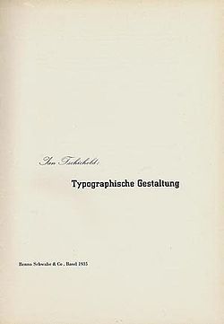
. The graphic designer Jan Tschichold
Jan Tschichold
Jan Tschichold was a typographer, book designer, teacher and writer.-Life:Tschichold was the son of a provincial signwriter, and he was trained in calligraphy...
helped to popularize the City typeface by his use of it for his book Typographische Gestaltung published by the Basel publishing house Benno Schwabe & Co.
Commercial uses
- IBMIBMInternational Business Machines Corporation or IBM is an American multinational technology and consulting corporation headquartered in Armonk, New York, United States. IBM manufactures and sells computer hardware and software, and it offers infrastructure, hosting and consulting services in areas...
Corporation used variations of City for their corporate logoLogoA logo is a graphic mark or emblem commonly used by commercial enterprises, organizations and even individuals to aid and promote instant public recognition...
from 1956 onward and used City Medium on the title pages and covers of their technical manuals for several decades.
- Southern TelevisionSouthern TelevisionSouthern Television was the first ITV broadcasting licence holder for the south and south-east of England from 30 August 1958 until the night of 31 December 1981. The company was launched as Southern Television Limited and the title Southern Television was consistently used on-air throughout its life...
used City for titling in their news programme Day by Day.
- The 1998 Anime Series Cowboy BebopCowboy Bebopis a critically acclaimed and award-winning 1998 Japanese anime series directed by Shinichirō Watanabe, written by Keiko Nobumoto, and produced by Sunrise. Its 26 episodes comprise a complete storyline: set in 2071, the series follows the adventures, misadventures and tragedies of five bounty...
used City for the titles
- A variant of this typeface was also used for the titles and credits of the CBSCBSCBS Broadcasting Inc. is a major US commercial broadcasting television network, which started as a radio network. The name is derived from the initials of the network's former name, Columbia Broadcasting System. The network is sometimes referred to as the "Eye Network" in reference to the shape of...
crime drama series, MannixMannixMannix is an American television detective series that ran from 1967 through 1975 on CBS. Created by Richard Levinson and William Link and developed by executive producer Bruce Geller, the title character, Joe Mannix, is a private investigator. He is played by Mike Connors...
.