

Paul Renner
Encyclopedia
Typeface
In typography, a typeface is the artistic representation or interpretation of characters; it is the way the type looks. Each type is designed and there are thousands of different typefaces in existence, with new ones being developed constantly....
designer, most notably of Futura
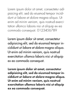
Futura (typeface)
In typography, Futura is a geometric sans-serif typeface designed in 1927 by Paul Renner. It is based on geometric shapes that became representative visual elements of the Bauhaus design style of 1919–1933...
. He was born in Wernigerode
Wernigerode
Wernigerode is a town in the district of Harz, Saxony-Anhalt, Germany. Until 2007, it was the capital of the district of Wernigerode. Its population was 35,500 in 1999....
, Germany
Germany
Germany , officially the Federal Republic of Germany , is a federal parliamentary republic in Europe. The country consists of 16 states while the capital and largest city is Berlin. Germany covers an area of 357,021 km2 and has a largely temperate seasonal climate...
and died in Hödingen.
He was born in Prussia and had a strict Protestant upbringing, being educated in 19th century Gymnasium. He was brought up to have a very German sense of leadership, of duty and responsibility. He was suspicious of abstract art and disliked many forms of modern culture, such as jazz, cinema, and dancing. But equally, he admired the functionalist strain in modernism. Thus, Renner can be seen as a bridge between the traditional (19th century) and the modern (20th century). He attempted to fuse the Gothic and the roman typefaces.
Renner was a prominent member of the Deutscher Werkbund
Deutscher Werkbund
The Deutscher Werkbund was a German association of artists, architects, designers, and industrialists. The Werkbund was to become an important event in the development of modern architecture and industrial design, particularly in the later creation of the Bauhaus school of design...
(German Work Federation). Two of his major texts are Typografie als Kunst (Typography as Art) and Die Kunst der Typographie (The Art of Typography). He created a new set of guidelines for good book design and invented the popular Futura
Futura (typeface)
In typography, Futura is a geometric sans-serif typeface designed in 1927 by Paul Renner. It is based on geometric shapes that became representative visual elements of the Bauhaus design style of 1919–1933...
, a geometric sans-serif
Sans-serif
In typography, a sans-serif, sans serif or san serif typeface is one that does not have the small projecting features called "serifs" at the end of strokes. The term comes from the French word sans, meaning "without"....
font used by many typographers throughout the 20th century and today. The typeface Architype Renner
Architype Renner
Architype Renner is a geometric sans-serif typeface reproducing the experimental alternate characters of Paul Renner's 1927–29 typeface Futura for the Bauer foundry. Renner's original design for Futura shows the influence of Herbert Bayer's experimental "Universal" alphabet...
is based upon Renner's early experimental exploration of geometric letterforms for the Futura typeface, most of which were deleted from the face's character set before it was issued. Tasse
Tasse
Tasse is a revival of Paul Renner's Steile Futura. The family consists of 4 weights and 5 widths each, but no italic fonts were made. Nelson maintained Renner's alternative characters, adding additional alternate characters. The face is licensed by Font Bureau.Tasse shows influence of pen-written...
, a 1994 typeface is a revival of Renner's 1953 typeface Steile Futura.
Renner was a friend of the eminent German typographer Jan Tschichold
Jan Tschichold
Jan Tschichold was a typographer, book designer, teacher and writer.-Life:Tschichold was the son of a provincial signwriter, and he was trained in calligraphy...
and a key participant in the heated ideological and artistic debates of that time.
Politics
Even before 1932, Renner made his opposition to the Nazis very clear, notably in his book “Kultur-bolschewismus?” (Cultural Bolshevism?). He was unable to find a German publisher, so it was published by his Swiss friend Eugen Rentsch.After the Nazis seized power in March 1933, Paul was arrested and dismissed from his post in Munich in 1933, and subsequently went into a period of internal exile. Soon after the book's publication, it was withdrawn from the German book market, until a photo-mechanical reprint was issued by Stroemfeld Verlag, Frankfurt am Main/Basel, in 2003. The new edition included comments by Roland Reuss and Peter Staengle (a main source for these notes).
Typefaces
- Architype RennerArchitype RennerArchitype Renner is a geometric sans-serif typeface reproducing the experimental alternate characters of Paul Renner's 1927–29 typeface Futura for the Bauer foundry. Renner's original design for Futura shows the influence of Herbert Bayer's experimental "Universal" alphabet...
(1927)
- FuturaFutura (typeface)In typography, Futura is a geometric sans-serif typeface designed in 1927 by Paul Renner. It is based on geometric shapes that became representative visual elements of the Bauhaus design style of 1919–1933...
(1928) - Plak (1928)
- Futura Black (1929)
- Futura light (1932)
- Ballade (1938)
- Renner Antiqua (1939)
Books
All books are German editions.- Typographie als Kunst, Munich 1922
- Mechanisierte Grafik. Schrift, Typo, Foto, Film, Farbe, Berlin 1930
- Kulturbolschewismus?, Zurich 1932,
- Die Kunst der Typographie, Berlin 1939, New print Augsburg 2003; ISBN 3875124146,
- Das moderne Buch, Lindau 1946,
- Ordnung und Harmonie der Farben. Eine Farbenlehre für Künstler und Handwerker, Ravensburg 1947
- Vom Geheimnis der Darstellung, Frankfurt 1955
External links
This article incorporates text from the German article :de:Paul Renner, especially from this version.