
Tasse
Encyclopedia
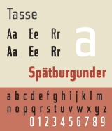
Tasse is a revival of Paul Renner
's Steile Futura. The family consists of 4 weights and 5 widths each, but no italic fonts were made. Nelson maintained Renner's alternative characters, adding additional alternate characters. The face is licensed by Font Bureau
.
Tasse shows influence of pen-written letters in contrast to the modular geometry of Futura
. The face is unusual for a sans-serif in having a true italic rather than a sloped Roman. Lowercase italic a becomes single story, and the suggestion of calligraphic strokes are found in the italic characters e, h, K, k, m, n, and u. Renner's original character set offered alternative, more rounded, versions of uppercase roman characters A, E, M, and W.
Paul Renner
Paul Renner was a typeface designer, most notably of Futura. He was born in Wernigerode, Germany and died in Hödingen....
's Steile Futura. The family consists of 4 weights and 5 widths each, but no italic fonts were made. Nelson maintained Renner's alternative characters, adding additional alternate characters. The face is licensed by Font Bureau
Font Bureau
The Font Bureau, Inc. or Font Bureau is a digital type foundry based in Boston, Massachusetts, United States. The foundry is one of the leading designers of typefaces, specializing in type designs for magazine and newspaper publishers....
.
Tasse shows influence of pen-written letters in contrast to the modular geometry of Futura
Futura (typeface)
In typography, Futura is a geometric sans-serif typeface designed in 1927 by Paul Renner. It is based on geometric shapes that became representative visual elements of the Bauhaus design style of 1919–1933...
. The face is unusual for a sans-serif in having a true italic rather than a sloped Roman. Lowercase italic a becomes single story, and the suggestion of calligraphic strokes are found in the italic characters e, h, K, k, m, n, and u. Renner's original character set offered alternative, more rounded, versions of uppercase roman characters A, E, M, and W.