
Lithos
Encyclopedia
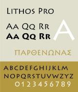
Lithos is a glyphic sans-serif
typeface
designed by Carol Twombly
in 1989 for Adobe Systems
. Lithos is inspired by the unadorned, geometric letterforms of the engravings found on Ancient Greek
public buildings. The typeface consists of only capital letters, and comes in five weights, with no italics.
According to Twombly, Lithos only used Greek inscriptions as inspiration, making Lithos more of a modern reinterpretation than a faithful reproduction. Twombly also designed Trajan
and Charlemagne based respectively on ancient Roman and Byzantine inscriptions. Those typefaces, unlike Lithos, were modeled more directly upon their historical counterparts. One example of Lithos' departure from historical accuracy is the inclusion of bold weights, which never existed in historical Greek inscriptions.
Publications associated with African, African-American and Southwestern cultures have used Lithos for its "ethnic" feel, even if it is the wrong ethnicity. Lithos has also become something of a generic stand-in whenever a "primitive" feel is desired. For this reason, Lithos has been compared to Rudolf Koch
's typeface, Neuland
, which was originally intended to be a modern reinterpretation of blackletter
, but received similarly broad use.
version called Lithos Pro, which included Adobe CE, Adobe Western 2, Greek character sets support, and small caps
in the lowercase positions. OpenType features include alternates, case forms, proportional lining figures, small caps.
during the late 1980s and early 1990s.
Lithos was used on the reverse side of the 2009 one dollar coin produced by the United States Mint
. The scene depicted on the coin is one of a native American planting corn.
Lithos is also used in the title typeface of the Very Short Introduction published by the Oxford University Press
.
Sans-serif
In typography, a sans-serif, sans serif or san serif typeface is one that does not have the small projecting features called "serifs" at the end of strokes. The term comes from the French word sans, meaning "without"....
typeface
Typeface
In typography, a typeface is the artistic representation or interpretation of characters; it is the way the type looks. Each type is designed and there are thousands of different typefaces in existence, with new ones being developed constantly....
designed by Carol Twombly
Carol Twombly
Carol Twombly is an American calligrapher and typeface designer who has designed many typefaces, including Trajan, Myriad and Adobe Caslon. She worked as a type designer at Adobe Systems from 1988 through 1999, during which time she designed, or contributed to the design of, many typefaces...
in 1989 for Adobe Systems
Adobe Systems
Adobe Systems Incorporated is an American computer software company founded in 1982 and headquartered in San Jose, California, United States...
. Lithos is inspired by the unadorned, geometric letterforms of the engravings found on Ancient Greek
Ancient Greece
Ancient Greece is a civilization belonging to a period of Greek history that lasted from the Archaic period of the 8th to 6th centuries BC to the end of antiquity. Immediately following this period was the beginning of the Early Middle Ages and the Byzantine era. Included in Ancient Greece is the...
public buildings. The typeface consists of only capital letters, and comes in five weights, with no italics.
According to Twombly, Lithos only used Greek inscriptions as inspiration, making Lithos more of a modern reinterpretation than a faithful reproduction. Twombly also designed Trajan
Trajan (typeface)
Trajan is an old style serif typeface designed in 1989 by Carol Twombly for Adobe. The design is based on the letterforms of capitalis monumentalis or Roman square capitals, as used for the inscription at the base of Trajan's Column from which the typeface takes its name. Since the inscription and...
and Charlemagne based respectively on ancient Roman and Byzantine inscriptions. Those typefaces, unlike Lithos, were modeled more directly upon their historical counterparts. One example of Lithos' departure from historical accuracy is the inclusion of bold weights, which never existed in historical Greek inscriptions.
Publications associated with African, African-American and Southwestern cultures have used Lithos for its "ethnic" feel, even if it is the wrong ethnicity. Lithos has also become something of a generic stand-in whenever a "primitive" feel is desired. For this reason, Lithos has been compared to Rudolf Koch
Rudolf Koch
thumb|250px|[[Fraktur]] fonts by Rudolf KochRudolf Koch was a leading German calligrapher, typographic artist and teacher, born in Nuremberg. He was primarily a calligrapher with the Gebr. Klingspor foundry. He created several typefaces, in both fraktur and roman styles...
's typeface, Neuland
Neuland
Neuland is a German typeface that was designed in 1923 by Rudolf Koch.Koch designed it by directly carving the type into metal. The original typeface thus had a great deal of variance between the sizes...
, which was originally intended to be a modern reinterpretation of blackletter
Blackletter
Blackletter, also known as Gothic script, Gothic minuscule, or Textura, was a script used throughout Western Europe from approximately 1150 to well into the 17th century. It continued to be used for the German language until the 20th century. Fraktur is a notable script of this type, and sometimes...
, but received similarly broad use.
Lithos Pro
In 2000, Adobe released the OpenTypeOpenType
OpenType is a format for scalable computer fonts. It was built on its predecessor TrueType, retaining TrueType's basic structure and adding many intricate data structures for prescribing typographic behavior...
version called Lithos Pro, which included Adobe CE, Adobe Western 2, Greek character sets support, and small caps
Small caps
In typography, small capitals are uppercase characters set at the same height and weight as surrounding lowercase letters or text figures...
in the lowercase positions. OpenType features include alternates, case forms, proportional lining figures, small caps.
Lithos in popular culture
Lithos was the resident typeface of MTVMTV
MTV, formerly an initialism of Music Television, is an American network based in New York City that launched on August 1, 1981. The original purpose of the channel was to play music videos guided by on-air hosts known as VJs....
during the late 1980s and early 1990s.
Lithos was used on the reverse side of the 2009 one dollar coin produced by the United States Mint
United States Mint
The United States Mint primarily produces circulating coinage for the United States to conduct its trade and commerce. The Mint was created by Congress with the Coinage Act of 1792, and placed within the Department of State...
. The scene depicted on the coin is one of a native American planting corn.
Lithos is also used in the title typeface of the Very Short Introduction published by the Oxford University Press
Oxford University Press
Oxford University Press is the largest university press in the world. It is a department of the University of Oxford and is governed by a group of 15 academics appointed by the Vice-Chancellor known as the Delegates of the Press. They are headed by the Secretary to the Delegates, who serves as...
.