
FF Meta
Encyclopedia
FF Meta is a humanist sans-serif
typeface
family designed by Erik Spiekermann
originally as a commission for the Deutsche Bundespost
(West German Post Office), but later released by Spiekermann himself in 1991 through his FontFont library. According to Spiekermann, FF Meta was intended to be a "complete antithesis of Helvetica
," which he found "boring and bland." Throughout the nineties
, FF Meta was embraced by the international design community with Spiekermann and E. M. Ginger writing that it had been dubiously praised as the "Helvetica of the 1990s."
FF Meta has been adopted by numerous corporations and other organizations as a corporate typeface, for signage or in their logo.
lower case:
square dot over the letter i.
double storey a.
upper case:
dropped horizontal element on A.
figures:
, where Spiekermann was working at the time, and commissioned a comprehensive corporate design program. As the typeface would be used repeatedly in small sizes, for identification (rather than copy
), require two different weights, and printed quickly on potentially poor paper stock, the brief called for a very legible, neutral, space-saving, and distinguishable (in regards to weight) typeface with special attention to producing unmistakable characters. Whereas traditionally, typefaces are designed to be viewed beautifully large, the goal with this particular typeface was to produce a typeface which worked well for its primary application.
Taking into account research done on six font families and the constraints of the brief, the characteristics of what would become FF Meta began to take shape. The typeface would have to be a sans-serif to match the client, narrow (but not condensed) to save space, feature strokes thick enough to withstand uneven printing but also light so that individual characters do not run together, contain clearly distinguishable characters for similar shaped characters, versatile capitals and figures that are clear but not obtrusive, and curves, indentations, flares, and open joins to combat poor definition, optical illusions, and over-inking. In addition to these demands, to meet Bundespost's needs, the family would also contain three fonts: regular, regular italic, and bold.
After completing and digitizing the typesetting font, mockup
s were generated for Bundespost's new forms and publications however despite positive interest from the German Minister of Telecommunications among others, Bundespost decided not to implement the new exclusive typeface for fear it would "cause unrest." Bundespost, despite funding the project, continued instead to use a variety of different versions of Helvetica.
decided to continue work on the typeface and eventually published it—along with other orphaned typefaces—under his newly formed publishing label FSI FontShop International
resulting in the release of FF Meta in 1991. This version of FF Meta was created by re-digitizing the original outlines and digitizing them in Fontographer
on a Macintosh
, work which was done by Spiekermann’s interns Just van Rossum
and Erik van Blokland between 1988-1989.
Sans-serif
In typography, a sans-serif, sans serif or san serif typeface is one that does not have the small projecting features called "serifs" at the end of strokes. The term comes from the French word sans, meaning "without"....
typeface
Typeface
In typography, a typeface is the artistic representation or interpretation of characters; it is the way the type looks. Each type is designed and there are thousands of different typefaces in existence, with new ones being developed constantly....
family designed by Erik Spiekermann
Erik Spiekermann
Erik Spiekermann is a German typographer and designer. He is a professor at the University of the Arts Bremen....
originally as a commission for the Deutsche Bundespost
Deutsche Bundespost
The Deutsche Bundespost was created in 1947 as a successor to the Reichspost . Between 1947 and 1950 the enterprise was called Deutsche Post...
(West German Post Office), but later released by Spiekermann himself in 1991 through his FontFont library. According to Spiekermann, FF Meta was intended to be a "complete antithesis of Helvetica
Helvetica
Helvetica is a widely used sans-serif typeface developed in 1957 by Swiss typeface designer Max Miedinger with Eduard Hoffmann.-Visual distinctive characteristics:Characteristics of this typeface are:lower case:square dot over the letter i....
," which he found "boring and bland." Throughout the nineties
1990s
File:1990s decade montage.png|From left, clockwise: The Hubble Space Telescope floats in space after it was taken up in 1990; American F-16s and F-15s fly over burning oil fields and the USA Lexie in Operation Desert Storm, also known as the 1991 Gulf War; The signing of the Oslo Accords on...
, FF Meta was embraced by the international design community with Spiekermann and E. M. Ginger writing that it had been dubiously praised as the "Helvetica of the 1990s."
FF Meta has been adopted by numerous corporations and other organizations as a corporate typeface, for signage or in their logo.
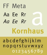
Visual Distinctive Characteristics
Characteristics of this typeface are:lower case:
square dot over the letter i.
double storey a.
upper case:
dropped horizontal element on A.
figures:
Development
Development began in February 1985 when Deutsche Bundespost approached Sedley Place DesignSedley Place
Sedley Place is an independent design agency based in Clapham, London and employees 35 designers, graphic artists, architects, web designers and account teams.-History:...
, where Spiekermann was working at the time, and commissioned a comprehensive corporate design program. As the typeface would be used repeatedly in small sizes, for identification (rather than copy
Copy (written)
Copy refers to written material, in contrast to photographs or other elements of layout, in a large number of contexts, including magazines, advertising, and book publishing....
), require two different weights, and printed quickly on potentially poor paper stock, the brief called for a very legible, neutral, space-saving, and distinguishable (in regards to weight) typeface with special attention to producing unmistakable characters. Whereas traditionally, typefaces are designed to be viewed beautifully large, the goal with this particular typeface was to produce a typeface which worked well for its primary application.
Taking into account research done on six font families and the constraints of the brief, the characteristics of what would become FF Meta began to take shape. The typeface would have to be a sans-serif to match the client, narrow (but not condensed) to save space, feature strokes thick enough to withstand uneven printing but also light so that individual characters do not run together, contain clearly distinguishable characters for similar shaped characters, versatile capitals and figures that are clear but not obtrusive, and curves, indentations, flares, and open joins to combat poor definition, optical illusions, and over-inking. In addition to these demands, to meet Bundespost's needs, the family would also contain three fonts: regular, regular italic, and bold.
After completing and digitizing the typesetting font, mockup
Mockup
In manufacturing and design, a mockup, or mock-up, is a scale or full-size model of a design or device, used for teaching, demonstration, design evaluation, promotion, and other purposes...
s were generated for Bundespost's new forms and publications however despite positive interest from the German Minister of Telecommunications among others, Bundespost decided not to implement the new exclusive typeface for fear it would "cause unrest." Bundespost, despite funding the project, continued instead to use a variety of different versions of Helvetica.
Releases
Years later, realizing that Bundespost and Sedley Place Design would never utilize the typeface, Spiekermann with his company MetaDesignMetaDesign
MetaDesign is an influential global design consultancy founded by Erik Spiekermann, Uli Mayer-Johanssen and Hans Ch. Krüger. The business has offices in Berlin, Beijing, Hamburg, Düsseldorf, Zurich and San Francisco and more than 330 employees....
decided to continue work on the typeface and eventually published it—along with other orphaned typefaces—under his newly formed publishing label FSI FontShop International
FSI FontShop International
FSI FontShop International is an international manufacturer of digital typefaces , based in Berlin and one of the large type foundries that exist today.All the typefaces are published as part of the FontFont library...
resulting in the release of FF Meta in 1991. This version of FF Meta was created by re-digitizing the original outlines and digitizing them in Fontographer
Fontographer
Fontographer , is a software application used to create digital fonts, available for both Microsoft Windows and Apple Macintosh platforms. It was originally developed by Altsys but is now owned by FontLab Ltd.-Fontastic:...
on a Macintosh
Macintosh
The Macintosh , or Mac, is a series of several lines of personal computers designed, developed, and marketed by Apple Inc. The first Macintosh was introduced by Apple's then-chairman Steve Jobs on January 24, 1984; it was the first commercially successful personal computer to feature a mouse and a...
, work which was done by Spiekermann’s interns Just van Rossum
Just van Rossum
Just van Rossum is a Dutch typeface designer and computer programmer.-Typeface design:Just van Rossum’s typefaces combination of programming and letterform design has resulted in several developments in typeface design. His typeface FF Beowolf used a random feature of the PostScript language to...
and Erik van Blokland between 1988-1989.
- 1991 FF Meta family released containing normal, normal small caps, and bold.
- 1992 FF Meta 2 released as an expansion adding an italics weight, and small caps for bold.
- 1993 FF MetaPlus released featuring some fine tuning of characters, spacing, and kerning along with the introducing three new weights: book, medium, and black in roman, italics, roman small caps, and roman small caps italics except for black which lacked small caps.
- 1998 FF Meta reorganized and released with the following families: FF Meta Normal, FF Meta Book, FF Meta Medium, FF Meta Bold and FF Meta Black, all in roman, italic, small caps and italic small caps, which came with their respective expert and lining figures.
- Sometime before 2005 foreign language versions by Tagir Safayev and Olga Chayeva., a condensed family, and additional light weights were added as: FF Meta Light, FF Meta Thin, and FF Meta Hairline.
- 2007 A serif companion, entitled FF Meta Serif, was completed and released.
Personnel
Although the design of FF Meta is attributed to Erik Spiekermann, design firms like Sedley Place Design often employ more than a single designer on a typeface project, what follows is a list of those involved in the development and subsequent further development.- Original sketches, concept, and research for FF Meta by Erik Spiekermann and Michael Bitter at Sedley Place Design, Berlin.
- Design of the completed alphabets by Gerry Barney and Mike Pratley at Sedley Place Design, London.