
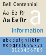
Bell Centennial
Encyclopedia
Bell Centennial is a sans-serif typeface designed by Matthew Carter
in the period 1975–8. The typeface was commissioned by AT&T as a proprietary type to replace their then current directory typeface Bell Gothic on the occasion of AT&T’s one hundredth anniversary. Carter was working for the Mergenthaler Linotype Company which now licenses the face for general public use.
, and reduce consumption of paper. Bell Centennial was designed to address and overcome most of the limitations of telephone directory printing: poor reproduction due to high-speed printing on newsprint, and ink spread which decayed legibility as it closed up counterforms. Carter's design increased the x-height of lowercase characters, slightly condensed the character width, and carved out many more open counters and bowls to increase legibility. To anticipate and blunt the degradation caused by ink spread, Carter drew the letters with deep ink trap
s, designed to fill in as the ink spread onto newsprint fiber, leaving the characters' counterforms open and legible at small point sizes.
Printed in the smaller point sizes used in telephone directories, the ink traps are not visible, having done their job; filling in and smoothing out the character stroke. However at larger point sizes, and on coated paper stock there is not enough ink spread to fill in the traps and the shape of the traps remain noticeable.
Bell Centennial is an example of a typeface designed to address a particular need, much like Chauncey H. Griffith's
Bell Gothic (AT&T's earlier telephone directory face); Adrian Frutiger's
Frutiger
, designed for signage at Charles De Gaulle Airport; or Erik Spiekermann's
FF Meta Sans
commissioned by the Deutsche Bundespost
(the German federal post office), but not adopted. Bell Centennial is only one of several typefaces Carter designed to address specific technical limitations, including CRT Gothic (1974), Video (1977), Georgia
(1996), and Verdana
(1996).
lower case:
square dot over the letter i.
double storey a.
upper case:
dropped horizontal element on A.
figures:
Matthew Carter
Matthew Carter is a type designer. He lives in Cambridge, Massachusetts, United States. Carter's career in type design has witnessed the transition from physical metal type to digital type...
in the period 1975–8. The typeface was commissioned by AT&T as a proprietary type to replace their then current directory typeface Bell Gothic on the occasion of AT&T’s one hundredth anniversary. Carter was working for the Mergenthaler Linotype Company which now licenses the face for general public use.
Design
AT&T’s brief called for a typeface that would fit substantially more characters per line without loss of legibility, dramatically reducing the need for abbreviations and two-line entries, increase legibility at the smaller point sizes used in a telephone directoryTelephone directory
A telephone directory is a listing of telephone subscribers in a geographical area or subscribers to services provided by the organization that publishes the directory...
, and reduce consumption of paper. Bell Centennial was designed to address and overcome most of the limitations of telephone directory printing: poor reproduction due to high-speed printing on newsprint, and ink spread which decayed legibility as it closed up counterforms. Carter's design increased the x-height of lowercase characters, slightly condensed the character width, and carved out many more open counters and bowls to increase legibility. To anticipate and blunt the degradation caused by ink spread, Carter drew the letters with deep ink trap
Ink trap
An ink trap is a feature of certain typefaces, where the corners or details are removed from the letterforms. When the type is printed, ink naturally spreads into the removed area. Without ink traps, the excess ink would blob and ruin the crisp edge....
s, designed to fill in as the ink spread onto newsprint fiber, leaving the characters' counterforms open and legible at small point sizes.
Printed in the smaller point sizes used in telephone directories, the ink traps are not visible, having done their job; filling in and smoothing out the character stroke. However at larger point sizes, and on coated paper stock there is not enough ink spread to fill in the traps and the shape of the traps remain noticeable.
Bell Centennial is an example of a typeface designed to address a particular need, much like Chauncey H. Griffith's
Chauncey H. Griffith
Chauncey H. Griffith , American printer and typeface designer. Griffith was born in the U.S. state of Ohio, and began his career as a compositor and pressman. In 1906 he joined the Mergenthaler Linotype Company as part of their sales force...
Bell Gothic (AT&T's earlier telephone directory face); Adrian Frutiger's
Adrian Frutiger
Adrian Frutiger is one of the prominent typeface designers of the 20th century, who continues to influence the direction of digital typography in the 21st century; he is best known for creating the typefaces Univers and Frutiger.-Early life:Adrian Frutiger was born in Unterseen, Canton of Bern, as...
Frutiger
Frutiger
Frutiger is a series of typefaces named after its designer, Adrian Frutiger. Initially available as a sans serif, it was later expanded to include ornamental and serif typefaces.-Distinctive characteristics:Characteristics of this typeface are:...
, designed for signage at Charles De Gaulle Airport; or Erik Spiekermann's
Erik Spiekermann
Erik Spiekermann is a German typographer and designer. He is a professor at the University of the Arts Bremen....
FF Meta Sans
FF Meta
FF Meta is a humanist sans-serif typeface family designed by Erik Spiekermann originally as a commission for the Deutsche Bundespost , but later released by Spiekermann himself in 1991 through his FontFont library...
commissioned by the Deutsche Bundespost
Deutsche Bundespost
The Deutsche Bundespost was created in 1947 as a successor to the Reichspost . Between 1947 and 1950 the enterprise was called Deutsche Post...
(the German federal post office), but not adopted. Bell Centennial is only one of several typefaces Carter designed to address specific technical limitations, including CRT Gothic (1974), Video (1977), Georgia
Georgia (typeface)
Georgia is a transitional serif typeface designed in 1993 by Matthew Carter and hinted by Tom Rickner for the Microsoft Corporation, as the serif companion to the first Microsoft sans serif screen font, Verdana. Microsoft released the initial version of the font on November 1, 1996 as part of the...
(1996), and Verdana
Verdana
Verdana is a humanist sans-serif typeface designed by Matthew Carter for Microsoft Corporation, with hand-hinting done by Thomas Rickner, then at Monotype. Demand for such a typeface was recognized by Virginia Howlett of Microsoft's typography group...
(1996).
Variants, and weight system
Bell Centennial's weight system differs from other faces in that weights are named for their specific uses in AT&T's telephone directories. The lightest weight, used for addresses is called Bell Centennial Address; a slightly heavier book weight is called Bell Centennial Caption; a demi weight, used for the entry name and telephone number, is called Bell Centennial Name and Number. A heavier bold weight, drawn as large and small capitals without a true lowercase, is called Bell Centennial Bold Listing. This nomenclature, while simplifying telephone book setting, perplexed some new users once the typeface family was released for general use by the Linotype foundry.Visual Distinctive Characteristics
Characteristics of this typeface are:lower case:
square dot over the letter i.
double storey a.
upper case:
dropped horizontal element on A.
figures: