
.gif)
Bell (typeface)
Encyclopedia
Sans-serif
In typography, a sans-serif, sans serif or san serif typeface is one that does not have the small projecting features called "serifs" at the end of strokes. The term comes from the French word sans, meaning "without"....
typeface
Typeface
In typography, a typeface is the artistic representation or interpretation of characters; it is the way the type looks. Each type is designed and there are thousands of different typefaces in existence, with new ones being developed constantly....
designed by Chauncey H. Griffith
Chauncey H. Griffith
Chauncey H. Griffith , American printer and typeface designer. Griffith was born in the U.S. state of Ohio, and began his career as a compositor and pressman. In 1906 he joined the Mergenthaler Linotype Company as part of their sales force...
in 1938 while heading the typographic development program at the Mergenthaler Linotype Company. The typeface was commissioned
John MacKay Shaw
John MacKay Shaw was a business executive, bibliophile, philanthropist, and writer. He was keenly interested in the tradition of poetry in the English language from the seventeenth through the twentieth centuries...
by AT&T as a proprietary typeface for use in telephone directories
Telephone directory
A telephone directory is a listing of telephone subscribers in a geographical area or subscribers to services provided by the organization that publishes the directory...
(and should not be confused with the Bell
Bell (Monotype)
Bell is a Scotch Roman typeface designed in 1788 by Richard Austin. After a short initial period of popularity, the face fell until disuse until it was revived in the 1930s, after which it enjoyed an enduring acceptance as a text face.-Visual Distinctive Characteristics:Characteristics of this...
typeface, designed for the British typefounder and publisher John Bell (1746-1831) by the punchcutter
Punchcutting
In traditional typography, punchcutting is the craft of cutting letter punches in steel from which matrices were made in copper for type founding in the letterpress era. Cutting punches and casting type was the first step of traditional typesetting. The cutting of letter punches was a highly...
Richard Austin). Bell Gothic was superseded by Matthew Carter
Matthew Carter
Matthew Carter is a type designer. He lives in Cambridge, Massachusetts, United States. Carter's career in type design has witnessed the transition from physical metal type to digital type...
's typeface Bell Centennial
Bell Centennial
Bell Centennial is a sans-serif typeface designed by Matthew Carter in the period 1975–8. The typeface was commissioned by AT&T as a proprietary type to replace their then current directory typeface Bell Gothic on the occasion of AT&T’s one hundredth anniversary...
in 1978, the one hundredth anniversary of AT&T's founding.
Design
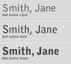
Earlier in Griffith's career at Mergenthaler Linotype, he had developed a highly successful newspaper text face called Excelsior which overcame many of the limitations of printing smaller point sizes on low quality newsprint. This contributed to his addressing similar limitations of telephone book printing. Bell Gothic was designed to be highly legible at small sizes, economical in its use of space (and hence paper), and reproduce well on uncoated, absorbent paper newsprint stock under less than optimal conditions. Griffith's face Bell Gothic is distinct for the cross bars on the uppercase I, the foot and cross bar on figure 1, and the angled terminus of the stroke on characters b, d, h, k, l, n, p, and q. While there are suggestions of an ink trapInk trap
An ink trap is a feature of certain typefaces, where the corners or details are removed from the letterforms. When the type is printed, ink naturally spreads into the removed area. Without ink traps, the excess ink would blob and ruin the crisp edge....
in several characters, they are minimal in comparison to the exaggerated ones found in Bell Centennial.
Evolution of use
Bell Gothic remained in uninterrupted use for AT&T telephone directories for forty years. Following AT&T's adoption of Bell Centennial, the Mergenthaler Linotype foundry licensed Bell Gothic for general use. Beginning in the early 1990s Bell Gothic became popular and associated with avant garde experimentation with type at places like the Cranbrook Academy of Art, the Design Academy Eindhoven in the Netherlands, and RISD. The typeface was used as a display and caption face by Metropolis magazine, by Canadian graphic designer Bruce MauBruce Mau
Bruce Mau is a Canadian designer. Mau is the creative director of Bruce Mau Design, and the founder of the Institute without Boundaries.-Life and career:...
in designing the initial ZONE book series, Dutch graphic designer Irma Boom
Irma Boom
Irma Boom is an Amsterdam-based graphic designer who specializes in book making. With her use of unfamiliar formats, materials, colors, structures, and typography. Boom turns books into a visual and haptic experience. Boom has established an international reputation, according to an interview in...
, and has been widely used by Semiotext(e)
Semiotext(e)
Semiotext is an American independent publisher. It is widely credited for having introduced so-called "French Theory" to North America through its magazine issues and Foreign Agents series. In 2000, the MIT Press began distributing Semiotext, taking it over from the anarchist publishing collective...
Books, the MIT Press
MIT Press
The MIT Press is a university press affiliated with the Massachusetts Institute of Technology in Cambridge, Massachusetts .-History:...
, and Dia Art Foundation
Dia Art Foundation
Dia Art Foundation is a non-profit organization that initiates, supports, presents, and preserves art projects. It was established in 1974 as the Lone Star Foundation by Philippa de Menil, the daughter of Houston arts patron Dominique de Menil and an heiress to the Schlumberger oil exploration...
.