

Samples of display typefaces
Encyclopedia
The list of samples of display typefaces summarises the principal fonts used in screen display of characters. The accurate identification of display typefaces is critical in graphic design
, web design
and forensic computing.
Graphic design
Graphic design is a creative process – most often involving a client and a designer and usually completed in conjunction with producers of form – undertaken in order to convey a specific message to a targeted audience...
, web design
Web design
Web design is the process of planning and creating a website. Text, images, digital media and interactive elements are used by web designers to produce the page seen on the web browser...
and forensic computing.
| Name | Example 1 | Example 2 | Example 3 |
|---|---|---|---|
| Ad lib Ad Lib (typeface) Ad Lib is a decorative typeface that was designed in 1961 by Freeman Craw. It was extremely popular from the early- to mid-1960s, and is often used today to evoke that era.It was used in the Pink Panther titles.See also: Samples of display typefaces... |
— | ||
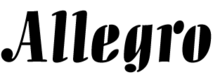
| Allegro Allegro (typeface) Allegro is a display typeface that was designed by Hans Bohn for the Ludwig & Mayer type foundry in 1936. Its unusual design suggests both musical notes and stenciled letters. It was common in commercial design in the mid–20th Century, but is seldom used today. It is only available in a... |
 |
 |
— |
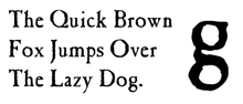
| Andreas Andreas (typeface) Andreas is a humanist serif typeface designed by Michael Harvey, and licensed from the Adobe Type library. Harvey drew the lettering in 1988 as part of the book-jacket design for James F. Peck's book In the Studios of Paris: William Bouguereau and His American Students, a Yale University Press... |
 |
 |
— |
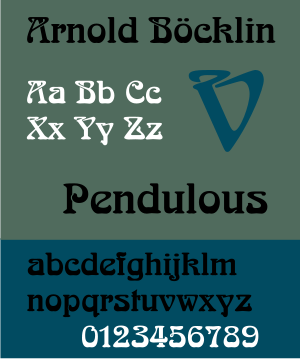
| Arnold Böcklin Arnold Böcklin (typeface) Arnold Böcklin is a display typeface that was designed in 1904 by Schriftgiesserei Otto Weisert foundry. It was named in memory of Arnold Böcklin, a Swiss symbolist painter who died in 1901.It is probably the best-known Art Nouveau typeface.... |
 |
||
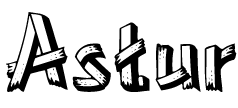
| Astur Astur (typeface) Astur is a decorative typeface that was designed in 1940 and licensed by the Spanish foundry Nacional Typefoundry. The letters appear to be made of wooden planks, and it is often used when an outdoor or camping look is desired... |
 |
 |
— |
| Banco Banco (typeface) Banco is an inclined titling typeface. It was designed by Roger Excoffon for the Fonderie Olive foundry in 1951. Excoffon did not design a matching lower case alphabet for the capitals.... |
 |
 |
— |
| Bauhaus | — | — | — |
| Braggadocio Braggadocio (typeface) Braggadocio is a geometrically constructed sans-serif stencil typeface designed by W.A. Woolley in 1930 for the Monotype Corporation. The design was based on Futura Black.... |
— | — | 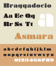 |
| Broadway Broadway (typeface) Broadway is a decorative typeface, perhaps the archetypal Art Deco typeface. The original face was designed by Morris Fuller Benton in 1927 for ATF as a capitals only display face. It had a long initial run of popularity, before being discontinued by ATF in 1954. It was re-discovered in the Cold... |
 |
 |
 |
| Caslon Antique Caslon Antique Caslon Antique is a decorative American typeface that was designed in 1894 by Berne Nadall. It was originally called "Fifteenth Century", but was renamed "Caslon Antique" by Nadall's foundry, Barnhart Bros. & Spindler, in the mid-1920s.... |
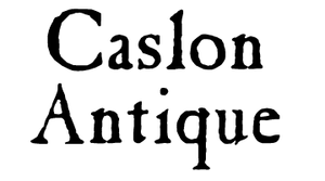 |
 |
— |
| Chiller Chiller (typeface) Chiller is a decorative style font, with a dangerous and reckless look, however it is very legible. It is currently supported by all major browsers.... |
— | — | — |
| Cooper Black Cooper Black Cooper Black is a heavily weighted, old style serif typeface designed by Oswald Bruce Cooper in 1921 and released by the Barnhart Brothers & Spindler type foundry in 1922. The typeface is drawn as an extra bold weight of Cooper Old Style. Though not based on a single historic model, Cooper Black... |
— | — | 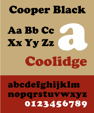 |
| Curlz Curlz Curlz is a whimsical serif typeface designed by Carl Crossgrove and Steve Matteson in 1995 for Agfa Monotype. While decorative and without a historical model, the face bears comparison with the Emigre foundry's 1991 typeface Remedy designed by Frank Heine.A TrueType version of Curlz shipped as part... |
— | — | 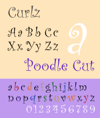 |
| Ellington Ellington (typeface) Ellington is a display typeface designed by Michael Harvey licensed from Monotype. It was designed in 1990 and it is named after Duke Ellington. The face has a large x-height and combines features of a modern serif typefaces with calligraphic elements.... |
 |
 |
— |
| Exocet Exocet (typeface) Exocet is a typeface designed by Jonathan Barnbrook for the Emigre foundry in 1991. It was originally designed for the European annual Illustration Now. It was used extensively for product designs in the 1990s, most notably for Tazo Tea. It can be seen in the 1993 movie Demolition Man where it is... |
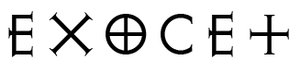 |
 |
— |
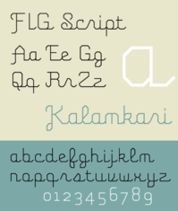
| FIG Script FIG Script FIG Script is a script typeface designed by Eric Olson in 2002 for Process Type Foundry, a digital foundry which he co-founded.The name FIG is an acronym for "Frank , Ian , and Glenn who collaborated in the development of the FIGlet computer program developed to generates text banners, in a... |
— | — |  |
| Forte | — | — | |
| Gigi | — | — | — |
| Harlow Solid | — | — | — |
| Harrington | — | — | — |
| Horizon | .png) |
— | — |
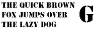
| Jim Crow Jim Crow (typeface) Jim Crow is the American Type Founders' 1933 and 1949 re-casting of the Dickinson Type Foundry's type of the 1850s, Gothic Shade. Dickenson, a Boston type foundry, had been incorporated into ATF in the original merger of 1892. The face was also known as Tombstone. ATF only cast the face in 24... |
 |
 |
— |
| Jokerman | — | — | — |
| Juice | — | — | — |
| Lo-Type Lo-Type Lo-Type is a display typeface originally designed by Louis Oppenheim. Oppenheim named the font using his own initials which he also used to sign his work. Oppenheim designed the avant-garde Lo-Type for Berthold during 1911–1914 under the influence of the emerging modernist era, thus participating... |
 |
 |
— |
| Magneto | — | — | — |
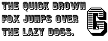
| Megadeth |  |
— | — |
| Neuland Neuland Neuland is a German typeface that was designed in 1923 by Rudolf Koch.Koch designed it by directly carving the type into metal. The original typeface thus had a great deal of variance between the sizes... |
 |
  |
— |
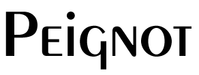
| Peignot Peignot Peignot is constructed sans-serif display typeface, designed by A. M. Cassandre in 1937. It was commissioned by the French foundry Deberny & Peignot. The typeface is notable for not having a traditional lowercase, but in its place a "multi-case" combining traditional lowercase and small capital... |
 |
 |
— |
| Ravie | — | — | — |
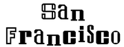
| San Francisco San Francisco (typeface) San Francisco was one of the original bitmap typefaces for the Apple Macintosh computer. It was designed by Susan Kare to mimic the ransom note effect. An official TrueType version was never made, and San Francisco was rendered obsolete with the arrival of System 7., by Hank Gillette, is a free... |
 |
 |
— |
| Showcard Gothic | — | — | — |
| Snap | — | — | — |
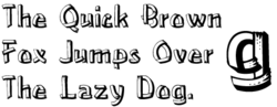
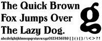
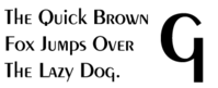
| Stencil Stencil (typeface) Stencil refers to two typefaces released within months of each other in 1937. The face created byR. Hunter Middleton for Ludlow was advertised in June, while Gerry Powell's version for American Type Founders appeared one month later... |
 |
 |
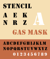 |
| Umbra Umbra (typeface) Umbra is a sans-serif display typeface designed in 1935 by R. Hunter Middleton. It is an adaptation of the uppercase set of his earlier typeface Tempo Light. The name Umbra refers to its shadow effect, in which the actual letter shape consists of negative space and is defined solely by its black... |
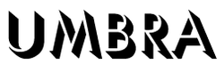 |
 |
— |
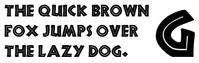
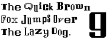
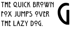
| Westminster Westminster (typeface) Westminster is a printing and display typeface designed to be read by computers. It was created in the 1960s and is named after the then Westminster Bank Limited , the United Kingdom bank that helped fund its production... |
— | — | |
| Willow Willow (typeface) -ITC Willow:ITC Willow was designed by Tony Forster in 1990. Although a contemporary typeface, Willow is the reminiscent of the Scottish Arts and Crafts style made popular by painter and social reformer Jessie Marion King , and architect and designer Charles Rennie Mackintosh of the Glasgow School... |
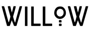 |
 |
— |
| Windsor Windsor (typeface) Windsor is an old style serif display typeface created in 1905 by Elisha Pechey for the Stephenson Blake type foundry. Capitals M and W are widely splayed, P and R have very large upper bowls. The Lowercase a, h, m and n of the Windsor font have angled right hand stems, e has an angled cross-stroke... |
— | — | — |
See also
- Samples of monospaced typefacesSamples of Monospaced typefacesThis is a list with samples of monospaced fonts.-See also:*Samples of display typefaces*Samples of simulation typefaces*Samples of sans serif typefaces*Samples of script typefaces*Samples of serif typefaces...
- Samples of sans serif typefacesSamples of Sans Serif typefaces-List:* Agency * ITC Avant Garde* Berlin Sans* Countdown * Espy Sans* Estrangelo Edessa* Gautami** Denmark* Kartika * Latha...
- Samples of script typefacesSamples of Script typefaces-Calligraphic:-Handwriting:-See also:*Fixedsys*Samples of display typefaces*Samples of monospaced typefaces*Samples of simulation typefaces*Samples of sans serif typefaces*Samples of serif typefaces...
- Samples of serif typefacesSamples of Serif typefacesThis list of samples of Serif typefaces details standard fonts used in printing, classical typesetting and printing. For a list of the principal serif fonts used in mainstream graphical user interfaces, such as – for example – GNOME on Linux, see Samples of display typefaces, although in reality...
- Samples of simulation typefacesSamples of simulation typefacesA simulation typeface is one designed after a unique or stereotypical aspect of the letterforms or scripts of a different language.-See also:*Faux Cyrillic*Typeface*Samples of display typefaces*Samples of monospaced typefaces...