

Radar chart
Encyclopedia
Data
The term data refers to qualitative or quantitative attributes of a variable or set of variables. Data are typically the results of measurements and can be the basis of graphs, images, or observations of a set of variables. Data are often viewed as the lowest level of abstraction from which...
in the form of a two-dimensional chart
Chart
A chart is a graphical representation of data, in which "the data is represented by symbols, such as bars in a bar chart, lines in a line chart, or slices in a pie chart"...
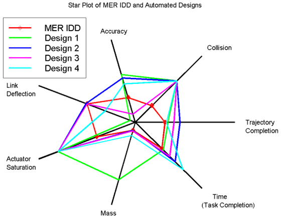
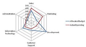
of three or more quantitative variables represented on axes starting from the same point. The relative position and angle of the axes is typically uninformative.
The radar chart is also known as web chart, spider chart, star chart,star plot, cobweb chart, irregular polygon, polar chart, or kiviat diagram.
Overview
The radar chart is a chartChart
A chart is a graphical representation of data, in which "the data is represented by symbols, such as bars in a bar chart, lines in a line chart, or slices in a pie chart"...
and/or plot
Plot (graphics)
A plot is a graphical technique for representing a data set, usually as a graph showing the relationship between two or more variables. The plot can be drawn by hand or by a mechanical or electronic plotter. Graphs are a visual representation of the relationship between variables, very useful for...
that consists of a sequence of equi-angular spokes, called radii, with each spoke representing one of the variables. The data length of a spoke is proportional to the magnitude of the variable for the data point relative to the maximum magnitude of the variable across all data points. A line is drawn connecting the data values for each spoke. This gives the plot a star-like appearance and the origin of one of the popular names for this plot. The star plot can be used to answer the following questions:
- Which observations are most similar, i.e., are there clusters of observations? (Radar charts are used to examine the relative values for a single data point (e.g., point 3 is large for variables 2 and 4, small for variables 1, 3, 5, and 6) and to locate similar points or dissimilar points.)
- Are there outliers?
Radar charts are a useful way to display multivariate observations with an arbitrary number of variables. Each star represents a single observation. Typically, radar charts are generated in a multi-plot format with many stars on each page and each star representing one observation. The star plot was first used by Georg von Mayr in 1877. Radar charts differ from glyph plots in that all variables are used to construct the plotted star figure. There is no separation into foreground and background variables. Instead, the star-shaped figures are usually arranged in a rectangular array on the page. It is somewhat easier to see patterns in the data if the observations are arranged in some non-arbitrary order (if the variables are assigned to the rays of the star in some meaningful order).
Application
One application of radar charts is the control of quality improvementQuality management
The term Quality management has a specific meaning within many business sectors. This specific definition, which does not aim to assure 'good quality' by the more general definition , can be considered to have four main components: quality planning, quality control, quality assurance and quality...
to display the performance metrics of any ongoing program.
They are also being used in sports to chart players' strengths and weaknesses, where they are usually called spider charts.
Further, radar charts are visually striking, and can add interest to what would otherwise be a dry data presentation.
Limitations
Radar charts are primarily suited for strikingly showing outlierOutlier
In statistics, an outlier is an observation that is numerically distant from the rest of the data. Grubbs defined an outlier as: An outlying observation, or outlier, is one that appears to deviate markedly from other members of the sample in which it occurs....
s and commonality
Commonality
Aviation commonality describes the economic and logistic benefits of operating a standardized fleet of aircraft that share common parts, training requirements, or other characteristics. Commonality lowers the cost of operating a fleet of aircraft by reducing the quantity and variety of spare parts...
, or when one chart is greater in every variable than another, and primarily used for ordinal measurements – where each variable corresponds to "better" in some respect, and all variables on the same scale.
Conversely, radar charts have been criticized as poorly suited for making trade-off decisions – when one chart is greater than another on some variables, but less on others.
Further, it is hard to visually compare lengths of different spokes, because radial distances are hard to judge, though concentric circles help as grid lines. Instead, one may use a simple line graph, particularly for time series.
Example
The chart on the right contains the star plots of 15 carČar
Čar is a village in the municipality of Bujanovac, Serbia. According to the 2002 census, the town has a population of 296 people.-References:...
s. The variable list for the sample star plot is:
- Price
- Mileage (MPG)
- 1978 Repair Record (1 = Worst, 5 = Best)
- 1977 Repair Record (1 = Worst, 5 = Best)
- Headroom
- Rear Seat Room
- Trunk Space
- Weight
- Length
We can look at these plots individually or we can use them to identify clusters of cars with similar features. For example, we can look at the star plot of the Cadillac Seville (the last one on the image) and see that it is one of the most expensive cars, gets below average (but not among the worst) gas mileage, has an average repair record, and has average-to-above-average roominess and size. We can then compare the Cadillac
Cadillac
Cadillac is an American luxury vehicle marque owned by General Motors . Cadillac vehicles are sold in over 50 countries and territories, but mostly in North America. Cadillac is currently the second oldest American automobile manufacturer behind fellow GM marque Buick and is among the oldest...
models (the last three plots) with the AMC models (the first three plots). This comparison shows distinct patterns. The AMC models tend to be inexpensive, have below average gas mileage, and are small in both height and weight and in roominess. The Cadillac models are expensive, have poor gas mileage, and are large in both size and roominess.
Artificial structure
Radar charts impose several structures on data, which are often artificial:- Relatedness of neighbors – radar charts are often used when neighboring variables are unrelated, creating spurious connections.
- Cyclic structure – the first and last variables are placed next to each other.
- Length – variables are often most naturally ordinal: better or worse, though the degree of difference may be artificial.
- Area – area scales as the square of values, exaggerating the effect of large numbers. For example, 2, 2 takes up 4 times the area of 1, 1. This is a general issue with area graphs, and area is hard to judge – see "Cleveland's hierarchy".
For example, the alternating data 9, 1, 9, 1, 9, 1 yields a spiking radar chart (which goes in and out), while reordering the data as 9, 9, 9, 1, 1, 1 instead yields two distinct wedges (sectors).
In some cases there is a natural structure, and radar charts can be well-suited. For example, for diagrams of data that vary over a 24-hour cycle, the hourly data is naturally related to its neighbor, and has a cyclic structure, so it can naturally be displayed as a radar chart.
One set of guidelines on the use of radar charts (or rather the closely related "polar area graph" is:
- you don't mind reading stacked areas instead of position along a common scale (see Cleveland's Hierarchy),
- the data set is truly cyclic, not linear, and
- there are two series to compare, one much smaller than the other
Data set size
Radar charts are helpful for small-to-moderate-sized multivariate data setData set
A data set is a collection of data, usually presented in tabular form. Each column represents a particular variable. Each row corresponds to a given member of the data set in question. Its values for each of the variables, such as height and weight of an object or values of random numbers. Each...
s. Their primary weakness is that their effectiveness is limited to data sets with less than a few hundred points. After that, they tend to be overwhelming.
Alternatives
Most simply, one may use a simple line graph, particularly for time series.For graphical qualitative comparison of 2-dimensional tabular data in several variables, a common alternative are Harvey Balls
Harvey Balls
Harvey Balls are round ideograms used for visual communication of qualitative information. They are commonly used in comparison tables to indicate the degree to which a particular item meets a particular criterion....
, which are used extensively by Consumer Reports
Consumer Reports
Consumer Reports is an American magazine published monthly by Consumers Union since 1936. It publishes reviews and comparisons of consumer products and services based on reporting and results from its in-house testing laboratory. It also publishes cleaning and general buying guides...
. Comparison in Harvey Balls (and radar charts) may be significantly aided by ordering the variables algorithmically to add order.
An excellent way for visualising structures within multivariate data is offered by principal component analysis (PCA).
Another alternative is to use small, inline bar charts, which may be compared to sparkline
Sparkline
A sparkline is a type of information graphic characterized by its small size and high data density. Sparklines present trends and variations associated with some measurement, such as average temperature or stock market activity, in a simple and condensed way...
s.