

Plot (graphics)
Encyclopedia
Data set
A data set is a collection of data, usually presented in tabular form. Each column represents a particular variable. Each row corresponds to a given member of the data set in question. Its values for each of the variables, such as height and weight of an object or values of random numbers. Each...
, usually as a graph
Graph of a function
In mathematics, the graph of a function f is the collection of all ordered pairs . In particular, if x is a real number, graph means the graphical representation of this collection, in the form of a curve on a Cartesian plane, together with Cartesian axes, etc. Graphing on a Cartesian plane is...
showing the relationship between two or more variables. The plot can be drawn by hand or by a mechanical or electronic plotter
Plotter
A plotter is a computer printing device for printing vector graphics. In the past, plotters were widely used in applications such as computer-aided design, though they have generally been replaced with wide-format conventional printers...
. Graphs are a visual representation of the relationship between variables, very useful for humans who can quickly derive an understanding which would not come from lists of values. Graphs can also be used to read off the value of an unknown variable plotted as a function of a known one. Graphs of functions are used in mathematics
Mathematics
Mathematics is the study of quantity, space, structure, and change. Mathematicians seek out patterns and formulate new conjectures. Mathematicians resolve the truth or falsity of conjectures by mathematical proofs, which are arguments sufficient to convince other mathematicians of their validity...
, the science
Science
Science is a systematic enterprise that builds and organizes knowledge in the form of testable explanations and predictions about the universe...
s, engineering
Engineering
Engineering is the discipline, art, skill and profession of acquiring and applying scientific, mathematical, economic, social, and practical knowledge, in order to design and build structures, machines, devices, systems, materials and processes that safely realize improvements to the lives of...
, technology
Technology
Technology is the making, usage, and knowledge of tools, machines, techniques, crafts, systems or methods of organization in order to solve a problem or perform a specific function. It can also refer to the collection of such tools, machinery, and procedures. The word technology comes ;...
, finance
Finance
"Finance" is often defined simply as the management of money or “funds” management Modern finance, however, is a family of business activity that includes the origination, marketing, and management of cash and money surrogates through a variety of capital accounts, instruments, and markets created...
, and other areas.
Overview
Plots play an important role in statisticsStatistics
Statistics is the study of the collection, organization, analysis, and interpretation of data. It deals with all aspects of this, including the planning of data collection in terms of the design of surveys and experiments....
and data analysis
Data analysis
Analysis of data is a process of inspecting, cleaning, transforming, and modeling data with the goal of highlighting useful information, suggesting conclusions, and supporting decision making...
. The procedures here can broadly be split into two parts: quantitative and graphical. Quantitative techniques are the set of statistical procedures that yield numeric or tabular output. Examples of quantitative techniques include:
- hypothesisHypothesisA hypothesis is a proposed explanation for a phenomenon. The term derives from the Greek, ὑποτιθέναι – hypotithenai meaning "to put under" or "to suppose". For a hypothesis to be put forward as a scientific hypothesis, the scientific method requires that one can test it...
testing - analysis of varianceRegression analysisIn statistics, regression analysis includes many techniques for modeling and analyzing several variables, when the focus is on the relationship between a dependent variable and one or more independent variables...
- point estimates and confidence intervalConfidence intervalIn statistics, a confidence interval is a particular kind of interval estimate of a population parameter and is used to indicate the reliability of an estimate. It is an observed interval , in principle different from sample to sample, that frequently includes the parameter of interest, if the...
s - least squares regression
These and similar techniques are all valuable and are mainstream in terms of classical analysis. There are also many statistical tools generally referred to as graphical techniques. These include:
- scatter plots
- histogramHistogramIn statistics, a histogram is a graphical representation showing a visual impression of the distribution of data. It is an estimate of the probability distribution of a continuous variable and was first introduced by Karl Pearson...
s - probability plotProbability plotIn statistics, a P-P plot is a probability plot for assessing how closely two data sets agree, which plots the two cumulative distribution functions against each other....
s - residual plots
- box plotBox plotIn descriptive statistics, a box plot or boxplot is a convenient way of graphically depicting groups of numerical data through their five-number summaries: the smallest observation , lower quartile , median , upper quartile , and largest observation...
s, and - block plots
Graphical procedures such as plots are a short path to gaining insight into a data set in terms of testing assumptions, model selection, model validation, estimator selection, relationship identification, factor effect determination, outlier detection. Statistical graphics give insight into aspects of the underlying structure of the data.
Graphs can also be used to solve some mathematical equations, typically by finding where two plots intersect
Line-line intersection
In Euclidean geometry, the intersection of a line and a line can be the empty set,a point, ora line. Distinguishing these cases, and finding the intersection point have use, for example, in computer graphics, motion planning, and collision detection....
.
Types of plots
- Arrhenius plotArrhenius plotAn Arrhenius plot displays the logarithm of kinetic constants plotted against inverse temperature . Arrhenius plots are often used to analyze the effect of temperature on the rates of chemical reactions...
: This plot displays the logarithm of a rate ( , ordinateOrdinateIn mathematics, ordinate refers to that element of an ordered pair which is plotted on the vertical axis of a two-dimensional Cartesian coordinate system, as opposed to the abscissa...
axis) plotted against inverse temperature ( , abscissaAbscissaIn mathematics, abscissa refers to that element of an ordered pair which is plotted on the horizontal axis of a two-dimensional Cartesian coordinate system, as opposed to the ordinate...
). Arrhenius plots are often used to analyze the effect of temperature on the rates of chemical reactions.
- BiplotBiplotBiplots are a type of exploratory graph used in statistics, a generalization of the simple two-variable scatterplot. A biplot allows information on both samples and variables of a data matrix to be displayed graphically. Samples are displayed as points while variables are displayed either as...
: These are a type of graph used in statistics. A biplot allows information on both samples and variables of a data matrix to be displayed graphically. Samples are displayed as points while variables are displayed either as vectors, linear axes or nonlinear trajectories. In the case of categorical variables, category level points may be used to represent the levels of a categorical variable. A generalised biplot displays information on both continuous and categorical variables.
- Bland-Altman plotBland-Altman plotA Bland-Altman plot in analytical chemistry and biostatistics is a method of data plotting used in analyzing the agreement between two different assays. It is identical to a Tukey mean-difference plot, which is what it is still known as in other fields, but was popularised in medical statistics by...
: In analytical chemistry and biostatistics this plot is a method of dataDataThe term data refers to qualitative or quantitative attributes of a variable or set of variables. Data are typically the results of measurements and can be the basis of graphs, images, or observations of a set of variables. Data are often viewed as the lowest level of abstraction from which...
plotting used in analysing the agreement between two different assayAssayAn assay is a procedure in molecular biology for testing or measuring the activity of a drug or biochemical in an organism or organic sample. A quantitative assay may also measure the amount of a substance in a sample. Bioassays and immunoassays are among the many varieties of specialized...
s. It is identical to a Tukey mean-difference plot, which is what it is still known as in other fields, but was popularised in medical statistics by Bland and Altman.
- Bode plotBode plotA Bode plot is a graph of the transfer function of a linear, time-invariant system versus frequency, plotted with a log-frequency axis, to show the system's frequency response...
s are used in control theoryControl theoryControl theory is an interdisciplinary branch of engineering and mathematics that deals with the behavior of dynamical systems. The desired output of a system is called the reference...
.
- Box plotBox plotIn descriptive statistics, a box plot or boxplot is a convenient way of graphically depicting groups of numerical data through their five-number summaries: the smallest observation , lower quartile , median , upper quartile , and largest observation...
: In descriptive statistics, a boxplot, also known as a box-and-whisker diagram or plot, is a convenient way of graphically depicting groups of numerical data through their five-number summariesFive-number summaryThe five-number summary is a descriptive statistic that provides information about a set of observations. It consists of the five most important sample percentiles:# the sample minimum # the lower quartile or first quartile...
(the smallest observation, lower quartile (Q1), median (Q2), upper quartile (Q3), and largest observation). A boxplot may also indicate which observations, if any, might be considered outliers.
- Dalitz plotDalitz plotThe Dalitz plot is a scatterplot often used in particle physics to represent the relative frequency of various manners in which the products of certain three-body decays may move apart....
: This a scatterplotScatterplotA scatter plot or scattergraph is a type of mathematical diagram using Cartesian coordinates to display values for two variables for a set of data....
often used in particle physics to represent the relative frequency of various (kinematically distinct) manners in which the products of certain (otherwise similar) three-body decays may move apart
- Funnel plotFunnel plotA funnel plot is a useful graph designed to check the existence of publication bias in systematic reviews and meta-analyses. It assumes that the largest studies will be near the average, and small studies will be spread on both sides of the average...
: This is a useful graph designed to check the existence of publication bias in meta-analyses. Funnel plots, introduced by Light and Pillemer in 1994 and discussed in detail by Egger and colleagues, are useful adjuncts to meta-analyses. A funnel plot is a scatterplotScatterplotA scatter plot or scattergraph is a type of mathematical diagram using Cartesian coordinates to display values for two variables for a set of data....
of treatment effect against a measure of study size. It is used primarily as a visual aid to detecting bias or systematic heterogeneityStudy heterogeneityIn statistics, study heterogeneity is a problem that can arise when attempting to undertake a meta-analysis. Ideally, the studies whose results are being combined in the meta-analysis should all be undertaken in the same way and to the same experimental protocols: study heterogeneity is a term used...
.
- Dot plot (bioinformatics)Dot plot (bioinformatics)A dot plot is a graphical method that allows the comparison of two biological sequences and identify regions of close similarity between them. It is a kind of recurrence plot.-Introduction:...
: A dot plot is a graphical method that allows the comparison of two biological sequences and identify regions of close similarity between them. It is a kind of recurrence plotRecurrence plotIn descriptive statistics and chaos theory, a recurrence plot is a plot showing, for a given moment in time, the times at which a phase space trajectory visits roughly the same area in the phase space...
.
- Dot plot (statistics)Dot plot (statistics)A dot chart or dot plot is a statistical chart consisting of data points plotted on a simple scale, typically using filled in circles. There are two common, yet very different, versions of the dot chart. The first is described by Wilkinson as a graph that has been used in hand-drawn graphs to...
: A dot chart or dot plot is a statisticalStatisticsStatistics is the study of the collection, organization, analysis, and interpretation of data. It deals with all aspects of this, including the planning of data collection in terms of the design of surveys and experiments....
chart consisting of group of data points plotted on a simple scale. Dot plots are used for continuousContinuous functionIn mathematics, a continuous function is a function for which, intuitively, "small" changes in the input result in "small" changes in the output. Otherwise, a function is said to be "discontinuous". A continuous function with a continuous inverse function is called "bicontinuous".Continuity of...
, quantitative, univariateUnivariateIn mathematics, univariate refers to an expression, equation, function or polynomial of only one variable. Objects of any of these types but involving more than one variable may be called multivariate...
data. Data points may be labelled if there are few of them. Dot plots are one of the simplest plots available, and are suitable for small to moderate sized data sets. They are useful for highlighting clusters and gaps, as well as outlierOutlierIn statistics, an outlier is an observation that is numerically distant from the rest of the data. Grubbs defined an outlier as: An outlying observation, or outlier, is one that appears to deviate markedly from other members of the sample in which it occurs....
s.
- Forest plotForest plotA forest plot is a graphical display designed to illustrate the relative strength of treatment effects in multiple quantitative scientific studies addressing the same question. It was developed for use in medical research as a means of graphically representing a meta-analysis of the results of...
: is a graphical display that shows the strength of the evidence in quantitative scientific studies. It was developed for use in medical research as a means of graphically representing a meta-analysisMeta-analysisIn statistics, a meta-analysis combines the results of several studies that address a set of related research hypotheses. In its simplest form, this is normally by identification of a common measure of effect size, for which a weighted average might be the output of a meta-analyses. Here the...
of the results of randomized controlled trials. In the last twenty years, similar meta-analytical techniques have been applied in observational studies (e.g. environmental epidemiologyEnvironmental epidemiologyEnvironmental epidemiology is the branch of epidemiology concerned with discovery of the environmental exposures that contribute to or protect against injuries, illnesses, developmental conditions, disabilities, and deaths; and identification of public health and health care actions to avoid,...
) and forest plots are often used in presenting the results of such studies also.
- Galbraith plotGalbraith plotIn statistics, a Galbraith plot , is one way of displaying several estimates of the same quantity that have different standard errors....
: In statistics, a Galbraith plot (also known as Galbraith's radial plot or just radial plot), is one way of displaying several estimates of the same quantity that have different standard errorStandard errorStandard error can refer to:* Standard error , the estimated standard deviation or error of a series of measurements* Standard error stream, one of the standard streams in Unix-like operating systems...
s. It can be used to examine heterogeneity in a meta-analysis, as an alternative or supplement to a forest plotForest plotA forest plot is a graphical display designed to illustrate the relative strength of treatment effects in multiple quantitative scientific studies addressing the same question. It was developed for use in medical research as a means of graphically representing a meta-analysis of the results of...
.
- Lineweaver–Burk plot : plot is used to represent and determine enzyme kineticsEnzyme kineticsEnzyme kinetics is the study of the chemical reactions that are catalysed by enzymes. In enzyme kinetics, the reaction rate is measured and the effects of varying the conditions of the reaction investigated...
.
- Nichols plot : This is a graph used in signal processingSignal processingSignal processing is an area of systems engineering, electrical engineering and applied mathematics that deals with operations on or analysis of signals, in either discrete or continuous time...
in which the logarithmLogarithmThe logarithm of a number is the exponent by which another fixed value, the base, has to be raised to produce that number. For example, the logarithm of 1000 to base 10 is 3, because 1000 is 10 to the power 3: More generally, if x = by, then y is the logarithm of x to base b, and is written...
of the magnitude is plotted against the phase of a frequency responseFrequency responseFrequency response is the quantitative measure of the output spectrum of a system or device in response to a stimulus, and is used to characterize the dynamics of the system. It is a measure of magnitude and phase of the output as a function of frequency, in comparison to the input...
on orthogonal axes.
- Normal probability plotNormal probability plotThe normal probability plot is a graphical technique for normality testing: assessing whether or not a data set is approximately normally distributed....
: The normal probability plot is a graphical technique for assessing whether or not a data setData setA data set is a collection of data, usually presented in tabular form. Each column represents a particular variable. Each row corresponds to a given member of the data set in question. Its values for each of the variables, such as height and weight of an object or values of random numbers. Each...
is approximately normally distributed. The data are plotted against a theoretical normal distribution in such a way that the points should form an approximate straight line. Departures from this straight line indicate departures from normality. The normal probability plot is a special case of the probability plotProbability plotIn statistics, a P-P plot is a probability plot for assessing how closely two data sets agree, which plots the two cumulative distribution functions against each other....
.
- Nyquist plotNyquist plotA Nyquist plot is a parametric plot of a transfer function used in automatic control and signal processing. The most common use of Nyquist plots is for assessing the stability of a system with feedback. In Cartesian coordinates, the real part of the transfer function is plotted on the X axis. The...
: Plot is used in automatic controlAutomatic controlAutomatic control is the application of concepts derived from the research area of modern control theory. Automatic control is also a technology for application of control strategies. The implementing requires prior of analyzing and modeling of the subject to be controlled...
and signal processingSignal processingSignal processing is an area of systems engineering, electrical engineering and applied mathematics that deals with operations on or analysis of signals, in either discrete or continuous time...
for assessing the stability of a system with feedbackFeedbackFeedback describes the situation when output from an event or phenomenon in the past will influence an occurrence or occurrences of the same Feedback describes the situation when output from (or information about the result of) an event or phenomenon in the past will influence an occurrence or...
. It is represented by a graph in polar coordinates in which the gain and phase of a frequency response are plotted. The plot of these phasor quantities shows the phase as the angle and the magnitude as the distance from the origin.
- Partial regression plotPartial regression plotIn applied statistics, a partial regression plot attempts to show the effect of adding an additional variable to the model...
: In applied statistics, a partial regression plot attempts to show the effect of adding an additional variable to the model (given that one or more independent variables are already in the model). Partial regression plots are also referred to as added variable plots, adjusted variable plots, and individual coefficient plots.
- Partial residual plotPartial residual plotIn applied statistics, a partial residual plot is a graphical technique that attempts to show the relationship between a given independent variable and the response variable given that other independent variables are also in the model.-Background:...
: In applied statistics, a partial residual plot is a graphical technique that attempts to show the relationship between a given independent variable and the response variable given that other independent variables are also in the model.
- Probability plotProbability plotIn statistics, a P-P plot is a probability plot for assessing how closely two data sets agree, which plots the two cumulative distribution functions against each other....
: The probability plot is a graphical technique for assessing whether or not a data setData setA data set is a collection of data, usually presented in tabular form. Each column represents a particular variable. Each row corresponds to a given member of the data set in question. Its values for each of the variables, such as height and weight of an object or values of random numbers. Each...
follows a given distribution such as the normal or Weibull, and for visually estimating the locationLocation parameterIn statistics, a location family is a class of probability distributions that is parametrized by a scalar- or vector-valued parameter μ, which determines the "location" or shift of the distribution...
and scale parameterScale parameterIn probability theory and statistics, a scale parameter is a special kind of numerical parameter of a parametric family of probability distributions...
s of the chosen distribution. The data are plotted against a theoretical distribution in such a way that the points should form approximately a straight line. Departures from this straight line indicate departures from the specified distribution.
- Q-Q plotQ-Q plotIn statistics, a Q-Q plot is a probability plot, which is a graphical method for comparing two probability distributions by plotting their quantiles against each other. First, the set of intervals for the quantiles are chosen...
: In statistics, a Q-Q plot (Q stands for quantileQuantileQuantiles are points taken at regular intervals from the cumulative distribution function of a random variable. Dividing ordered data into q essentially equal-sized data subsets is the motivation for q-quantiles; the quantiles are the data values marking the boundaries between consecutive subsets...
) is a graphical method for diagnosing differences between the probability distributionProbability distributionIn probability theory, a probability mass, probability density, or probability distribution is a function that describes the probability of a random variable taking certain values....
of a statistical populationStatistical populationA statistical population is a set of entities concerning which statistical inferences are to be drawn, often based on a random sample taken from the population. For example, if we were interested in generalizations about crows, then we would describe the set of crows that is of interest...
from which a random sampleRandom sampleIn statistics, a sample is a subject chosen from a population for investigation; a random sample is one chosen by a method involving an unpredictable component...
has been taken and a comparison distribution. An example of the kind of differences that can be tested for is non-normality of the population distribution.
- Recurrence plotRecurrence plotIn descriptive statistics and chaos theory, a recurrence plot is a plot showing, for a given moment in time, the times at which a phase space trajectory visits roughly the same area in the phase space...
: In descriptive statistics and chaos theory, a recurrence plot (RP) is a plot showing, for a given moment in time, the times at which a phase spacePhase spaceIn mathematics and physics, a phase space, introduced by Willard Gibbs in 1901, is a space in which all possible states of a system are represented, with each possible state of the system corresponding to one unique point in the phase space...
. In other words, it is a graph of

- showing
 on a horizontal axis and
  on a vertical axis, where
  is a phase spacePhase spaceIn mathematics and physics, a phase space, introduced by Willard Gibbs in 1901, is a space in which all possible states of a system are represented, with each possible state of the system corresponding to one unique point in the phase space...
trajectory.
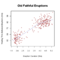
- ScatterplotScatterplotA scatter plot or scattergraph is a type of mathematical diagram using Cartesian coordinates to display values for two variables for a set of data....
: A scatter graph or scatter plot is a type of display using variablesVariable (mathematics)In mathematics, a variable is a value that may change within the scope of a given problem or set of operations. In contrast, a constant is a value that remains unchanged, though often unknown or undetermined. The concepts of constants and variables are fundamental to many areas of mathematics and...
for a set of data. The data is displayed as a collection of points, each having the value of one variable determining the position on the horizontal axis and the value of the other variable determining the position on the vertical axis.
- Shmoo plotShmoo plotIn electrical engineering, a shmoo plot is a graphical display of the response of a component or system varying over a range of conditions and inputs. Often used to represent the results of the testing of complex electronic systems such as computers, ASICs or microprocessors...
: In electrical engineering, a shmoo plot is a graphical display of the response of a component or system varying over a range of conditions and inputs. Often used to represent the results of the testing of complex electronic systems such as computers, ASICs or microprocessors. The plot usually shows the range of conditions in which the device under testDevice under testDevice under test , also known as unit under test , is a term commonly used to refer to a manufactured product undergoing testing.-In semiconductor testing:...
will operate.
- Spaghetti plotsSpaghetti PlotsSpaghetti plots are a method of viewing data to visualize possible flows through systems. Flows depicted in this manner appear like noodles, hence the coining of this term. This method of statistics was first used to track routing through factories. Visualizing flow in this manner can reduce...
are a method of viewing data to visualize possible flows through systems. Flows depicted in this manner appear like noodles, hence the coining of this term. This method of statistics was first used to track routing through factories. Visualizing flow in this manner can reduce inefficiency within the flow of a system.
- StemplotStemplotA stemplot , in statistics, is a device for presenting quantitative data in a graphical format, similar to a histogram, to assist in visualizing the shape of a distribution. They evolved from Arthur Bowley's work in the early 1900s, and are useful tools in exploratory data analysis...
: A stemplot (or stem-and-leaf plot), in statistics, is a device for presenting quantitative data in a graphical format, similar to a histogramHistogramIn statistics, a histogram is a graphical representation showing a visual impression of the distribution of data. It is an estimate of the probability distribution of a continuous variable and was first introduced by Karl Pearson...
, to assist in visualizing the shapeShapeThe shape of an object located in some space is a geometrical description of the part of that space occupied by the object, as determined by its external boundary – abstracting from location and orientation in space, size, and other properties such as colour, content, and material...
of a distributionProbability distributionIn probability theory, a probability mass, probability density, or probability distribution is a function that describes the probability of a random variable taking certain values....
. They evolved from Arthur Bowley's work in the early 1900s, and are useful tools in exploratory data analysisExploratory data analysisIn statistics, exploratory data analysis is an approach to analysing data sets to summarize their main characteristics in easy-to-understand form, often with visual graphs, without using a statistical model or having formulated a hypothesis...
. Unlike histograms, stemplots retain the original data to at least two significant digits, and put the data in order, thereby easing the move to order-based inference and non-parametric statisticsNon-parametric statisticsIn statistics, the term non-parametric statistics has at least two different meanings:The first meaning of non-parametric covers techniques that do not rely on data belonging to any particular distribution. These include, among others:...
.
- Star plot : A graphical method of displaying multivariate data. Each star represents a single observation. Typically, star plots are generated in a multi-plot format with many stars on each page and each star representing one observation.
- Ternary plotTernary plotA ternary plot, ternary graph, triangle plot, simplex plot, or de Finetti diagram is a barycentric plot on three variables which sum to a constant. It graphically depicts the ratios of the three variables as positions in an equilateral triangle...
A ternary plot, ternary graph, triangle plot, simplex plot, or de Finetti diagram is a barycentricBarycentric coordinates (mathematics)In geometry, the barycentric coordinate system is a coordinate system in which the location of a point is specified as the center of mass, or barycenter, of masses placed at the vertices of a simplex . Barycentric coordinates are a form of homogeneous coordinates...
plot on three variables which sum to a constant. It graphically depicts the ratios of the three variables as positions in an equilateralEquilateralIn geometry, an equilateral polygon is a polygon which has all sides of the same length.For instance, an equilateral triangle is a triangle of equal edge lengths...
triangleTriangleA triangle is one of the basic shapes of geometry: a polygon with three corners or vertices and three sides or edges which are line segments. A triangle with vertices A, B, and C is denoted ....
. It is used in petrologyPetrologyPetrology is the branch of geology that studies rocks, and the conditions in which rocks form....
, mineralogyMineralogyMineralogy is the study of chemistry, crystal structure, and physical properties of minerals. Specific studies within mineralogy include the processes of mineral origin and formation, classification of minerals, their geographical distribution, as well as their utilization.-History:Early writing...
, metallurgyMetallurgyMetallurgy is a domain of materials science that studies the physical and chemical behavior of metallic elements, their intermetallic compounds, and their mixtures, which are called alloys. It is also the technology of metals: the way in which science is applied to their practical use...
, and other physical sciences to show the compositions of systems composed of three species. In population geneticsPopulation geneticsPopulation genetics is the study of allele frequency distribution and change under the influence of the four main evolutionary processes: natural selection, genetic drift, mutation and gene flow. It also takes into account the factors of recombination, population subdivision and population...
, it is often called a de Finetti diagramDe Finetti diagramA de Finetti diagram is a ternary plot used in population genetics. It is named after the Italian statistician Bruno de Finetti and is used to graph the genotype frequencies of populations, where there are two alleles and the population is diploid...
. In game theoryGame theoryGame theory is a mathematical method for analyzing calculated circumstances, such as in games, where a person’s success is based upon the choices of others...
, it is often called a simplex plot.
- Violin plotViolin plotViolin plots are a method of plotting numeric data. A violin plot is a combination of a box plot and a kernel density plot. Specifically, it starts with a box plot...
: Violin plots are a method of plotting numeric data. They are similar to box plotBox plotIn descriptive statistics, a box plot or boxplot is a convenient way of graphically depicting groups of numerical data through their five-number summaries: the smallest observation , lower quartile , median , upper quartile , and largest observation...
s, except that they also show the probability densityProbability density functionIn probability theory, a probability density function , or density of a continuous random variable is a function that describes the relative likelihood for this random variable to occur at a given point. The probability for the random variable to fall within a particular region is given by the...
of the data at different values (in the simplest case this could be a histogramHistogramIn statistics, a histogram is a graphical representation showing a visual impression of the distribution of data. It is an estimate of the probability distribution of a continuous variable and was first introduced by Karl Pearson...
). Typically violin plots will include a marker for the median of the data and a box indicating the interquartile range, as in standard box plots. Overlaid on this box plot is a kernel density estimationKernel density estimationIn statistics, kernel density estimation is a non-parametric way of estimating the probability density function of a random variable. Kernel density estimation is a fundamental data smoothing problem where inferences about the population are made, based on a finite data sample...
. Violin plots are available as extensions to a number of software packages, including R through the vioplot library, and Stata through the vioplot add-in.
Examples
Types of graphs and their uses vary very widely. A few typical examples are:- Simple graph: Supply and demandSupply and demandSupply and demand is an economic model of price determination in a market. It concludes that in a competitive market, the unit price for a particular good will vary until it settles at a point where the quantity demanded by consumers will equal the quantity supplied by producers , resulting in an...
curves, simple graphs used in economics to relate supply and demand to price. The graphs can be used together to determine the economic equilibriumEconomic equilibriumIn economics, economic equilibrium is a state of the world where economic forces are balanced and in the absence of external influences the values of economic variables will not change. It is the point at which quantity demanded and quantity supplied are equal...
(essentially, to solve an equation). - Simple graph used for reading values: the bell-shaped normal or Gaussian probability distribution, from which, for example, the probability of a man's height being in a specified range can be derived, given data for the adult male population.
- Very complex graph: the psychrometric chart, relating temperature, pressure, humidity, and other quantities.
- Non-rectangular coordinates: the above all use two-dimensional rectangular coordinates; an example of a graph using polar coordinates, sometimes in three dimensions, is the antennaAntennaAntenna may refer to:-Science and engineering:* Antenna , also known as an aerial, a transducer designed to transmit or receive electromagnetic Antenna (pl. antennas in radio/TV, antennae in biology) may refer to:-Science and engineering:* Antenna (radio), also known as an aerial, a transducer...
radiation patternRadiation patternIn the field of antenna design the term radiation pattern most commonly refers to the directional dependence of the strength of the radio waves from the antenna or other source ....
chart, which represents the power radiated in all directions by an antenna of specified type.
See also
- Graph of a functionGraph of a functionIn mathematics, the graph of a function f is the collection of all ordered pairs . In particular, if x is a real number, graph means the graphical representation of this collection, in the form of a curve on a Cartesian plane, together with Cartesian axes, etc. Graphing on a Cartesian plane is...
- List of graphical methods
Plotting software
- List of plotting programs