
Kerning
Encyclopedia
In typography
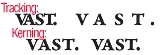
, kerning (less commonly mortising) is the process of adjusting the spacing between characters in a proportional font, usually to achieve a visually pleasing result. Kerning is the adjustment of the space between individual letter forms vs. tracking
which is the uniform adjustment of spacing applied over a range of characters. In a well-kerned font, the two-dimensional blank spaces between each pair of characters all have similar area. The related term kern denotes a part of a type letter that overhangs the edge of the type block.
of corner. In the days when all type was cast metal
, a corner was notched to a consistent height on one or both sides of a letter-piece. Such notched pieces were only set against one another, not against unnotched ones, which had straight sides. The corner allowed for a character's features to reach into the area normally taken up by the next character, for example the top bar of the T, or the right diagonal stroke of the V to hang over the bottom left corner of an A.
Having a consistently shaped corner cut out allowed for using fewer pieces of type to make up all possible kerning pairs; for example a T- and V-piece with kerning on the right would match the same A piece with a matching kerning indention on the left.
An alternative is to have ligature
s for common glyph
combinations, such as the French L, or the combinations ff, fi and ffi.
. However, depending on the adjacent letter, the space may be reduced (and occasionally increased) to improve the overall appearance of the text. For example, A and V can be placed closer together so that the top left of the V is directly above the bottom right of the A.
fonts, and applications that support this feature. Although this is the newest, most advanced form of kerning, using kerning classes is essentially the same approach as was used in metal type. The use of kerning classes is necessitated mostly by today's multi-language fonts that feature many more glyphs, and more kerning pairs, than a single language font would need; especially accented letters.
Which letters need to be kerned depends on the languages the font is to be used with. Some combinations of letters are not used in normal words in any language, so to include kerning for these combinations is not necessary.
sign.
type design
, and advanced typographic systems allow the specification of kerning. It is commonly confused with tracking
. Most high quality fonts contain instructions for kerning which are applied automatically by the typesetting engine.
Most typesetting systems, including the freely available TeX
and all of its derivative software, support the proper use of kerning. Many word processor
s, including Microsoft Word and LibreOffice
also support kerning.
Non-proportional (monospaced) fonts don't use kerning, since their characters by definition always have the same spacing.
.
Typography
Typography is the art and technique of arranging type in order to make language visible. The arrangement of type involves the selection of typefaces, point size, line length, leading , adjusting the spaces between groups of letters and adjusting the space between pairs of letters...
, kerning (less commonly mortising) is the process of adjusting the spacing between characters in a proportional font, usually to achieve a visually pleasing result. Kerning is the adjustment of the space between individual letter forms vs. tracking
Tracking (typography)
In typography, letter-spacing, also called tracking, refers to the amount of space between a group of letters to affect density in a line or block of text....
which is the uniform adjustment of spacing applied over a range of characters. In a well-kerned font, the two-dimensional blank spaces between each pair of characters all have similar area. The related term kern denotes a part of a type letter that overhangs the edge of the type block.
In metal typesetting
The word kern is a cognateCognate
In linguistics, cognates are words that have a common etymological origin. This learned term derives from the Latin cognatus . Cognates within the same language are called doublets. Strictly speaking, loanwords from another language are usually not meant by the term, e.g...
of corner. In the days when all type was cast metal
Metal
A metal , is an element, compound, or alloy that is a good conductor of both electricity and heat. Metals are usually malleable and shiny, that is they reflect most of incident light...
, a corner was notched to a consistent height on one or both sides of a letter-piece. Such notched pieces were only set against one another, not against unnotched ones, which had straight sides. The corner allowed for a character's features to reach into the area normally taken up by the next character, for example the top bar of the T, or the right diagonal stroke of the V to hang over the bottom left corner of an A.
Having a consistently shaped corner cut out allowed for using fewer pieces of type to make up all possible kerning pairs; for example a T- and V-piece with kerning on the right would match the same A piece with a matching kerning indention on the left.
An alternative is to have ligature
Ligature (typography)
In writing and typography, a ligature occurs where two or more graphemes are joined as a single glyph. Ligatures usually replace consecutive characters sharing common components and are part of a more general class of glyphs called "contextual forms", where the specific shape of a letter depends on...
s for common glyph
Glyph
A glyph is an element of writing: an individual mark on a written medium that contributes to the meaning of what is written. A glyph is made up of one or more graphemes....
combinations, such as the French L, or the combinations ff, fi and ffi.
Example
Simple proportional typeface will specify the right and left boundaries, called sidebearings, of each glyphGlyph
A glyph is an element of writing: an individual mark on a written medium that contributes to the meaning of what is written. A glyph is made up of one or more graphemes....
. However, depending on the adjacent letter, the space may be reduced (and occasionally increased) to improve the overall appearance of the text. For example, A and V can be placed closer together so that the top left of the V is directly above the bottom right of the A.
Kerning pairs
In digital typography, kerning is usually applied to kerning pairs as a number to be added to the default character spacing, expressed in the font's coordinate system. For example, the kerning of VA in Adobe's Helvetica font is -80. A digital font's kerning feature can also increase the character spacing between two characters; for example, the kerning value for ry in Adobe's Helvetica is 30. Increased character width is used mainly in conjunction with accented letters.Kerning classes
Another approach is to use kerning classes; where one offset is stored for any pair of characters from two sets, for example (V, W) and (a, e, o). This one class is equivalent to the pairs Va, Wa, Ve, We, etc. Kerning classes can be used in OpenTypeOpenType
OpenType is a format for scalable computer fonts. It was built on its predecessor TrueType, retaining TrueType's basic structure and adding many intricate data structures for prescribing typographic behavior...
fonts, and applications that support this feature. Although this is the newest, most advanced form of kerning, using kerning classes is essentially the same approach as was used in metal type. The use of kerning classes is necessitated mostly by today's multi-language fonts that feature many more glyphs, and more kerning pairs, than a single language font would need; especially accented letters.
Examples of kerned letters
Kerning is widely used to fit capital letters, such as T, V, W, and Y, closer to some other capital letters on either side (especially A) and to some lower case letters on the right side, such as the combination Ro. It is also used to fit a period (full stop) closer to these and to F, as well as the lower case letters y and r. Some other combinations are AC, FA, and OA.Which letters need to be kerned depends on the languages the font is to be used with. Some combinations of letters are not used in normal words in any language, so to include kerning for these combinations is not necessary.
Autokerning
Some typographic programs provide an autokerning feature. Autokerning simply takes into account a predefined list of common kerning pairs and, if the outlines of two consecutive glyphs are spaced too far apart, makes a kerning entry. Auto kerning is especially useful for kerning multi-language fonts. However, it is rarely a sufficient alternative for manual kerning, as some characters may appear to an algorithmic comparison to be spaced very closely together, but to a human reader might appear to be spaced too far apart; especially when the only part of a glyph that is 'too close' is a diacriticDiacritic
A diacritic is a glyph added to a letter, or basic glyph. The term derives from the Greek διακριτικός . Diacritic is both an adjective and a noun, whereas diacritical is only an adjective. Some diacritical marks, such as the acute and grave are often called accents...
sign.
Uses
Kerning is implicitly part of digitalDigital typography
Digital typography is the arrangement of type using computers.- See also :* Typography* Computer font* Web typography* Desktop publishing* Font rasterization...
type design
Type design
Type design is the art of designing typefaces.- History :Although the technology of printing text using movable type was invented in China, and despite the esteem which calligraphy held in that civilization, the vast number of Chinese characters meant that few distinctive, complete fonts could be...
, and advanced typographic systems allow the specification of kerning. It is commonly confused with tracking
Tracking (typography)
In typography, letter-spacing, also called tracking, refers to the amount of space between a group of letters to affect density in a line or block of text....
. Most high quality fonts contain instructions for kerning which are applied automatically by the typesetting engine.
Most typesetting systems, including the freely available TeX
TeX
TeX is a typesetting system designed and mostly written by Donald Knuth and released in 1978. Within the typesetting system, its name is formatted as ....
and all of its derivative software, support the proper use of kerning. Many word processor
Word processor
A word processor is a computer application used for the production of any sort of printable material....
s, including Microsoft Word and LibreOffice
LibreOffice
LibreOffice is a free and open source office suite developed by The Document Foundation as a fork of OpenOffice.org. It is largely compatible with other major office suites, including Microsoft Office, and available on a variety of platforms...
also support kerning.
Non-proportional (monospaced) fonts don't use kerning, since their characters by definition always have the same spacing.
Kerning tools
Some page layout programs allow the user to kern characters within their text. However, to permanently change the kerning of a font one must use a font editorFont editor
A font editor is a class of application software specifically designed to create or modify computer font files.Font editors differ greatly depending if they are designed to edit bitmap fonts or outline fonts. Modern font editors mostly deal with the outline fonts, because bitmap fonts are an older...
.