
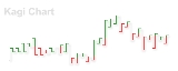
Kagi chart
Encyclopedia
The Kagi chart is a chart
used for tracking price movements and to make decisions on purchasing stock
. It differs from traditional stock charts, such as the Candlestick chart
by being mostly independent of time. This feature aids in producing a chart that reduces random noise.
Due to its effectiveness in showing a clear path of price movements, the Kagi chart is one of the various charts that investors use to make better decisions about stocks. The most important benefit of this chart is that it is independent of time and change of direction occurs only when a specific amount is reached.
The Kagi chart was originally developed in Japan
during the 1870s when the Japanese stock market started trading. It was used for tracking the price movement of rice
and found use in determining the general levels of supply and demand for certain assets.
Alternatively, thin and thick lines can be replaced with lines of different colours, such as the green/red example in the figure.
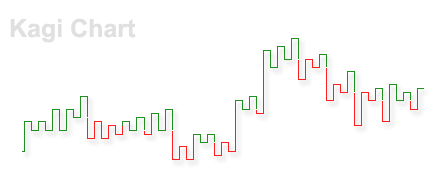
Changes in line thickness are used to generate transaction signals. Buy signals are generated when the Kagi line goes from thin to thick and sell signals are generated when the line turns from thick to thin.
Chart
A chart is a graphical representation of data, in which "the data is represented by symbols, such as bars in a bar chart, lines in a line chart, or slices in a pie chart"...
used for tracking price movements and to make decisions on purchasing stock
Stock
The capital stock of a business entity represents the original capital paid into or invested in the business by its founders. It serves as a security for the creditors of a business since it cannot be withdrawn to the detriment of the creditors...
. It differs from traditional stock charts, such as the Candlestick chart
Candlestick chart
A candlestick chart is a style of bar-chart used primarily to describe price movements of a security, derivative, or currency over time.It is a combination of a line-chart and a bar-chart, in that each bar represents the range of price movement over a given time interval. It is most often used in...
by being mostly independent of time. This feature aids in producing a chart that reduces random noise.
Due to its effectiveness in showing a clear path of price movements, the Kagi chart is one of the various charts that investors use to make better decisions about stocks. The most important benefit of this chart is that it is independent of time and change of direction occurs only when a specific amount is reached.
The Kagi chart was originally developed in Japan
Japan
Japan is an island nation in East Asia. Located in the Pacific Ocean, it lies to the east of the Sea of Japan, China, North Korea, South Korea and Russia, stretching from the Sea of Okhotsk in the north to the East China Sea and Taiwan in the south...
during the 1870s when the Japanese stock market started trading. It was used for tracking the price movement of rice
Rice
Rice is the seed of the monocot plants Oryza sativa or Oryza glaberrima . As a cereal grain, it is the most important staple food for a large part of the world's human population, especially in East Asia, Southeast Asia, South Asia, the Middle East, and the West Indies...
and found use in determining the general levels of supply and demand for certain assets.
Construction
Kagi charts look similar to swing charts and do not have a time axis. A Kagi chart is created with a series of vertical lines connected by short horizontal lines. The thickness and direction of the lines is based on the price of the underlying stock or asset, as follows:- The thickness of the line changes when the price reaches the high or low of the previous vertical line.
- The direction of the line changes when the price reaches a preset reversal amount, which is usually set at 4%. When a direction change occurs, a short horizontal line is drawn between the lines of opposite direction.
Alternatively, thin and thick lines can be replaced with lines of different colours, such as the green/red example in the figure.
Changes in line thickness are used to generate transaction signals. Buy signals are generated when the Kagi line goes from thin to thick and sell signals are generated when the line turns from thick to thin.
How to plot a Kagi chart
- Find the starting point. The starting point is generally considered the first closing price. From this point forward, you compare each day's closing price with the starting price.
- Draw a thin vertical line from the starting price to each day's closing price, while the trend does not reverse.
- If a day's closing price moves in the opposite direction to the trend by more than the reversal amount, draw a short horizontal line and a new vertical line, beginning from the horizontal line to the new closing price.
- If the price on a day is greater than or equal to the previous high, change to a thick line and continue the vertical line. If the price on that day is less than or equal to the previous low, then change to a thin line.