
Architype Van Doesburg
Encyclopedia
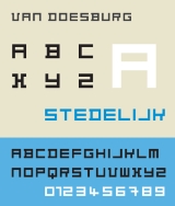
Architype Van Doesburg is a geometric sans-serif typeface based upon a 1919 alphabet designed by Theo Van Doesburg
, a cofounder of the De Stijl
art movement. The digital revival shown at right was produced by Freda Sack and David Quay of The Foundry.
The face is constructed entirely of perpendicular evenly weighted strokes. Each character is based upon a square divided into a raster of 25 smaller squares. Van Doesburg's earliest uses of the alphabet was in limited quantity, made up of letterpress ruling pieces, and not as strictly formed as his more finished 1919 version. A similarly constructed rectilinear sans-serif typeface, designed in 1917 by Piet Zwart
bears comparison. The face is similar to Van Doesburg's later 1928 alphabet designed for the Café Aubette in Strasbourg. Both faces anticipate later typographic explorations of geometric reductionism of Wim Crouwel's
1967 New Alphabet
and early digital faces like Zuzana Licko's
faces Lo-Res and Emperor 8. The Architype Van Doesburg typeface is part of a collection of several revivals of early twentieth century typographic experimentation designed by Freda Sack and David Quay of The Foundry.
Theo van Doesburg
Theo van Doesburg was a Dutch artist, practicing in painting, writing, poetry and architecture. He is best known as the founder and leader of De Stijl.-Biography:-Early life:...
, a cofounder of the De Stijl
De Stijl
De Stijl , propagating the group's theories. Next to van Doesburg, the group's principal members were the painters Piet Mondrian , Vilmos Huszár , and Bart van der Leck , and the architects Gerrit Rietveld , Robert van 't Hoff , and J.J.P. Oud...
art movement. The digital revival shown at right was produced by Freda Sack and David Quay of The Foundry.
The face is constructed entirely of perpendicular evenly weighted strokes. Each character is based upon a square divided into a raster of 25 smaller squares. Van Doesburg's earliest uses of the alphabet was in limited quantity, made up of letterpress ruling pieces, and not as strictly formed as his more finished 1919 version. A similarly constructed rectilinear sans-serif typeface, designed in 1917 by Piet Zwart
Piet Zwart
Piet Zwart was a Dutch photographer, typographer, and industrial designer.- Examples of His Artwork :He started his career as an architect and worked for Jan Wils and Berlage....
bears comparison. The face is similar to Van Doesburg's later 1928 alphabet designed for the Café Aubette in Strasbourg. Both faces anticipate later typographic explorations of geometric reductionism of Wim Crouwel's
Wim Crouwel
Willem Hendrik Crouwel is a Dutch graphic designer and typographer.Between 1947 and 1949 he studied Fine Arts at Academie Minerva in Groningen, The Netherlands...
1967 New Alphabet
New Alphabet (typeface)
-History:New Alphabet is a personal, experimental project of Crouwel. The typeface embraces the limitations of the cathode ray tube technology used by early data display screens and phototypesetting equipment and thus only contains horizontal and vertical strokes. Conventional typefaces can suffer...
and early digital faces like Zuzana Licko's
Zuzana Licko
Zuzana Licko is a typeface designer based out of the San Francisco Bay Area who was born in Bratislava, Czechoslovakia.Licko came to the United States when she was a child along with her family...
faces Lo-Res and Emperor 8. The Architype Van Doesburg typeface is part of a collection of several revivals of early twentieth century typographic experimentation designed by Freda Sack and David Quay of The Foundry.