

Bullet graph
Encyclopedia
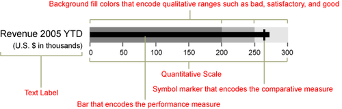
A bullet graph is a variation of a bar graph developed by Stephen Few. Seemingly inspired by the traditional thermometer charts and progress bars found in many dashboards, the bullet graph serves as a replacement for dashboard gauges and meters. Few developed bullet graphs to overcome the fundamental issues of gauges and meters; they typically display too little information, require too much space, and are cluttered with useless and distracting decoration. The bullet graph features a single, primary measure (for example, current year-to-date revenue), compares that measure to one or more other measures to enrich its meaning (for example, compared to a target), and displays it in the context of qualitative ranges of performance, such as poor, satisfactory, and good. The qualitative ranges are displayed as varying intensities of a single hue
to make them discernible by those who are color blind and to restrict the use of colors on the dashboard to a minimum.
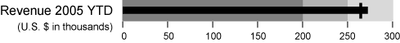
Below is an example of a single bullet graph:
 Below is the same example, this time with labels to identify each part of the bullet graph.
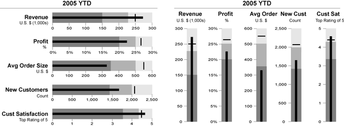
 Bullet graphs may be horizontal or vertical, and may be stacked to allow comparisons of several measures at once, as illustrated below.
 More information about bullet graphs can be found in the book Information Dashboard Design by Stephen Few.
Hue
Hue is one of the main properties of a color, defined technically , as "the degree to which a stimulus can be describedas similar to or different from stimuli that are described as red, green, blue, and yellow,"...
to make them discernible by those who are color blind and to restrict the use of colors on the dashboard to a minimum.
Below is an example of a single bullet graph:
External links
- Perceptual Edge - Stephen Few's consultancy
- Bullet Graph Controls - Open source bullet graph controls for Windows FormsWindows FormsWindows Forms is the name given to the graphical application programming interface included as a part of Microsoft .NET Framework, providing access to native Microsoft Windows interface elements by wrapping the extant Windows API in managed code...
and Windows Presentation FoundationWindows Presentation FoundationDeveloped by Microsoft, the Windows Presentation Foundation is a computer-software graphical subsystem for rendering user interfaces in Windows-based applications. WPF, previously known as "Avalon", was initially released as part of .NET Framework 3.0. Rather than relying on the older GDI... - The Bullet Graph design specification
- Discussion with several bullet graph examples
- How to Create Bullet Graphs To Replace Gauges in Excel
- Video Tutorial: Creating a Bullet Graph in Excel
- How to create Bullet Graphs with the Google Charts API
- How to create Bullet Graphs in Google Spreadsheets
- How to Create Bullet Graphs in SAS