
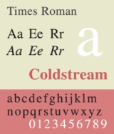
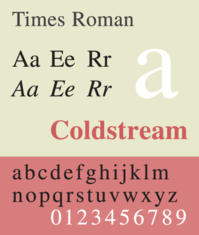
Times Roman
Encyclopedia
Serif
In typography, serifs are semi-structural details on the ends of some of the strokes that make up letters and symbols. A typeface with serifs is called a serif typeface . A typeface without serifs is called sans serif or sans-serif, from the French sans, meaning “without”...
typeface
Typeface
In typography, a typeface is the artistic representation or interpretation of characters; it is the way the type looks. Each type is designed and there are thousands of different typefaces in existence, with new ones being developed constantly....
commissioned by the British newspaper The Times
The Times
The Times is a British daily national newspaper, first published in London in 1785 under the title The Daily Universal Register . The Times and its sister paper The Sunday Times are published by Times Newspapers Limited, a subsidiary since 1981 of News International...
in 1931, created by Victor Lardent
Victor Lardent
Victor Lardent , was a British advertising designer and draftsman at The Times, London. He created the font Times New Roman under the direction of Stanley Morison in 1932.-References :...
at the English branch of Monotype
Monotype Corporation
Monotype Imaging Holdings is a Delaware corporation based in Woburn, Massachusetts and specializing in typesetting and typeface design as well as text and imaging solutions for use with consumer electronics devices. Monotype Imaging Holdings is the owner of Monotype Imaging Inc., Linotype,...
. It was commissioned after Stanley Morison
Stanley Morison
Stanley Morison was an English typographer, designer and historian of printing.Born in Wanstead, Essex, Morison spent most of his childhood and early adult years at the family home in Fairfax Road, Harringay...
had written an article criticizing The Times for being badly printed and typographically antiquated. The font was supervised by Morison and drawn by Victor Lardent, an artist from the advertising department of The Times. Morison used an older font named Plantin
Plantin (typeface)
Plantin is a transitional serif typeface named after the printer Christophe Plantin. It was first cut in 1913 under the direction of Frank Hinman Pierpont for the Monotype Corporation, and is based on a Gros Cicero face cut in the 16th century by Robert Granjon...
as the basis for his design, but made revisions for legibility and economy of space. Morison's revision became known as Times New Roman and made its debut in the 3 October 1932 issue of The Times newspaper. After one year, the design was released for commercial sale. The Times stayed with Times New Roman for 40 years, but new production techniques and the format change from broadsheet
Broadsheet
Broadsheet is the largest of the various newspaper formats and is characterized by long vertical pages . The term derives from types of popular prints usually just of a single sheet, sold on the streets and containing various types of material, from ballads to political satire. The first broadsheet...
to tabloid in 2004 have caused the newspaper to switch font five times since 1972. However, all the new fonts have been variants of the original New Roman font.
Some experts believe that the design was based on an earlier original work of William Starling Burgess.
This theory remains controversial.
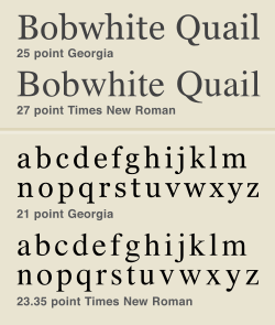
Because of its popularity, the typeface has been influential in the subsequent development of a number of serif typefaces both before and after the start of the digital-font era. One notable example is Georgia
Georgia (typeface)
Georgia is a transitional serif typeface designed in 1993 by Matthew Carter and hinted by Tom Rickner for the Microsoft Corporation, as the serif companion to the first Microsoft sans serif screen font, Verdana. Microsoft released the initial version of the font on November 1, 1996 as part of the...
, shown below on the right, which has very similar stroke shapes to Times New Roman but wider serifs.
Although no longer used by The Times, Times New Roman is still frequent in book typography, particularly in mass-market paperbacks in the United States. Especially because of its adoption in Microsoft
Microsoft
Microsoft Corporation is an American public multinational corporation headquartered in Redmond, Washington, USA that develops, manufactures, licenses, and supports a wide range of products and services predominantly related to computing through its various product divisions...
products, it has become one of the most widely used typefaces in history.
Times New Roman
This family includes Times New Roman (roman, bold), Times New Roman Medium (roman, bold), Times New Roman Semi Bold (roman, bold), Times New Roman Bold (roman, bold), Times New Roman Extra Bold, Times New Roman PS (roman, bold, italicsItalic type
In typography, italic type is a cursive typeface based on a stylized form of calligraphic handwriting. Owing to the influence from calligraphy, such typefaces often slant slightly to the right. Different glyph shapes from roman type are also usually used—another influence from calligraphy...
), Times New Roman Condensed (roman, bold, italic), Times New Roman Small Text (roman, bold, italic), Times New Seven (roman, bold, italics)..
Times New Roman WGL
It includes fonts in WGL character sets, and only sold in TrueType format. It includes Times New Roman regular, bold, italic, bold italic.Times New Roman World
It is a version based on Windows Vista fonts. It includes fonts in WGL character sets, Hebrew, Arabic characters. Similar to Helvetica World, Arabic in italic fonts are in roman positions.Times Roman and Times New Roman
Times Roman, and its licensees like Adobe and Apple, is the font family used by Linotype. Times New Roman, and its licensees like Microsoft, is licensed from MonotypeMonotype Corporation
Monotype Imaging Holdings is a Delaware corporation based in Woburn, Massachusetts and specializing in typesetting and typeface design as well as text and imaging solutions for use with consumer electronics devices. Monotype Imaging Holdings is the owner of Monotype Imaging Inc., Linotype,...
. Linotype classifies Times Roman as the upright (Roman) font of the Times family.
Originally issued by the Monotype Corp. in England, perhaps in 1931, 1933 or 1943, the face design was also licensed to Linotype, because The Times newspaper used Linotype equipment for much of its production. Linotype applied for registration of the trademark name Times Roman and received registration status in 1945. In the 1980s, there was an attempt by unknown entrepreneurs to seek from Rupert Murdoch
Rupert Murdoch
Keith Rupert Murdoch, AC, KSG is an Australian-American business magnate. He is the founder and Chairman and CEO of , the world's second-largest media conglomerate....
, who owned The Times, the right to use the Times Roman name; separately, a legal action was also initiated to clarify the right of Monotype to use the name in the US despite Linotype's registration. As a result of legal action, Linotype and its licensees continue to use the name Times Roman, while Monotype and its licensees use the name Times New Roman.
There is controversy about who created Times New Roman. Traditionally the inventor was thought to be Stanley Morison
Stanley Morison
Stanley Morison was an English typographer, designer and historian of printing.Born in Wanstead, Essex, Morison spent most of his childhood and early adult years at the family home in Fairfax Road, Harringay...
, and it made its debut in the Oct. 3, 1943 issue of The Times of London. However evidence found in 1987 suggested the real creator was a wooden boat designer from Boston named William Starling Burgess
William Starling Burgess
William Starling Burgess was a yacht designer, aviation pioneer, and naval architect.-Biography:William Starling Burgess was born in Boston. He was the son of Edward Burgess who died when Starling was 12. Starling attended Milton Academy and Harvard University. He was a partner in Burgess &...
. In 1904 he created it for company documents at his shipyard in Marblehead, Mass. and hired Lanston Monotype to issue it. However Burgess abandoned the idea and Monotype shelved the sketches, until decades later when Canadian printer Gerald Giampa stumbled upon them in 1987, after he had purchased Lanston Monotype. Giampa then asked Mike Parker to complete the type which was issued in June 2009.
Although Times and Times New Roman are variations on a theme from the Times family, various differences developed between the versions marketed by Linotype and Monotype when the master fonts were transferred from metal to photo and digital media. For example, Linotype has slanted serif
Serif
In typography, serifs are semi-structural details on the ends of some of the strokes that make up letters and symbols. A typeface with serifs is called a serif typeface . A typeface without serifs is called sans serif or sans-serif, from the French sans, meaning “without”...
s on the capital S, while Monotype's are vertical, and the addition of a serif on the number 5 in Linotype's that is absent in Monotype's. Most of these differences are invisible in body text at normal reading distances, or 10pts at 300 dpi. (Vivid differences between the two versions do occur in the lowercase z in the italic weight and in the percent sign in all weights.) Subtle competition grew between the two foundries, as the proportions and details as well as the width metrics for their version of Times grew apart.
Microsoft's version of Times New Roman licensed from Monotype matches the widths from the Adobe/Linotype version (a PostScript
PostScript
PostScript is a dynamically typed concatenative programming language created by John Warnock and Charles Geschke in 1982. It is best known for its use as a page description language in the electronic and desktop publishing areas. Adobe PostScript 3 is also the worldwide printing and imaging...
core font by Linotype). It has the lighter capitals that were originally developed for printing German (where all nouns begin with a capital letter). Versions of Times New Roman from Monotype exist which vary from the Linotype metrics (i.e. not the same as the version for Microsoft).
Times 4-line Mathematics Series 569
This is a variant designed for printing mathematical formulae, using the 4‑line system for mathematics developed by Monotype in 1957. This modified version of Times Roman was designed for use as part of Monotype's 4-line Mathematics system. The major changes to the Times Roman typeface itself were a reduction in the slope of italic characters to 12 degrees from 16 degrees, so as to reduce the need for kerning, and a change in the form of italic v and w so that italic v could be more easily distinguished from a Greek nu.The 4-line system involved casting characters for 10-point Times Roman on 6-point bodies. The top of the character would overhang the slug, forming a kern which was less fragile than the normal kerns of foundry type, as it was on a slab of cast metal. This technique had been in previous use on Monotype machines, usually involving double-height matrices, to allow the automatic setting of "advertising figures" (numbers that occupy two or more lines, usually to clearly indicate a price in an advertisement set in small type). This meant that the same matrix could be used for both superscript and subscript numbers. More importantly, it allowed a variable or other item to have both a superscript and a subscript at the same time, one above the other, without inordinate difficulty.
Previously, while the Monotype system, due to its flexibility, was widely used for setting mathematical formulas, the typeface Modern Series 7 was usually used for this purpose. Because of the popularity of Times Roman at the time, Monotype chose to design a variant of Times Roman suited to mathematical composition, and recut many additional characters needed for mathematics, including special symbols as well as Greek and Fraktur alphabets, to accompany the system instead of designing it around the typeface that was being used, for which characters were already available. Matrices for some 700 characters were available as part of Times Roman Series 569 when it was released in 1958, with new characters constantly being added for over a decade afterwards (thus, in 1971, 8,000 characters were included, and new ones were being added at a rate of about 5 per week).
Times Series 727 and 827
Monotype also produced Times Roman Series 727, in which the heavier strokes of upper-case letters were made slightly thinner to produce a better effect when setting text in the German language (in which all nouns are typically capitalized), and Series 827, in which certain letters were modified to correspond to their appearance in other typefaces popular in French typography.Claritas
A modified 4¾ point size of Times Roman was produced by Monotype for use in printing matter requiring a very small size of type. Listed as Times Newspaper Smalls, available as either Series 333 or 335, it was also referred to by the name Claritas.Free variants
Times Roman and Times New Roman are proprietary fonts. There are some free softwareFree software
Free software, software libre or libre software is software that can be used, studied, and modified without restriction, and which can be copied and redistributed in modified or unmodified form either without restriction, or with restrictions that only ensure that further recipients can also do...
metric-compatible fonts used as free Times Roman and Times New Roman alternatives or used for font substitution
Font substitution
Font substitution is the process of using one font in place of another when the intended font either is not available or does not contain glyphs for the required characters.Font substitution can be aided by:...
:
- URW++ produced a version of Times New Roman called Nimbus RomanNimbus RomanNimbus Roman is a serif typeface created by URW Studio in 1982.Nimbus Roman No 9 L is a serif typeface created by URW Studio in 1987, and eventually released under the GPL and AFPL in 1996 and LPPL in 2009...
in 1982. Nimbus Roman No9 L, URW's PostScriptPostScriptPostScript is a dynamically typed concatenative programming language created by John Warnock and Charles Geschke in 1982. It is best known for its use as a page description language in the electronic and desktop publishing areas. Adobe PostScript 3 is also the worldwide printing and imaging...
variant, was released under the GNU General Public LicenseGNU General Public LicenseThe GNU General Public License is the most widely used free software license, originally written by Richard Stallman for the GNU Project....
in 1996, and available in major freeFree softwareFree software, software libre or libre software is software that can be used, studied, and modified without restriction, and which can be copied and redistributed in modified or unmodified form either without restriction, or with restrictions that only ensure that further recipients can also do...
and open source operating systems. - FreeSerif, a free font descending from URW++ Nimbus Roman No9 L, which in turn descends from Times. It is one of free (GPL) fonts developed in GNU FreeFont project, first published in 2002. It is used in some free software as Times Roman replacement or for Times Roman font substitution.
- Liberation Serif is metrically equivalent font to Times New Roman developed by Ascender Corp. and published by Red Hat in 2007 under the GPL license with some exceptions. It is used in some GNU/Linux distributions as default font replacement for Times New Roman.
Others
- Times Ten is a version of Times by Linotype, specially designed for smaller text (12 point and below). It features wider characters and stronger hairlines.
- Times Eighteen is the headline version of Times by Linotype, ideal for point sizes of 18 and larger. The characters are subtly condensed and the hairlines are finer.
- CG Times is a variant of Times family made by Compugraphic Corporation foundry.
- Pelham is a version of Times Roman by DTP Types of Britain, which also cut an infant version with single-story versions of the letters a and g.
- Times Europa Office is an update to Times Europa, designed by Akira Kobayashi (released 2006). It contains tabulated numbers, mathematical signs, and currency symbols. Each character has the same advanced width in all the fonts in the family. In addition, cap heights and x-heights are the same.
Other typefaces used by The Times
The Times newspaper has commissioned various alternatives to Times New Roman:- Times Europa was designed by Walter TracyWalter TracyWalter Valentine Tracy RDI was an English typographer and writer and designer of books, magazines, and newspapers.- Biography :Walter Tracy was born in Islington, London and attended Shoreditch Secondary school. At the age of fourteen he was apprenticed to the large printing firm William Clowes as...
in 1972 for The Times, as a sturdier alternative to the Times font family, designed for the demands of faster printing presses and cheaper paper. The typeface features more open counter spaces. - Times Roman replaced Times Europa on 30 August 1982.
- Times Millennium was made in 1991, drawn by Gunnlaugur Briem on the instructions of Aurobind Patel, composing manager of News International.
- Times Classic first appeared in 2001. Designed as an economical face by the British type team of Dave Farey and Richard Dawson, it took advantage of the new PC-based publishing system at the newspaper, while obviating the production shortcomings of its predecessor Times Millennium. The new typeface included 120 letters per font. Initially the family comprised ten fonts, but a condensed version was added in 2004.
- Times Modern was unveiled on 20 November 2006, as the successor of Times Classic. Designed for improving legibility in smaller font sizes, it uses 45-degree angled bracket serifs. The font was published by Elsner + Flake as EF Times Modern; it was designed by Research Studios, led by Ben Preston (deputy editor of The Times) and designer Neville Brody.
Uses
- MicrosoftMicrosoftMicrosoft Corporation is an American public multinational corporation headquartered in Redmond, Washington, USA that develops, manufactures, licenses, and supports a wide range of products and services predominantly related to computing through its various product divisions...
has distributed Times New Roman with every copy of Microsoft WindowsMicrosoft WindowsMicrosoft Windows is a series of operating systems produced by Microsoft.Microsoft introduced an operating environment named Windows on November 20, 1985 as an add-on to MS-DOS in response to the growing interest in graphical user interfaces . Microsoft Windows came to dominate the world's personal...
since version 3.1, and the typefaceTypefaceIn typography, a typeface is the artistic representation or interpretation of characters; it is the way the type looks. Each type is designed and there are thousands of different typefaces in existence, with new ones being developed constantly....
is used as the default in many applicationsApplication softwareApplication software, also known as an application or an "app", is computer software designed to help the user to perform specific tasks. Examples include enterprise software, accounting software, office suites, graphics software and media players. Many application programs deal principally with...
for MS Windows, especially word processorWord processorA word processor is a computer application used for the production of any sort of printable material....
s and Web browserWeb browserA web browser is a software application for retrieving, presenting, and traversing information resources on the World Wide Web. An information resource is identified by a Uniform Resource Identifier and may be a web page, image, video, or other piece of content...
s. - Linotype's Times Roman is the default Apple Mac OS X font for serif/roman generic font family and is installed by default in Mac OS X. Monotype's Times New Roman is installed by default only in latest versions of Mac OS X (e.g. 10.5).
- In 2004, the United States Department of StateUnited States Department of StateThe United States Department of State , is the United States federal executive department responsible for international relations of the United States, equivalent to the foreign ministries of other countries...
announced that as of 1 February 2004, all US diplomatic documents would use 14-pointPoint (typography)In typography, a point is the smallest unit of measure, being a subdivision of the larger pica. It is commonly abbreviated as pt. The point has long been the usual unit for measuring font size and leading and other minute items on a printed page....
Times New Roman instead of the previous 12-point Courier NewCourier (typeface)Courier is a monospaced slab serif typeface designed to resemble the output from a strike-on typewriter. The typeface was designed by Howard "Bud" Kettler in 1955...
. - Researchers in 2008 found that satirical readings of text printed in Times New Roman were perceived as more funny and angry than those printed in ArialArialArial, sometimes marketed or displayed in software as Arial MT, is a sans-serif typeface and set of computer fonts. Fonts from the Arial family are packaged with Microsoft Windows, some other Microsoft software applications, Apple Mac OS X and many PostScript 3 computer printers...
.
William Starling Burgess
In 1994, the printing historian Mike Parker published evidence that the design of Times New Roman was based on a 1904 design of William Starling BurgessWilliam Starling Burgess
William Starling Burgess was a yacht designer, aviation pioneer, and naval architect.-Biography:William Starling Burgess was born in Boston. He was the son of Edward Burgess who died when Starling was 12. Starling attended Milton Academy and Harvard University. He was a partner in Burgess &...
.
This theory remains controversial.
The Times Online web site credits the design to "Stanley Morrison, Cameron Latham and perhaps Starling Burgess".
See also
- ArialArialArial, sometimes marketed or displayed in software as Arial MT, is a sans-serif typeface and set of computer fonts. Fonts from the Arial family are packaged with Microsoft Windows, some other Microsoft software applications, Apple Mac OS X and many PostScript 3 computer printers...
- Core fonts for the WebCore fonts for the WebCore fonts for the Web was a project begun by Microsoft in 1996 to make a standard pack of fonts for the Internet. It was terminated in 2002. It included the proprietary fonts Andale Mono, Arial, Arial Black, Comic Sans MS, Courier New, Georgia, Impact, Times New Roman, Trebuchet MS, Verdana and...
- HelveticaHelveticaHelvetica is a widely used sans-serif typeface developed in 1957 by Swiss typeface designer Max Miedinger with Eduard Hoffmann.-Visual distinctive characteristics:Characteristics of this typeface are:lower case:square dot over the letter i....
- Liberation fontsLiberation fontsLiberation is the collective name of four TrueType font families: Liberation Sans, Liberation Sans Narrow, Liberation Serif and Liberation Mono...
- List of typefaces
- MathTimeMathTimeMathTime is a commercial set of Times compatible mathematical type family for TeX, created by Michael Spivak. Used together with Times, it is one of the few typefaces that provide full-featured text and mathematical typesetting within TeX.MathTime has been available in three variants:* MathTime...
- Unicode fonts
- VerdanaVerdanaVerdana is a humanist sans-serif typeface designed by Matthew Carter for Microsoft Corporation, with hand-hinting done by Thomas Rickner, then at Monotype. Demand for such a typeface was recognized by Virginia Howlett of Microsoft's typography group...
External links
- Type trading card: Times New Roman/Albertus (Monotype)
- Times New Roman (Linotype purchase page)
- Goodbye to the Courier font? – Tom VanderbiltTom VanderbiltTom Vanderbilt is an American journalist, blogger, and author of the best-selling book, Traffic: Why We Drive the Way We Do .-Personal life:...
, Slate.com, 20 February 2004. - A conversation with Times Modern designer Luke Prowse