

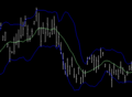
Open-high-low-close chart
Encyclopedia
Chart
A chart is a graphical representation of data, in which "the data is represented by symbols, such as bars in a bar chart, lines in a line chart, or slices in a pie chart"...
typically used to illustrate movements in the price of a financial instrument over time. Each vertical line on the chart shows the price range (the highest and lowest prices) over one unit of time, e.g. one day or one hour. Tick marks
Hatch mark
Hatch marks, sometimes also called hash marks, or tick marks, are a form of mathematical notation. They are typically used three ways:#Unit and value marks – as on a ruler or number line.#Congruency notation – as on a geometric figure....
project from each side of the line indicating the opening price (e.g. for a daily bar chart this would be the starting price for that day) on the left, and the closing price for that time period on the right. The bars may be shown in different hues depending on whether prices rose or fell in that period.
The Japanese candlestick chart
Candlestick chart
A candlestick chart is a style of bar-chart used primarily to describe price movements of a security, derivative, or currency over time.It is a combination of a line-chart and a bar-chart, in that each bar represents the range of price movement over a given time interval. It is most often used in...
is another way of displaying market price data, with the opening and closing prices defining a rectangle within the range for each time unit. Both charts show exactly the same data, i.e. the opening, high, low, and closing prices during a particular time frame. Some traders find the candlestick chart easier to read.