

Nicolas Jenson
Encyclopedia
Nicolas Jenson was a French engraver, pioneer printer
and type designer who carried out most of his work in Venice. Jenson acted as Master of the French Royal Mint at Tours
, and is accredited with being the creator of the first model roman type
.
Nicholas Jenson has been something of cult figure among students of early printing since the nineteenth century when the aesthete William Morris praised the beauty and perfection of his roman font. Apart from any qualitative judgments, the large number of Jenson's editions (108 between 1470 and 1481 according to Lowry) makes him an important figure in the early history of printing and a pivotal force in the emergence of Venice as one of the first great centers of the printing press.
In October 1458, while acting as Master of the French Royal Mint, Jenson was sent to Mainz
, by King Charles VII, to study the art of metal movable type. Jenson then went to Mainz to study printing under Johannes Gutenberg. In 1470 he opened a printing shop in Venice, and, in the first work he produced, the printed roman lowercase letter took on the proportions, shapes, and arrangements that marked its transition from an imitation of handwriting to the style that has remained in use throughout subsequent centuries of printing. Jenson also designed Greek-style type and black-letter type. Although he composed his types in a meticulously even style, he did not always print them accurately.
Nonetheless, he published more than 150 titles, soundly edited by scholars of authority. From whom Jenson learned this is in question. Some hypothesize that Jenson studied under the tutelage of Gutenberg
, although there is no verifiable evidence of this. By this time Gutenberg's first press had been seized by Johann Fust
, and historians are unsure of his activities during this period. Further, by the time Jenson arrived in Mainz, there were a number of established printers under which he could have been apprenticed. Jenson left Mainz in 1461, but with no desire to return to France after King Charles
' death in 1461, as he had little desire to return under the new rule of Louis XI
. Jenson went to Venice in 1468, where he opened his own printing workshop, eventually producing around 150 titles.
In the first work he produced, the printed roman lowercase letter took on the proportions, shapes, and arrangements that marked its transition from an imitation of handwriting to the style that has remained in use throughout subsequent centuries of printing. Jenson also designed Greek-style type and black-letter type.
By the end of his life Jenson was a wealthy man, producing liturgical, theological and legal texts in a variety of gothic fonts, the roman type left only for the odd commissioned work.
 Working separately from but concurrently with Johann and Wendelin of Speyer
(de Spira), Nicholas Jenson is popularly thought to have made the final definitive break from blackletter
style towards a fully evolved roman letterform. Jenson was a Frenchman who first traveled to Germany to learn punchcutting but moved on to Italy where he created his roman types. (See an example 1470 edition of Eusebius, De Evangelica Praeparatione.)
During the 1470’s Nicholas Jenson’s technical skill and business acumen helped establish Venice
as Italy’s publishing capital and in centuries since he has been celebrated for perfecting roman type, the rebirth of Latin inscription. But what set Jenson apart from other printers was his constant drive to expand his financial base beyond the patronage system. Wishing to invade the untapped market of university textbooks, he built a team of Italian banking families and German merchants-speculators and, armed with capital, by 1477 he could run as many as 12 presses simultaneously. In order to lower prices and force out less productive rivals, he cut cursive gothic type, enabling him to print text and gloss on the same page for the first time in history.
Jenson's highly legible and evenly colored typeface, based upon Humanistic scripts, has been reinterpreted through the centuries by numerous type designers, most notably William Morris
Jenson's fame as one of history's greatest typeface designers and punch cutters rests on the types first used in Eusebiu's De praeparatione evangelica, which presents the full flowering of roman type design.
Jenson constructed his first roman typeface deliberately on the basis of typographical principles
, as opposed to the old manuscript models. It was first employed in his 1470 edition of Eusebius, De Evangelica Praeparatione. In 1471, a Greek typeface followed, which was used for quotations, and then in 1473 a Black Letter typeface
, which he used in books on medicine and history.
Jenson was set apart from other printers because he was able to expand his financial base beyond the patronage system. Wishing to incade the relatively untapped market of university textbooks, he built a team of Italian banking families and German merchant-speculators and, armed with capital, by 1477 could run as many as twelve presses simultaneously. He is also responsible for launching two book trading companies, first in 1475 and then in 1480, under the name of Johannes de Colonia, Nicolaus Jenson et socii. A particular advertisement from 1482 exhorts Jenson's books:
Following his death in 1480, his respective typefaces were employed by the Aldine Press
, and have continued to be the basis for numerous fonts. Examples include Bruce Rogers' "Centaur
" in 1914, Morris Fuller Benton's
"Cloister Old Style" in 1926, and Robert Slimbach's
"Adobe Jenson
" in 1996.
The Manual Of Linotype Typography,Published 1923 by Nicholas Jenson,
A hardcover book containing 256 pages of type specimens and typographic recommendations. From the introduction: This "Manual of Linotype Typography" places before . . . printers pages based on the best typographic standards of today, presented with the greatest possible variety in order to promote versatility, and accompanied by explanatory remarks. Thus the composing-room force has opportunity to copy something really good and do it with understanding." Beautifully preserved production printed in black, green, and vermillion with a tipped-in frontis illustration and decorated endpapers.
Caesar, Julius. Works, 1471. Printed, in venice by Nicolas Jenson, 1471.
Nicolas Jenson printed one of the earliest and most beautiful editions of Caesar. We note here especially the remarkable clarity and simplicity of the printer's Roman typeface, which drew its inspiration from etchings on Roman monuments. On this opening page we are also treated to a wonderful illuminated initial and border.
VK 405, Bible in Latin, Nicholas Jenson, Venice, 1479
The Bible was written by forty different human authors over a 1500-year period. While the original Autographs were perfect, the process of hand copying resulted in derivations from the original texts. Although no major doctrines of the faith have been compromised, decisions about which reading is correct necessitates an on-going study.The Van Kampen Collection continues to grow. Its distinct focus reflecting the historical transmission and various states of the biblical texts highlights the sovereign hand of God in the preservation of His precious word. An array of exemplary books and manuscripts from many cultures and eras makes the Collection an invaluable resource in the process of affirming the authenticity, accuracy, and authority of God's Word - the Bible.
s attention then turns to the printers themselves, particularly to the Frenchman Nicholas Jenson, the most influential publisher and printer of the age. The author analyses Jenson's design techniques and his quest for customers and describes the uneasy transition from manuscript to printed page. Today, venetian typefaces of the 1470s remain the basic currency of learning.
Lowry, Martin.
Oxford, UK ; Cambridge, Mass., USA : B. Blackwell, 1991. xvii, 286 p., [16] p. of plates : ill. ; 24 cm.
Encyclopedia of Journalism. Ed. Christopher H. Sterling. Vol. 4. Thousand Oaks, CA: Sage Reference, 2009. p1405-1409.Word Count:2718.
New Catholic Encyclopedia. Vol. 2. 2nd ed. Detroit: Gale, 2003. p520-524.Word Count:3393.
and some typographic examples held at the Brooklyn Public Library under - Kurt H. Volk Inc. "Master Typographers of the Ages."
Printer
Printer may refer to:* Printer , a person or a company* Printer , a hardware device* Optical printer for motion picture films* The Moscow subway station Pechatniki, whose name means "Printers"...
and type designer who carried out most of his work in Venice. Jenson acted as Master of the French Royal Mint at Tours
Tours
Tours is a city in central France, the capital of the Indre-et-Loire department.It is located on the lower reaches of the river Loire, between Orléans and the Atlantic coast. Touraine, the region around Tours, is known for its wines, the alleged perfection of its local spoken French, and for the...
, and is accredited with being the creator of the first model roman type
Roman type
In typography, roman is one of the three main kinds of historical type, alongside blackletter and italic. Roman type was modelled from a European scribal manuscript style of the 1400s, based on the pairing of inscriptional capitals used in ancient Rome with Carolingian minuscules developed in the...
.
Nicholas Jenson has been something of cult figure among students of early printing since the nineteenth century when the aesthete William Morris praised the beauty and perfection of his roman font. Apart from any qualitative judgments, the large number of Jenson's editions (108 between 1470 and 1481 according to Lowry) makes him an important figure in the early history of printing and a pivotal force in the emergence of Venice as one of the first great centers of the printing press.
History
Nicholas Jenson was responsible for the development of the first full roman typeface, which was based on humanistic characteristics and was highly legible.In October 1458, while acting as Master of the French Royal Mint, Jenson was sent to Mainz
Mainz
Mainz under the Holy Roman Empire, and previously was a Roman fort city which commanded the west bank of the Rhine and formed part of the northernmost frontier of the Roman Empire...
, by King Charles VII, to study the art of metal movable type. Jenson then went to Mainz to study printing under Johannes Gutenberg. In 1470 he opened a printing shop in Venice, and, in the first work he produced, the printed roman lowercase letter took on the proportions, shapes, and arrangements that marked its transition from an imitation of handwriting to the style that has remained in use throughout subsequent centuries of printing. Jenson also designed Greek-style type and black-letter type. Although he composed his types in a meticulously even style, he did not always print them accurately.
Nonetheless, he published more than 150 titles, soundly edited by scholars of authority. From whom Jenson learned this is in question. Some hypothesize that Jenson studied under the tutelage of Gutenberg
Gutenberg
Gutenberg may refer to:People:* Johannes Gutenberg , inventor of movable type printing* Beno Gutenberg , a German-born seismologist* Erich Gutenberg , a German economistPlaces:...
, although there is no verifiable evidence of this. By this time Gutenberg's first press had been seized by Johann Fust
Johann Fust
Johann Fust was an early German printer.- Family background :Fust belonged to a rich and respectable burgher family of Mainz, traceable back to the early thirteenth-century; members of the family held many civil and religious offices.The name was always written Fust, but in 1506 Peter Schöffer, in...
, and historians are unsure of his activities during this period. Further, by the time Jenson arrived in Mainz, there were a number of established printers under which he could have been apprenticed. Jenson left Mainz in 1461, but with no desire to return to France after King Charles
King Charles
King Charles may refer to:*A number of kings named Charles I *A number of kings named Charles II *A number of kings named Charles III *A number of kings named Charles IV...
' death in 1461, as he had little desire to return under the new rule of Louis XI
Louis XI of France
Louis XI , called the Prudent , was the King of France from 1461 to 1483. He was the son of Charles VII of France and Mary of Anjou, a member of the House of Valois....
. Jenson went to Venice in 1468, where he opened his own printing workshop, eventually producing around 150 titles.
In the first work he produced, the printed roman lowercase letter took on the proportions, shapes, and arrangements that marked its transition from an imitation of handwriting to the style that has remained in use throughout subsequent centuries of printing. Jenson also designed Greek-style type and black-letter type.
By the end of his life Jenson was a wealthy man, producing liturgical, theological and legal texts in a variety of gothic fonts, the roman type left only for the odd commissioned work.
Printing history
Johann and Wendelin of Speyer
The brothers Johann and Wendelin of Speyer were German printers in Venice from 1468 to 1477....
(de Spira), Nicholas Jenson is popularly thought to have made the final definitive break from blackletter
Blackletter
Blackletter, also known as Gothic script, Gothic minuscule, or Textura, was a script used throughout Western Europe from approximately 1150 to well into the 17th century. It continued to be used for the German language until the 20th century. Fraktur is a notable script of this type, and sometimes...
style towards a fully evolved roman letterform. Jenson was a Frenchman who first traveled to Germany to learn punchcutting but moved on to Italy where he created his roman types. (See an example 1470 edition of Eusebius, De Evangelica Praeparatione.)
During the 1470’s Nicholas Jenson’s technical skill and business acumen helped establish Venice
Venice
Venice is a city in northern Italy which is renowned for the beauty of its setting, its architecture and its artworks. It is the capital of the Veneto region...
as Italy’s publishing capital and in centuries since he has been celebrated for perfecting roman type, the rebirth of Latin inscription. But what set Jenson apart from other printers was his constant drive to expand his financial base beyond the patronage system. Wishing to invade the untapped market of university textbooks, he built a team of Italian banking families and German merchants-speculators and, armed with capital, by 1477 he could run as many as 12 presses simultaneously. In order to lower prices and force out less productive rivals, he cut cursive gothic type, enabling him to print text and gloss on the same page for the first time in history.
The typeface
Jenson was a success in his own time, both artistically and financially. Beyond his time he has remained an inspiration ...his early training [of goldsmithing] gave him even greater sensitivities to the sculptural nature of type...the letters Jenson employed were capitals, often beautiful capitals that could summon the spirit of Rome.Jenson's highly legible and evenly colored typeface, based upon Humanistic scripts, has been reinterpreted through the centuries by numerous type designers, most notably William Morris
William Morris
William Morris 24 March 18343 October 1896 was an English textile designer, artist, writer, and socialist associated with the Pre-Raphaelite Brotherhood and the English Arts and Crafts Movement...
Jenson's fame as one of history's greatest typeface designers and punch cutters rests on the types first used in Eusebiu's De praeparatione evangelica, which presents the full flowering of roman type design.
Jenson constructed his first roman typeface deliberately on the basis of typographical principles
Typography
Typography is the art and technique of arranging type in order to make language visible. The arrangement of type involves the selection of typefaces, point size, line length, leading , adjusting the spaces between groups of letters and adjusting the space between pairs of letters...
, as opposed to the old manuscript models. It was first employed in his 1470 edition of Eusebius, De Evangelica Praeparatione. In 1471, a Greek typeface followed, which was used for quotations, and then in 1473 a Black Letter typeface
Blackletter
Blackletter, also known as Gothic script, Gothic minuscule, or Textura, was a script used throughout Western Europe from approximately 1150 to well into the 17th century. It continued to be used for the German language until the 20th century. Fraktur is a notable script of this type, and sometimes...
, which he used in books on medicine and history.
Jenson was set apart from other printers because he was able to expand his financial base beyond the patronage system. Wishing to incade the relatively untapped market of university textbooks, he built a team of Italian banking families and German merchant-speculators and, armed with capital, by 1477 could run as many as twelve presses simultaneously. He is also responsible for launching two book trading companies, first in 1475 and then in 1480, under the name of Johannes de Colonia, Nicolaus Jenson et socii. A particular advertisement from 1482 exhorts Jenson's books:
Following his death in 1480, his respective typefaces were employed by the Aldine Press
Aldine Press
Aldine Press was the printing office started by Aldus Manutius in 1494 in Venice, from which were issued the celebrated Aldine editions of the classics . The Aldine Press is famous in the history of typography, among other things, for the introduction of italics...
, and have continued to be the basis for numerous fonts. Examples include Bruce Rogers' "Centaur
Centaur (typeface)
Centaur is a Humanist Type Family originally drawn as titling capitals by Bruce Rogers in 1914 for the Metropolitan Museum of Art. The matrices were cut by Robert Wiebking and the type was privately cast by the American Type Foundery. The typeface is based upon several Renaissance models...
" in 1914, Morris Fuller Benton's
Morris Fuller Benton
Morris Fuller Benton was an influential American typeface designer who headed the design department of the American Type Founders , for which he was the chief type designer from 1900 to 1937...
"Cloister Old Style" in 1926, and Robert Slimbach's
Robert Slimbach
Robert Slimbach is a type designer, who has worked at Adobe Systems since 1987. He has won many awards for his digital typeface designs, including the rarely-awarded Charles Peignot Award from the Association Typographique Internationale, and repeated TDC2 awards from the Type Directors Club.-...
"Adobe Jenson
Adobe Jenson
Adobe Jenson is an old style serif typeface drawn for Adobe Systems by type designer Robert Slimbach. Its Roman styles are based on a Venetian oldstyle text face cut by Nicolas Jenson in 1470, and its italics are based on those by Ludovico Vicentino degli Arrighi...
" in 1996.
Published works
By 1472, Jenson had only been printing for two years. Even so, his roman type quickly became the model for what later came to be called Venetian oldstyle and was widely imitated. Though Jenson's type was soon superseded in popularity by those of Aldus and Garamond, it was revived again by William Morris in the late 19th century and became the model of choice for a number of private press printers.The Manual Of Linotype Typography,Published 1923 by Nicholas Jenson,
A hardcover book containing 256 pages of type specimens and typographic recommendations. From the introduction: This "Manual of Linotype Typography" places before . . . printers pages based on the best typographic standards of today, presented with the greatest possible variety in order to promote versatility, and accompanied by explanatory remarks. Thus the composing-room force has opportunity to copy something really good and do it with understanding." Beautifully preserved production printed in black, green, and vermillion with a tipped-in frontis illustration and decorated endpapers.
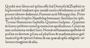
Caesar, Julius. Works, 1471. Printed, in venice by Nicolas Jenson, 1471.
Nicolas Jenson printed one of the earliest and most beautiful editions of Caesar. We note here especially the remarkable clarity and simplicity of the printer's Roman typeface, which drew its inspiration from etchings on Roman monuments. On this opening page we are also treated to a wonderful illuminated initial and border.
VK 405, Bible in Latin, Nicholas Jenson, Venice, 1479
The Bible was written by forty different human authors over a 1500-year period. While the original Autographs were perfect, the process of hand copying resulted in derivations from the original texts. Although no major doctrines of the faith have been compromised, decisions about which reading is correct necessitates an on-going study.The Van Kampen Collection continues to grow. Its distinct focus reflecting the historical transmission and various states of the biblical texts highlights the sovereign hand of God in the preservation of His precious word. An array of exemplary books and manuscripts from many cultures and eras makes the Collection an invaluable resource in the process of affirming the authenticity, accuracy, and authority of God's Word - the Bible.
Venetian publishing in Renaissance Europe
This book tells the story of how printing came to Venice, and how the most commercially advanced power in 15th century Europe exploited the new invention to disseminate the scholarship of the Renaissance. Within forty years of Gutenberg's invention, and despite having no tradition in printing, Venice had become responsible for nearly twenty percent of books published in Europe, and had almost driven the German pioneers out of the upper levels of the market. The early chapters examine the values and careers of the men who backed the first printers. Martin LowryMartin Lowry
Thomas Martin Lowry CBE FRS was an English physical chemist. Independently from Johannes Nicolaus Brønsted he has developed the Brønsted–Lowry acid–base theory and was as a founder-member and president of the Faraday Society.-Biography:Lowry was born in Low Moor, Bradford, West Yorkshire,...
s attention then turns to the printers themselves, particularly to the Frenchman Nicholas Jenson, the most influential publisher and printer of the age. The author analyses Jenson's design techniques and his quest for customers and describes the uneasy transition from manuscript to printed page. Today, venetian typefaces of the 1470s remain the basic currency of learning.
Gallery
See also
- Antiqua
- BemboBemboBembo is the name given to a 20th-century revival of an old style serif or humanist typeface cut by Francesco Griffo around 1495.The typeface Bembo seen today is a revival designed under the direction of Stanley Morison for the Monotype Corporation in 1929.It is considered a good choice for...
- History of western typography
- TypefaceTypefaceIn typography, a typeface is the artistic representation or interpretation of characters; it is the way the type looks. Each type is designed and there are thousands of different typefaces in existence, with new ones being developed constantly....
- Adobe JensonAdobe JensonAdobe Jenson is an old style serif typeface drawn for Adobe Systems by type designer Robert Slimbach. Its Roman styles are based on a Venetian oldstyle text face cut by Nicolas Jenson in 1470, and its italics are based on those by Ludovico Vicentino degli Arrighi...
- Roman typeface
- William MorrisWilliam MorrisWilliam Morris 24 March 18343 October 1896 was an English textile designer, artist, writer, and socialist associated with the Pre-Raphaelite Brotherhood and the English Arts and Crafts Movement...
Sources
- 1.Meggs, Philip B., Purvis, Alston W.History of Graphic Design. Hoboken, N.J: Wiley, 2006.
- 2."Nicolas Jenson." Encyclopædia Britannica. Encyclopædia Britannica Online. Encyclopædia Britannica, 2011. Web. 12 Oct. 2011.
- 3.Jenson, Nicolas, ca. 1420-1480. The last will and testament of the late Nicolas Jenson, printer, who departed this life at the city of Venice in the month of September, A.D. 1480. [Chicago, Ludlow typograph co., 1928] 15 p. 30 cm
- 4.Jenson, Nicolas, ca. 1420-1480. Pliny the Elder: historia naturalis[S.l. : s.n. ; 19--]
Lowry, Martin.
- 5.Nicholas Jenson and the rise of Venetian publishing in Renaissance Europe / Martin Lowry.
Oxford, UK ; Cambridge, Mass., USA : B. Blackwell, 1991. xvii, 286 p., [16] p. of plates : ill. ; 24 cm.
- http://www.jstor.org.proxy.library.csi.cuny.edu/stable/view/2124306?&Search=yes&searchText=nicholas&searchText=jenson&list=hide&searchUri=%2Faction%2FdoAdvancedSearch%3Fq0%3Dnicholas%2Bjenson%26f0%3Dall%26c1%3DAND%26q1%3D%26f1%3Dall%26acc%3Don%26wc%3Don%26Search%3DSearch%26sd%3D%26ed%3D%26la%3D%26jo%3D&prevSearch=&item=1&ttl=723&returnArticleService=showArticle
-
- http://www.jstor.org.proxy.library.csi.cuny.edu/stable/view/25542569?&Search=yes&searchText=nicholas&searchText=jenson&list=hide&searchUri=%2Faction%2FdoAdvancedSearch%3Fq0%3Dnicholas%2Bjenson%26f0%3Dall%26c1%3DAND%26q1%3D%26f1%3Dall%26acc%3Don%26wc%3Don%26Search%3DSearch%26sd%3D%26ed%3D%26la%3D%26jo%3D&prevSearch=&item=2&ttl=723&returnArticleService=showArticle
-
-
- http://www.jstor.org.proxy.library.csi.cuny.edu/stable/view/572966?&Search=yes&searchText=nicholas&searchText=jenson&list=hide&searchUri=%2Faction%2FdoAdvancedSearch%3Fq0%3Dnicholas%2Bjenson%26f0%3Dall%26c1%3DAND%26q1%3D%26f1%3Dall%26acc%3Don%26wc%3Don%26Search%3DSearch%26sd%3D%26ed%3D%26la%3D%26jo%3D&prevSearch=&item=3&ttl=723&returnArticleService=showArticle
-
- 6.Gross, Hanns. "Nicholas Jenson and the Rise of Venetian Publishing in Renaissance Europe." January 1, 1993
- 7.Type and Typography. Jim Martin.
Encyclopedia of Journalism. Ed. Christopher H. Sterling. Vol. 4. Thousand Oaks, CA: Sage Reference, 2009. p1405-1409.Word Count:2718.
- 8.Book, the Printed. V. E. LEWIS.
New Catholic Encyclopedia. Vol. 2. 2nd ed. Detroit: Gale, 2003. p520-524.Word Count:3393.
- 9.Bullen, Henry Lewis. Nicolas Jenson, Printer of Venice: His famous type designs and some comment upon the printing types of earlier printers. San Francisco. Printed by John Henry Nash.(1926)
and some typographic examples held at the Brooklyn Public Library under - Kurt H. Volk Inc. "Master Typographers of the Ages."
- 10.An Encyclopedic Survey of Type Design and Techniques Throughout History by Friedrich Friedl, Nicolaus Ott (Editor), Bernard Stein, published by Könemann Verlagsgesellschaft mbH
External links
- The will of Nicolas Jenson (English translation)
- Examples of Nicolas Jenson's printing
- http://www.flickr.com/photos/bookhistorian/sets/72157623526914141/