
Mrs Eaves
Encyclopedia
Mrs Eaves is a transitional serif typeface designed by Zuzana Licko
in 1996, and licensed by Emigre
, a typefoundry run by Licko and husband Rudy VanderLans
. Mrs Eaves is a revival of the types of English printer and punchcutter John Baskerville
, and is related to contemporary Baskerville typefaces
.
Licko's revival is less academic than some, basing as many of its details on contemporary methods of reproduction: the flatness of offset lithography in comparison to letterpress printing, and the resolution of set devices, and on-screen display. The overall stroke weight of Mrs Eaves is considerably heavier than most other revivals, countering the often anemic reproduction of smaller point sizes in other digital revivals of Baskerville, and restoring some of the feeling of letterpress printing's unpredictability.
The typeface family includes roman, italic, petite capitals, small capitals, bold, and roman and italic ligatures. Ligatures in all variants of Mrs Eaves include the standard fi, ffi, and fl ligatures, and resurrect the classic eighteenth century ct and st ligatures. A Just Ligatures variant, available in roman and italic, contain a vast array of new ligatures, many incorporating intertwined and swash characters.
Issue 38, The Authentic Issue, saw the first extensive use of Mrs Eaves in Emigre Magazine. http://www.emigre.com/EMag.php?issue=38
Licko's selection of the name Mrs Eaves reveals an interesting story. Like his types, John Baskerville was, himself, a controversial character. He hired Sarah Eaves as his housekeeper. Eventually her husband Richard abandoned her and their five children, and Mrs Eaves became Baskerville's mistress and eventual helpmate with typesetting and printing. She married Baskerville within a month of her estranged husband's death. Selection of the name Mrs Eaves honors one of the forgotten women in the history of typography.
In an interview featured in Eye
(No. 43, Vol. 11, Spring 2002), Licko explained why she thought Mrs Eaves was a successful typeface:
logotype is set in Mrs Eaves. It is also used for the titles (but not author names) on the covers and spines of the current Penguin Classics from Penguin Books
.
Blacktree's Quicksilver
wordmark uses Mrs Eaves. Roman and petite caps.
Bowdoin College
uses Mrs Eaves in the college wordmark and in many other official materials.
Radiohead
's 2003 album Hail to the Thief
prominently used Mrs Eaves in its related artworks.
Zuzana Licko
Zuzana Licko is a typeface designer based out of the San Francisco Bay Area who was born in Bratislava, Czechoslovakia.Licko came to the United States when she was a child along with her family...
in 1996, and licensed by Emigre
Emigre
Emigre, also known as Emigre Graphics, is a digital type foundry, publisher and distributor of graphic design centered information based in Berkeley, California, that was founded in 1984 by husband-and-wife team Rudy VanderLans and Zuzana Licko. The type foundry also published Emigre magazine...
, a typefoundry run by Licko and husband Rudy VanderLans
Rudy VanderLans
Rudy VanderLans is a Dutch type and graphic designer and the co-founder of Emigre, an independent type foundry.VanderLans studied at the Royal Academy of Art in the Hague. Later, he moved to California and studied photography at the University of California, Berkeley...
. Mrs Eaves is a revival of the types of English printer and punchcutter John Baskerville
John Baskerville
John Baskerville was an English businessman, in areas including japanning and papier-mâché, but he is best remembered as a printer and typographer.-Life:...
, and is related to contemporary Baskerville typefaces
Baskerville
Baskerville is a transitional serif typeface designed in 1757 by John Baskerville in Birmingham, England. Baskerville is classified as a transitional typeface, positioned between the old style typefaces of William Caslon, and the modern styles of Giambattista Bodoni and Firmin Didot.The...
.
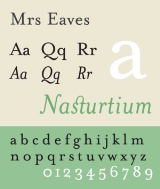
Description
Like Baskerville, Mrs Eaves has a near vertical stress, departing from the old style model. Identifying characters, similar to Baskerville's types, are the lowercase g with its open lower counter and swashlike ear. Both the roman and italic uppercase Q have a flowing swashlike tail. The uppercase C has serifs at top and bottom; there is no serif at the apex of the central junction in uppercase W; and the uppercase G has a sharp spur suggesting a vestigial serif.Licko's revival is less academic than some, basing as many of its details on contemporary methods of reproduction: the flatness of offset lithography in comparison to letterpress printing, and the resolution of set devices, and on-screen display. The overall stroke weight of Mrs Eaves is considerably heavier than most other revivals, countering the often anemic reproduction of smaller point sizes in other digital revivals of Baskerville, and restoring some of the feeling of letterpress printing's unpredictability.
The typeface family includes roman, italic, petite capitals, small capitals, bold, and roman and italic ligatures. Ligatures in all variants of Mrs Eaves include the standard fi, ffi, and fl ligatures, and resurrect the classic eighteenth century ct and st ligatures. A Just Ligatures variant, available in roman and italic, contain a vast array of new ligatures, many incorporating intertwined and swash characters.
Issue 38, The Authentic Issue, saw the first extensive use of Mrs Eaves in Emigre Magazine. http://www.emigre.com/EMag.php?issue=38
Licko's selection of the name Mrs Eaves reveals an interesting story. Like his types, John Baskerville was, himself, a controversial character. He hired Sarah Eaves as his housekeeper. Eventually her husband Richard abandoned her and their five children, and Mrs Eaves became Baskerville's mistress and eventual helpmate with typesetting and printing. She married Baskerville within a month of her estranged husband's death. Selection of the name Mrs Eaves honors one of the forgotten women in the history of typography.
In an interview featured in Eye
Eye (magazine)
Eye Magazine, The International Review of Graphic Design is a quarterly print magazine on graphic design and visual culture.- History :...
(No. 43, Vol. 11, Spring 2002), Licko explained why she thought Mrs Eaves was a successful typeface:
Prominent Uses
The WordPressWordPress
WordPress is a free and open source blogging tool and publishing platform powered by PHP and MySQL. It is often customized into a content management system . It has many features including a plug-in architecture and a template system. WordPress is used by over 14.7% of Alexa Internet's "top 1...
logotype is set in Mrs Eaves. It is also used for the titles (but not author names) on the covers and spines of the current Penguin Classics from Penguin Books
Penguin Books
Penguin Books is a publisher founded in 1935 by Sir Allen Lane and V.K. Krishna Menon. Penguin revolutionised publishing in the 1930s through its high quality, inexpensive paperbacks, sold through Woolworths and other high street stores for sixpence. Penguin's success demonstrated that large...
.
Blacktree's Quicksilver
Quicksilver (software)
Quicksilver is a computer utility software program for Mac OS X, originally developed by Blacktree Software and distributed freely. It is essentially a graphical shell for the Mac OS X operating system, allowing users to use the keyboard to rapidly perform tasks such as launching...
wordmark uses Mrs Eaves. Roman and petite caps.
Bowdoin College
Bowdoin College
Bowdoin College , founded in 1794, is an elite private liberal arts college located in the coastal Maine town of Brunswick, Maine. As of 2011, U.S. News and World Report ranks Bowdoin 6th among liberal arts colleges in the United States. At times, it was ranked as high as 4th in the country. It is...
uses Mrs Eaves in the college wordmark and in many other official materials.
Radiohead
Radiohead
Radiohead are an English rock band from Abingdon, Oxfordshire, formed in 1985. The band consists of Thom Yorke , Jonny Greenwood , Ed O'Brien , Colin Greenwood and Phil Selway .Radiohead released their debut single "Creep" in 1992...
's 2003 album Hail to the Thief
Hail to the Thief
Hail to the Thief is the sixth studio album by the English rock band Radiohead, released in June 2003 through Parlophone Records. After two Radiohead albums that featured heavily processed vocals, less guitar, and strong influence from experimental electronica and jazz, Hail to the Thief was seen...
prominently used Mrs Eaves in its related artworks.
Spacing issues
Mrs Eaves has been criticised by typographers for its very loose and uneven spacing, and for having few kerning pairs.Further reading
- Blackwell, Lewis. 20th Century Type. Yale University Press: 2004. ISBN 0-300-10073-6.
- Fiedl, Frederich, Nicholas Ott and Bernard Stein. Typography: An Encyclopedic Survey of Type Design and Techniques Through History. Black Dog & Leventhal: 1998. ISBN 1-57912-023-7.
- Macmillan, Neil. An A–Z of Type Designers. Yale University Press: 2006. ISBN 0-300-11151-7.
- Meggs, Philip B. and Roy McKelvey. Revival of the Fittest. RC Publications, Inc.: 2000. ISBN 1-883915-08-2
- Updike, Daniel Berkley. Printing Types Their History, Forms and Use, Vol. II. Dover Publications, Inc.: 1937, 1980. ISBN 0-486-23929-2