

Information graphics
Encyclopedia
Information
Information in its most restricted technical sense is a message or collection of messages that consists of an ordered sequence of symbols, or it is the meaning that can be interpreted from such a message or collection of messages. Information can be recorded or transmitted. It can be recorded as...
, data
Data
The term data refers to qualitative or quantitative attributes of a variable or set of variables. Data are typically the results of measurements and can be the basis of graphs, images, or observations of a set of variables. Data are often viewed as the lowest level of abstraction from which...
or knowledge
Knowledge
Knowledge is a familiarity with someone or something unknown, which can include information, facts, descriptions, or skills acquired through experience or education. It can refer to the theoretical or practical understanding of a subject...
. These graphics
Graphics
Graphics are visual presentations on some surface, such as a wall, canvas, computer screen, paper, or stone to brand, inform, illustrate, or entertain. Examples are photographs, drawings, Line Art, graphs, diagrams, typography, numbers, symbols, geometric designs, maps, engineering drawings,or...
present complex information quickly and clearly, such as in signs
Information sign
An information sign is a very legibly printed and very noticeable placard that informs people of the purpose of an object, or gives them instruction on the use of something. An example is a traffic sign such as a stop sign....
, maps
MAPS
Maps is the plural of map, a visual representation of an area.As an acronym, MAPS may refer to:* Mail Abuse Prevention System, an organisation that provides anti-spam support...
, journalism
Journalism
Journalism is the practice of investigation and reporting of events, issues and trends to a broad audience in a timely fashion. Though there are many variations of journalism, the ideal is to inform the intended audience. Along with covering organizations and institutions such as government and...
, technical writing
Technical writing
Technical writing, a form of technical communication, is a style of writing used in fields as diverse as computer hardware and software, engineering, chemistry, the aerospace industry, robotics, finance, consumer electronics, and biotechnology....
, and education
Education
Education in its broadest, general sense is the means through which the aims and habits of a group of people lives on from one generation to the next. Generally, it occurs through any experience that has a formative effect on the way one thinks, feels, or acts...
. With an information graphic, computer scientists
Computer science
Computer science or computing science is the study of the theoretical foundations of information and computation and of practical techniques for their implementation and application in computer systems...
, mathematician
Mathematician
A mathematician is a person whose primary area of study is the field of mathematics. Mathematicians are concerned with quantity, structure, space, and change....
s, and statisticians develop and communicate concepts using a single symbol to process information.
Overview
Today information graphics surround us in the media, in published works both pedestrian and scientific, in road signs and manuals. They illustrate information that would be unwieldy in text form, and act as a visual shorthand for everyday concepts such as stopStop sign
A Stop sign is a traffic sign to notify drivers that they must stop before proceeding.-Specifications:The Vienna Convention on Road Signs and Signals proposed standard stop sign diameters of 0.6, 0.9 or 1.2 metres. UK and New Zealand stop signs are 750, 900 or 1200 mm, according to sign...
and go
Arrow (symbol)
An arrow is a graphical symbol such as → or ←, used to point or indicate direction, being in its simplest form a line segment with a triangle affixed to one end, and in more complex forms a representation of an actual arrow...
.
In newspapers, infographics are commonly used to show the weather, as well as maps and site plans for newsworthy events, and graphs for statistical data. Some books are almost entirely made up of information graphics, such as David Macaulay
David Macaulay
David Macaulay is an author and illustrator. Now a resident of Norwich, Vermont, United States, he is an alumnus and faculty member at the Rhode Island School of Design.- Biography :...
's The Way Things Work
The Way Things Work
The Way Things Work is a book by David Macaulay. It is intended to serve as an entertaining introduction to everyday machines. It covers machines as simple as levers and gears and as complicated as radio telescopes and automatic transmissions...
. Although they are used heavily in children's books, they are also common in scientific literature, where they illustrate physical systems, especially ones that cannot be photographed (such as cutaway diagrams, astronomical diagrams, and images of microscopic or sub-microscopic systems).
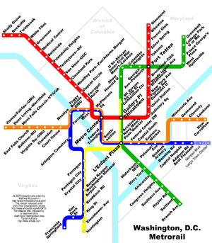
Modern maps, especially route maps for transit systems, use infographic techniques to integrate a variety of information, such as the conceptual layout of the transit network, transfer points, and local landmarks.
Traffic signs and other public signs rely heavily on information graphics, such as stylized human figures (the ubiquitous stick figure
Stick figure
A stick figure is a very simple type of drawing made of lines and dots, often of the human form or other animals. In a stick figure, the head is represented by a circle, sometimes embellished with details such as eyes, mouth or crudely scratched-out hair. The arms, legs and torso are all...
), icons and emblems to represent concepts such as yield, caution, and the direction of traffic. Public places such as transit terminals usually have some sort of integrated "signage system" with standardized icons and stylized maps.
Technical manuals make extensive use of diagrams and also common icons to highlight warnings, dangers, and standards certifications.
Early experiments
Prehistory
Prehistory is the span of time before recorded history. Prehistory can refer to the period of human existence before the availability of those written records with which recorded history begins. More broadly, it refers to all the time preceding human existence and the invention of writing...
, early humans created the first information graphics: cave paintings and later maps
MAPS
Maps is the plural of map, a visual representation of an area.As an acronym, MAPS may refer to:* Mail Abuse Prevention System, an organisation that provides anti-spam support...
. Map-making began several millennia before writing
Writing
Writing is the representation of language in a textual medium through the use of a set of signs or symbols . It is distinguished from illustration, such as cave drawing and painting, and non-symbolic preservation of language via non-textual media, such as magnetic tape audio.Writing most likely...
, and the map at Çatalhöyük
Çatalhöyük
Çatalhöyük was a very large Neolithic and Chalcolithic settlement in southern Anatolia, which existed from approximately 7500 BCE to 5700 BCE...
dates from around 7500 BCE. Later icons were used to keep records of cattle and stock. The Indians of Mesoamerica
Mesoamerica
Mesoamerica is a region and culture area in the Americas, extending approximately from central Mexico to Belize, Guatemala, El Salvador, Honduras, Nicaragua, and Costa Rica, within which a number of pre-Columbian societies flourished before the Spanish colonization of the Americas in the 15th and...
used imagery to depict the journeys of past generations. Illegible on their own, they served as a supportive element to memory and storytelling.
In 1786, William Playfair
William Playfair
William Playfair was a Scottish engineer and political economist, the founder of graphical methods of statistics....
published the first data graphs
Graphics
Graphics are visual presentations on some surface, such as a wall, canvas, computer screen, paper, or stone to brand, inform, illustrate, or entertain. Examples are photographs, drawings, Line Art, graphs, diagrams, typography, numbers, symbols, geometric designs, maps, engineering drawings,or...
in his book The Commercial and Political Atlas. The book is filled with statistical graphs, bar chart
Bar chart
A bar chart or bar graph is a chart with rectangular bars with lengths proportional to the values that they represent. The bars can be plotted vertically or horizontally....
s, line graph
Line graph
In graph theory, the line graph L of undirected graph G is another graph L that represents the adjacencies between edges of G...
s and histogram
Histogram
In statistics, a histogram is a graphical representation showing a visual impression of the distribution of data. It is an estimate of the probability distribution of a continuous variable and was first introduced by Karl Pearson...
s, that represent the economy of 18th century England
England
England is a country that is part of the United Kingdom. It shares land borders with Scotland to the north and Wales to the west; the Irish Sea is to the north west, the Celtic Sea to the south west, with the North Sea to the east and the English Channel to the south separating it from continental...
. In 1801 Playfair introduced the first area chart
Area chart
An area chart or area graph displays graphically quantitive data. It is based on the line chart. The area between axis and line are commonly emphasized with colors, textures and hatchings...
and pie chart
Pie chart
A pie chart is a circular chart divided into sectors, illustrating proportion. In a pie chart, the arc length of each sector , is proportional to the quantity it represents. When angles are measured with 1 turn as unit then a number of percent is identified with the same number of centiturns...
in Statistical Breviary.
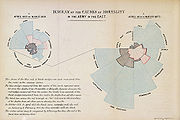
In 1857, English nurse Florence Nightingale
Florence Nightingale
Florence Nightingale OM, RRC was a celebrated English nurse, writer and statistician. She came to prominence for her pioneering work in nursing during the Crimean War, where she tended to wounded soldiers. She was dubbed "The Lady with the Lamp" after her habit of making rounds at night...
used information graphics persuading Queen Victoria to improve conditions in military hospitals, principally the Coxcomb chart, a combination of stacked bar and pie charts, depicting the number and causes of deaths during each month of the Crimean War
Crimean War
The Crimean War was a conflict fought between the Russian Empire and an alliance of the French Empire, the British Empire, the Ottoman Empire, and the Kingdom of Sardinia. The war was part of a long-running contest between the major European powers for influence over territories of the declining...
.
1861 saw the release of a seminal information graphic on the subject of Napoleon's disastrous march on Moscow
French invasion of Russia
The French invasion of Russia of 1812 was a turning point in the Napoleonic Wars. It reduced the French and allied invasion forces to a tiny fraction of their initial strength and triggered a major shift in European politics as it dramatically weakened French hegemony in Europe...
.
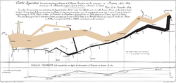
Charles Joseph Minard
Charles Joseph Minard was a French civil engineer noted for his inventions in the field of information graphics.- Biography :...
, captured four different changing variables that contributed to the failure, in a single two-dimensional image: the army's direction as they traveled, the location the troops passed through, the size of the army as troops died from hunger and wounds, and the freezing temperatures they experienced.
James Joseph Sylvester
James Joseph Sylvester
James Joseph Sylvester was an English mathematician. He made fundamental contributions to matrix theory, invariant theory, number theory, partition theory and combinatorics...
introduced the term "graph" in 1878 and published a set of diagrams showing the relationship between chemical bonds and mathematical properties. These were also the first mathematic graphs
Graph (mathematics)
In mathematics, a graph is an abstract representation of a set of objects where some pairs of the objects are connected by links. The interconnected objects are represented by mathematical abstractions called vertices, and the links that connect some pairs of vertices are called edges...
.
The development of a visual language in the 20th century
In 1936 Otto NeurathOtto Neurath
Otto Neurath was an Austrian philosopher of science, sociologist, and political economist...
introduced a system of pictographs intended to function as an international visual or picture language. Isotype
Isotype (pictograms)
Isotype is a method of showing social, technological, biological and historical connections in pictorial form...
included a set of stylized human figures which were the basis for the ubiquitous modern stick figures.
In 1942 Isidore Isou
Isidore Isou
Isidore Isou , born Ioan-Isidor Goldstein, was a Romanian-born French poet, film critic and visual artist...
published the Lettrist manifesto.
In 1958 Stephen Toulmin
Stephen Toulmin
Stephen Edelston Toulmin was a British philosopher, author, and educator. Influenced by Ludwig Wittgenstein, Toulmin devoted his works to the analysis of moral reasoning. Throughout his writings, he sought to develop practical arguments which can be used effectively in evaluating the ethics behind...
proposed a graphical argument model that became influential in argumentation theory
Argumentation theory
Argumentation theory, or argumentation, is the interdisciplinary study of how humans should, can, and do reach conclusions through logical reasoning, that is, claims based, soundly or not, on premises. It includes the arts and sciences of civil debate, dialogue, conversation, and persuasion...
and its applications.
The 1972 Munich Olympics were the venue for Otl Aicher to introduce a new set of pictograms that proved to be extremely popular, and influenced the ubiquitous modern stick figures used in public signs.
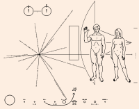
Pioneer plaque
The Pioneer plaques are a pair of gold-anodized aluminium plaques which were placed on board the 1972 Pioneer 10 and 1973 Pioneer 11 spacecraft, featuring a pictorial message, in case either Pioneer 10 or 11 are intercepted by extraterrestrial life...
was launched into space with the Pioneer 10
Pioneer 10
Pioneer 10 is a 258-kilogram robotic space probe that completed the first interplanetary mission to Jupiter, and became the first spacecraft to achieve escape velocity from the Solar System. The project was managed by the NASA Ames Research Center and the contract for the construction of the...
probe. Inscribed into the plaque was an information graphic intended as a kind of interstellar message in a bottle
Message in a bottle
A message in a bottle is a form of communication whereby a message is sealed in a container and released into the sea or ocean...
, designed by Carl Sagan
Carl Sagan
Carl Edward Sagan was an American astronomer, astrophysicist, cosmologist, author, science popularizer and science communicator in astronomy and natural sciences. He published more than 600 scientific papers and articles and was author, co-author or editor of more than 20 books...
and Frank Drake
Frank Drake
Frank Donald Drake PhD is an American astronomer and astrophysicist. He is most notable as one of the pioneers in the search for extraterrestrial intelligence, including the founding of SETI, mounting the first observational attempts at detecting extraterrestrial communications in 1961 in Project...
. The message is unique in that it is intended to be understood
Communication with Extraterrestrial Intelligence
Communication with extraterrestrial intelligence is a branch of the search for extraterrestrial intelligence that focuses on composing and deciphering messages that could theoretically be understood by another technological civilization. The best-known CETI experiment was the 1974 Arecibo message...
by extraterrestrial beings who would share no common language with humans. It depicts a picture of a man and a woman standing in front of a simplified silhouette of the probe in order to give a sense of scale. It also contains a map locating the sun relative to a number of pulsars, and a simplified depiction of the solar system, with the probe's path from earth into outer space shown with an arrow.
2005–Present day. The information graphic trend starts to become popular amongst the larger social media aggregation sites Digg Reddit. The data contained in modern info graphics tends to be research centric and attributed to multiple sources.
With the popularity of the information graphics continuing to grow, see google search trends, many internet marketing companies use this to generate viral content that web users will share freely.
Visual devices
Information graphics are visual devices intended to communicate complex information quickly and clearly. The devices include, according to Doug Newsom (2004), charts, diagrams, graphs, tables, maps and lists. Among the most common devices are horizontal bar chartBar chart
A bar chart or bar graph is a chart with rectangular bars with lengths proportional to the values that they represent. The bars can be plotted vertically or horizontally....
s, vertical column charts, and round or oval pie chart
Pie chart
A pie chart is a circular chart divided into sectors, illustrating proportion. In a pie chart, the arc length of each sector , is proportional to the quantity it represents. When angles are measured with 1 turn as unit then a number of percent is identified with the same number of centiturns...
s, that can summarize a lot of statistical information. Diagram
Diagram
A diagram is a two-dimensional geometric symbolic representation of information according to some visualization technique. Sometimes, the technique uses a three-dimensional visualization which is then projected onto the two-dimensional surface...
s can be used to show how a system works, and may be an organizational chart
Organizational chart
An organizational chart is a diagram that shows the structure of an organization and the relationships and relative ranks of its parts and positions/jobs...
that shows lines of authority, or a systems flowchart
Flowchart
A flowchart is a type of diagram that represents an algorithm or process, showing the steps as boxes of various kinds, and their order by connecting these with arrows. This diagrammatic representation can give a step-by-step solution to a given problem. Process operations are represented in these...
that shows sequential movement. Illustrated graphics use images to related data. The snapshots features used every day by USA Today are good examples of this technique. Tables
Table (information)
A table is a means of arranging data in rows and columns.Production % of goalNorth 4087102%South 4093110% The use of tables is pervasive throughout all communication, research and data analysis. Tables appear in print media, handwritten notes, computer software, architectural...
are commonly used and may contain lots of numbers. Modern interactive maps and bulleted numbers are also infographic devices.
Elements of information graphics
The basic material of an information graphic is the dataData
The term data refers to qualitative or quantitative attributes of a variable or set of variables. Data are typically the results of measurements and can be the basis of graphs, images, or observations of a set of variables. Data are often viewed as the lowest level of abstraction from which...
, information
Information
Information in its most restricted technical sense is a message or collection of messages that consists of an ordered sequence of symbols, or it is the meaning that can be interpreted from such a message or collection of messages. Information can be recorded or transmitted. It can be recorded as...
, or knowledge
Knowledge
Knowledge is a familiarity with someone or something unknown, which can include information, facts, descriptions, or skills acquired through experience or education. It can refer to the theoretical or practical understanding of a subject...
that the graphic presents. In the case of data, the creator may make use of automated tools such as graphing software to represent the data in the form of lines, boxes, arrows, and various symbols and pictograms. The information graphic might also feature a key
Glossary
A glossary, also known as an idioticon, vocabulary, or clavis, is an alphabetical list of terms in a particular domain of knowledge with the definitions for those terms...
which defines the visual elements in plain English. A scale
Scale (map)
The scale of a map is defined as the ratio of a distance on the map to the corresponding distance on the ground.If the region of the map is small enough for the curvature of the Earth to be neglected, then the scale may be taken as a constant ratio over the whole map....
and labels are also common.
The elements of an info graphic do not have to be an exact or realistic representation of the data, but can be a simplified version.
Interpreting information graphics
Many information graphics are specialised forms of depictionDepiction
Depiction is meaning conveyed through pictures. Basically, a picture maps an object to a two-dimensional scheme or picture plane. Pictures are made with various materials and techniques, such as painting, drawing, or prints mosaics, tapestries, stained glass, and collages of unusual and disparate...
that represent their content in sophisticated and often abstract ways. In order to interpret the meaning of these graphics appropriately, the viewer requires a suitable level of graphicacy
Graphicacy
Graphicacy is concerned with the capacities people require in order to interpret and generate information in the form of graphics.Our society is becoming increasingly reliant on graphics to communicate information. Until recently, words and numbers were the main vehicles for communication –...
. In many cases, the required graphicacy involves comprehension
Comprehension (logic)
In logic, the comprehension of an object is the totality of intensions, that is, attributes, characters, marks, properties, or qualities, that the object possesses, or else the totality of intensions that are pertinent to the context of a given discussion...
skills that are learned rather than innate. At a fundamental level, the skills of decoding individual graphic signs and symbols must be acquired before sense can be made of an information graphic as a whole. However, knowledge of the conventions
Convention (norm)
A convention is a set of agreed, stipulated or generally accepted standards, norms, social norms or criteria, often taking the form of a custom....
for distributing and arranging these individual components is also necessary for the building of understanding.
Interpreting with a common visual language
In contrast to the above, many other forms of infographics take advantage of innate visual language that is largely universal. The disciplined use of the color red, for emphasis, on an otherwise muted design, demands attention in a primal way even children understand. Many maps, interfaces, dials and gauges on instruments and machinery use icons that are easy to grasp and speed understanding for safe operation. The use of a rabbit and a turtle icon to represent fast and slow, respectively, is one such successful use by the John DeereJohn Deere
John Deere was an American blacksmith and manufacturer who founded Deere & Company, one of the largest and leading agricultural and construction equipment manufacturers in the world...
company on the throttle of their tractors.
Modern practitioners
A statistician and sculptor, Edward TufteEdward Tufte
Edward Rolf Tufte is an American statistician and professor emeritus of political science, statistics, and computer science at Yale University. He is noted for his writings on information design and as a pioneer in the field of data visualization....
has written a series of highly regarded books on the subject of information graphics. Tufte also delivers lectures and workshops on a regular basis. He describes the process of incorporating many dimensions of information into a two-dimensional image as 'escaping flatland' (alluding to the 2-dimensional world of the Victorian novella Flatland
Flatland
Flatland: A Romance of Many Dimensions is an 1884 satirical novella by the English schoolmaster Edwin Abbott Abbott. Writing pseudonymously as "A Square", Abbott used the fictional two-dimensional world of Flatland to offer pointed observations on the social hierarchy of Victorian culture...
).
The work done by Peter Sullivan
Peter Sullivan (designer)
Peter Sullivan was a British graphic designer best known for his work on information graphics in The Sunday Times. He worked for the paper 15 years, starting from the beginning of the 1970s, until his death at the age of 64. His colleagues included Nigel Holmes, Edwin Taylor, Robert Harding and...
for The Sunday Times
The Sunday Times (UK)
The Sunday Times is a Sunday broadsheet newspaper, distributed in the United Kingdom. The Sunday Times is published by Times Newspapers Ltd, a subsidiary of News International, which is in turn owned by News Corporation. Times Newspapers also owns The Times, but the two papers were founded...
in the 1970s, 80s and 90s, was one of the key factors in encouraging newspapers to use more graphics. Sullivan is also one of the few authors who have written about information graphics in newspapers. Likewise the staff artists at USA Today
USA Today
USA Today is a national American daily newspaper published by the Gannett Company. It was founded by Al Neuharth. The newspaper vies with The Wall Street Journal for the position of having the widest circulation of any newspaper in the United States, something it previously held since 2003...
, the colorful United States newspaper that debuted in 1982, firmly established the philosophy of using graphics to make information easier to comprehend. The paper received criticism for oversimplifying news and sometimes creating infographics that emphasized entertainment over respect for content and data, sometimes referred to as chartjunk
Chartjunk
Chartjunk refers to all visual elements in charts and graphs that are not necessary to comprehend the information represented on the graph, or that distract the viewer from this information....
. While some critics deride the graphic qualities of this work, its role in establishing infographics as a practice cannot be ignored.
Nigel Holmes
Nigel Holmes
Nigel Holmes is a British graphic designer and theorist, who focuses on information graphics and information design.- Biography :Holmes received a MA in illustration from the Royal College of Art in 1966....
is an established commercial creator of what he calls "explanation graphics". His works deal not only with the visual display of information but also of knowledge – how to do things. He created graphics for Time magazine for 16 years, and is the author of several books on the subject.
Close and strongly related to the field of information graphics, is information design
Information design
Information design is the skill and practice of preparing information so people can use it with efficiency and effectiveness. Where the data is complex or unstructured, a visual representation can express its meaning more clearly to the viewer....
. Actually, making infographics is a certain discipline within the information design world. Author and founder of the TED
TED (conference)
TED is a global set of conferences owned by the private non-profit Sapling Foundation, formed to disseminate "ideas worth spreading"....
, Richard Saul Wurman
Richard Saul Wurman
Richard Saul Wurman is an architect and graphic designer who is considered to be a pioneer in the practice of making information easily understandable. Wurman has written and designed over 80 books, and created the TED conferences, but remains associated only with TEDMED.-Early life and...
, is considered the originator of the phrase, "information architect", and many of his books, such as Information Anxiety, helped propel the phrase, "information design", from a concept to an actual job category.
While the art form of infographics has its roots in print, by the year 2000, the use of Adobe Flash
Adobe Flash
Adobe Flash is a multimedia platform used to add animation, video, and interactivity to web pages. Flash is frequently used for advertisements, games and flash animations for broadcast...
-based animations on the web has allowed to make mapping solutions and other products famous and addictive by using many key best practices of infographics.
Likewise, their use in television is relatively recent, for in 2002, two Norwegian musicians of Röyksopp issued a music video for their song Remind Me that was completely made from animated infographics. In 2004, a television commercial for the French energy company Areva
Areva
AREVA is a French public multinational industrial conglomerate headquartered in the Tour Areva in Courbevoie, Paris. AREVA is mainly known for nuclear power; it also has interests in other energy projects. It was created on 3 September 2001, by the merger of Framatome , Cogema and...
used similar animated infographics and both of these videos and their high visibility have helped the corporate world recognize the value in using this form of visual language to describe complex information efficiently.
See also
- A picture is worth a thousand wordsA picture is worth a thousand wordsThe adage "A picture is worth a thousand words" refers to the idea that a complex idea can be conveyed with just a single still image. It also aptly characterizes one of the main goals of visualization, namely making it possible to absorb large amounts of data quickly.It is believed that the modern...
- Argument map
- Charts
- Condegram spiral plotCondegram spiral plotThe Condegram spiral plot is an illustrative device developed by , Associate Professor at the University of Alaska, Fairbanks to display space weather data. Space weather effects on Earth are ultimately driven by processes originating with the Sun, many of which are communicated to Earth by the...
- Digital dashboardDashboard (interface)In computer user interfaces, a dashboard is a floating window that provides contextual access to commonly used tools in a software program. The interface is used to greatest effect in full-screen editing modes. Dashboard user interfaces are also used to display management information in an easy to...
- Data Presentation ArchitectureData Presentation ArchitectureData presentation architecture is a skill-set that seeks to identify, locate, manipulate, format and present data in such a way as to optimally communicate meaning and proffer knowledge.-Origin and context:...
- Data visualizationData visualizationData visualization is the study of the visual representation of data, meaning "information that has been abstracted in some schematic form, including attributes or variables for the units of information"....
- Graphic designGraphic designGraphic design is a creative process – most often involving a client and a designer and usually completed in conjunction with producers of form – undertaken in order to convey a specific message to a targeted audience...
- Graphic image development
- Graphic organizers
- Information designInformation designInformation design is the skill and practice of preparing information so people can use it with efficiency and effectiveness. Where the data is complex or unstructured, a visual representation can express its meaning more clearly to the viewer....
- List of information graphics software
- Scientific visualizationScientific visualizationScientific visualization is an interdisciplinary branch of science according to Friendly "primarily concerned with the visualization of three-dimensional phenomena , where the emphasis is on realistic renderings of volumes, surfaces, illumination sources, and so forth, perhaps...
- Statistical graphicsStatistical graphicsStatistical graphics, also known as graphical techniques, are information graphics in the field of statistics used to visualize quantitative data.- Overview :...
- Technical illustrationTechnical illustrationTechnical Illustration is the use of illustration to visually communicate information of a technical nature. Technical illustrations can be components of technical drawings or diagrams...
- Isotype (picture language)
- TimelineTimelineA timeline is a way of displaying a list of events in chronological order, sometimes described as a project artifact . It is typically a graphic design showing a long bar labeled with dates alongside itself and events labeled on points where they would have happened.-Uses of timelines:Timelines...
- Visualization (graphic)Visualization (graphic)Visualization is any technique for creating images, diagrams, or animations to communicate a message. Visualization through visual imagery has been an effective way to communicate both abstract and concrete ideas since the dawn of man...
- News IllustratedNews IllustratedNews Illustrated is a full-page information graphic that runs every Sunday in the South Florida Sun-Sentinel, one of 12 newspapers owned by Tribune Company. It tells news stories visually — and in ways that are hard to replicate with traditional journalism...
Further reading
- Jacques BertinJacques BertinJacques Bertin was a French cartographer and theorist, known from his book Semiologie Graphique , edited in 1967...
(1983). Semiology of Graphics. Madison, WI: University of Wisconsin Press. Translation by William Berg of Semiologie Graphique. Paris: Mouton/Gauthier-Villars, 1967. - William S. Cleveland (1985). The Elements of Graphing Data. Summit, NJ: Hobart Press.
- William S. Cleveland (1993). Visualizing Data. Summit, NJ: Hobart Press.
- Paul LewiPaul LewiPaul J. Lewi is a Belgian scientist, who elaborated Spectral Map Analysis in 1975 and was one of the cofounders of chemometrics in 1983. Paul Lewi is married with Philomena Van Bylen, and together they have 5 children.- Biography :...
(2006). "Speaking of Graphics". - Thomas L. Hankins (1999). "Blood, dirt, and nomograms: A particular history of graphs". In: Isis, 90:50–80.
- Robert L. Harris (1999). Information Graphics: A Comprehensive Illustrated Reference. Oxford University Press.
- Eric K. Meyer (1997). Designing Infographics. Hayden Books.
- Edward R. Tufte (1983). The Visual Display of Quantitative Information. Edition, Cheshire, CT: Graphics Press.
- Edward R. Tufte (1990). Envisioning Information. Cheshire, CT: Graphics Press.
- Edward R. Tufte (1997). Visual Explanations: Images and Quantities, Evidence and Narrative. Cheshire,
- Edward R. Tufte (2006). Beautiful Evidence. Cheshire. CT: Graphics Press.
- John Wilder Tukey (1977). Exploratory Data Analysis. Addison-Wesley.
External links
- Infographipedia, the infographic search engine Infographipedia claims more than 25 000 infographics where everyone can also post infographics
- Milestones in the History of Thematic Cartography, Statistical Graphics and Data Visualization
- Periodic Table of Visualization Methods
- NSF Science & Engineering Visualization Challenge
- Society for Newsdesign
- Integration and Application Network Conceptual Diagram Symbol Libraries – Free vector symbol libraries (from the Integration and Application NetworkIntegration and Application NetworkThe Integration and Application Network is an initiative of the University of Maryland Center for Environmental Science. IAN's mission is to inspire, manage and produce timely syntheses and assessments, working creatively with a wide variety of global partners.IAN help scientists to effectively...
) for communicating environmental science through conceptual diagrams. - Semi-Structured and Unstructured Information Systems: Information Visualization Summary Review Book Chapter.
- InformationIsBeautiful.net
- http://topseoliverpool.co.uk/wp-content/uploads/2011/10/QR-CODES-INFOGRAPHIC1.png Example of an Infographic Displaying Data
- Visualizing Information for Advocacy: An Introduction to Information Design Booklet on information design for non-profit and non-governmental organizations.