
Color theory
Encyclopedia
In the visual arts
, color theory is a body of practical guidance to color
mixing and the visual impacts of specific color combinations. Although color theory principles first appeared in the writings of Leone Battista Alberti
(c.1435) and the notebooks of Leonardo da Vinci
(c.1490), a tradition of "colory theory" began in the 18th century, initially within a partisan controversy around Isaac Newton
's theory of color (Opticks, 1704) and the nature of so-called primary color
s. From there it developed as an independent artistic tradition with only superficial reference to colorimetry
and vision science
.
The most important problem has been a confusion between the behavior of light
mixtures, called additive color
, and the behavior of paint or ink or dye or pigment mixtures, called subtractive color
. This problem arises because the absorption of light by material substances follows different rules from the perception of light by the eye.
A second problem has been the failure to describe the very important effects of strong luminance (lightness) contrasts in the appearance of colors reflected from a surface (such as paints or inks) as opposed to colors of light; "colors" such as browns or ochres cannot appear in mixtures of light. Thus, a strong lightness contrast between a mid-valued yellow paint and a surrounding bright white makes the yellow appear to be green or brown, while a strong brightness contrast between a rainbow and the surrounding sky makes the yellow in a rainbow appear to be a fainter yellow, or white.
A third problem has been the tendency to describe color effects holistically or categorically, for example as a contrast between "yellow" and "blue" conceived as generic colors, when most color effects are due to contrasts on three relative attributes that define all colors:
Thus, the visual impact of "yellow" vs. "blue" hues in visual design depends on the relative lightness and intensity of the hues.
These confusions are partly historical, and arose in scientific uncertainty about color perception that was not resolved until the late 19th century, when the artistic notions were already entrenched. However, they also arise from the attempt to describe the highly contextual and flexible behavior of color perception in terms of abstract color sensations that can be generated equivalently by any visual media.
Many historical "color theorists" have assumed that three "pure" primary colors can mix all possible colors, and that any failure of specific paints or inks to match this ideal performance is due to the impurity or imperfection of the colorants. In reality, only imaginary "primary colors" used in colorimetry can "mix" or quantify all visible (perceptually possible) colors; but to do this, these imaginary primaries are defined as lying outside the range of visible colors; i.e., they cannot be seen. Any three real "primary" colors of light, paint or ink can mix only a limited range of colors, called a gamut
, which is always smaller (contains fewer colors) than the full range of colors humans can perceive.
)—because these colors were believed capable of mixing all other colors. This color mixing behavior had long been known to printers, dyers and painters, but these trades preferred pure pigments to primary color mixtures, because the mixtures were too dull (unsaturated).
 The RYB primary colors became the foundation of 18th century theories of color vision
, as the fundamental sensory qualities that are blended in the perception of all physical colors and equally in the physical mixture of pigments or dyes. These theories were enhanced by 18th-century investigations of a variety of purely psychological color effects, in particular the contrast between "complementary" or opposing hues that are produced by color afterimages and in the contrasting shadows in colored light. These ideas and many personal color observations were summarized in two founding documents in color theory: the Theory of Colours (1810) by the German poet and government minister Johann Wolfgang von Goethe
, and The Law of Simultaneous Color Contrast (1839) by the French industrial chemist Michel Eugène Chevreul
.
Subsequently, German and English scientists established in the late 19th century that color perception is best described in terms of a different set of primary colors—red, green and blue violet (RGB
)—modeled through the additive mixture of three monochromatic lights. Subsequent research anchored these primary colors in the differing responses to light by three types of color receptors or cones in the retina
(trichromacy). On this basis the quantitative description of color mixture or colorimetry
developed in the early 20th century, along with a series of increasingly sophisticated models of color space
and color perception, such as the opponent process
theory.
Across the same period, industrial chemistry radically expanded the color range of lightfast synthetic pigments, allowing for substantially improved saturation in color mixtures of dyes, paints and inks. It also created the dyes and chemical processes necessary for color photography. As a result three-color printing became aesthetically and economically feasible in mass printed media, and the artists' color theory was adapted to primary colors most effective in inks or photographic dyes: cyan
, magenta
, and yellow
(CMY). (In printing, dark colors are supplemented by a black ink, known as the CMYK system; in both printing and photography, white is provided by the color of the paper.) These CMY primary colors were reconciled with the RGB primaries, and subtractive color mixing with additive color mixing, by defining the CMY primaries as substances that absorbed only one of the retinal primary colors: cyan absorbs only red (−R+G+B), magenta only green (+R−G+B), and yellow only blue violet (+R+G−B). It is important to add that the CMYK, or process, color printing is meant as an economical way of producing a wide range of colors for printing, but is deficient in reproducing certain colors, notably orange and slightly deficient in reproducing purples. A wider range of color can be obtained with the addition of other colors to the printing process, such as in Pantone
's Hexachrome
printing ink system (six colors), among others.
 For much of the 19th century artistic color theory either lagged behind scientific understanding or was augmented by science books written for the lay public, in particular Modern Chromatics (1879) by the American physicist Ogden Rood
, and early color atlases developed by Albert Munsell (Munsell Book of Color, 1915, see Munsell color system
) and Wilhelm Ostwald
(Color Atlas, 1919). Major advances were made in the early 20th century by artists teaching or associated with the German Bauhaus
, in particular Wassily Kandinsky
, Johannes Itten
, Faber Birren and Josef Albers
, whose writings mix speculation with an empirical or demonstration-based study of color design principles.
Contemporary color theory must address the expanded range of media created by digital media and print management systems, which substantially expand the range of imaging systems and viewing contexts in which color can be used. These applications are areas of intensive research, much of it proprietary; artistic color theory has little to say about these complex new opportunities.
is often used to describe complementary colors, which are colors which cancel each other's hue to produce an achromatic (white, gray or black) light mixture. Newton offered as a conjecture that colors exactly opposite one another on the hue circle cancel out each other's hue; this concept was demonstrated more thoroughly in the 19th century.
A key assumption in Newton's hue circle was that the "fiery" or maximum saturated hues are located on the outer circumference of the circle, while achromatic white is at the center. Then the saturation of the mixture of two spectral hues was predicted by the straight line between them; the mixture of three colors was predicted by the "center of gravity" or centroid of three triangle points, and so on.
 According to traditional color theory based on subtractive primary colors and the RYB color model
, which is derived from paint mixtures, yellow mixed with violet, orange mixed with blue, or red mixed with green produces an equivalent gray and are the painter's complementary colors. These contrasts form the basis of Chevreul's law of color contrast: colors that appear together will be altered as if mixed with the complementary color of the other color. Thus, a piece of yellow fabric placed on a blue background will appear tinted orange, because orange is the complementary color to blue.
Unfortunately, the artists' primary colors are not the same as complementary colors defined by light mixtures. This discrepancy becomes important when color theory is applied across media. Digital color management uses a hue circle defined around the additive primary colors (the RGB color model
), as the colors in a computer monitor are additive mixtures of light, not subtractive mixtures of paints.
One reason the artist's primary colors even work at all is that the imperfect pigments being used have sloped absorption curves, and thus change color with concentration. A pigment that is pure red at high concentrations can behave more like magenta at low concentrations. This allows it to make purples that would otherwise be impossible. Likewise, a blue that is ultramarine at high concentrations appears cyan at low concentrations, allowing it to be used to mix green. Chromium red pigments can appear orange, and then yellow, as the concentration is reduced. It is even possible to mix very low concentrations of the blue mentioned and the chromium red to get a greenish color. This works much better with oil colors than it does with water colors and dyes.
So the old primaries depend on sloped absorption curves and pigment leakages to work, while the new scientifically derived ones depend solely on controlling the amount of absorption in certain parts of the spectrum.
Another reason the correct primary colors were not used by early artists is that they were not available as durable pigments. Modern methods in chemistry were needed to produce them.
, seems related to the observed contrast in landscape light, between the "warm" colors associated with daylight or sunset and the "cool" colors associated with a gray or overcast day. Warm colors are often said to be hues from red through yellow, browns and tans included; cool colors are often said to be the hues from blue green through blue violet, most grays included. There is historical disagreement about the colors that anchor the polarity, but 19th century sources put the peak contrast between red orange and greenish blue.
Color theory has ascribed perceptual and psychological effects to this contrast. Warm colors are said to advance or appear more active in a painting, while cool colors tend to recede; used in interior design or fashion, warm colors are said to arouse or stimulate the viewer, while cool colors calm and relax. Most of these effects, to the extent they are real, can be attributed to the higher saturation and lighter value of warm pigments in contrast to cool pigments. Thus, brown is a dark, unsaturated warm color that few people think of as visually active or psychologically arousing.
Compare the traditional warm–cool association of color with the color temperature
of a theoretical radiating black body
, where the association of color with temperature is reversed. For instance, the hottest star
s radiate blue light (i.e., with shorter wavelength and higher frequency) and the coolest radiate red.
Neutrals are obtained by mixing pure colors with either white,black or grey, or by mixing two complementary colors. In color theory, neutral colors are colors easily modified by adjacent more saturated colors and they appear to take on the hue complementary to the saturated color. Next to a bright red couch, a gray wall will appear distinctly greenish.
Black and white have long been known to combine well with almost any other colors; black increases the apparent saturation or brightness of colors paired with it, and white shows off all hues to equal effect.
It is common among some painters to darken a paint color by adding black paint—producing colors called shades—or lighten a color by adding white—producing colors called tints. However it is not always the best way for representational painting, as an unfortunate result is for colors to also shift in hue. For instance, darkening a color by adding black can cause colors such as yellows, reds and oranges, to shift toward the greenish or bluish part of the spectrum. Lightening a color by adding white can cause a shift towards blue when mixed with reds and oranges. Another practice when darkening a color is to use its opposite, or complementary, color (e.g. purplish-red added to yellowish-green) in order to neutralize it without a shift in hue, and darken it if the additive color is darker than the parent color. When lightening a color this hue shift can be corrected with the addition of a small amount of an adjacent color to bring the hue of the mixture back in line with the parent color (e.g. adding a small amount of orange to a mixture of red and white will correct the tendency of this mixture to shift slightly towards the blue end of the spectrum).
and other visual arts, two-dimensional color wheel
s or three-dimensional color solid
s are used as tools to teach beginners the essential relationships between colors. The organization of colors in a particular color model depends on the purpose of that model: some models show relationships based on Human color perception
, whereas others are based on the color mixing properties of a particular medium such as a computer display or set of paints.
This system is still popular among contemporary painters, as it is basically a simplified version of Newton's geometrical rule that colors closer together on the hue circle will produce more vibrant mixtures. However, with the range of contemporary paints available, many artists simply add more paints to their palette as desired for a variety of practical reasons. For example, they may add a scarlet, purple and/or green paint to expand the mixable gamut
; and they include one or more dark colors (especially "earth" colors such as yellow ochre or burnt sienna) simply because they are convenient to have premixed. Printers commonly augment a CYMK palette with spot
(trademark specific) ink colors.

Wherein color harmony is a function (f) of the interaction between color/s (Col 1, 2, 3, …, n) and the factors that influence positive aesthetic response to color: individual differences (ID) such as age, gender, personality and affective state; cultural experiences (CE), the prevailing context (CX) which includes setting and ambient lighting; intervening perceptual effects (P) and the effects of time (T) in terms of prevailing social trends.
In addition, given that humans can perceive over 2.8 million different hues, it has been suggested that the number of possible color combinations is virtually infinite thereby implying that predictive color harmony formulae are fundamentally unsound. Despite this, many color theorists have devised formulae, principles or guidelines for color combination with the aim being to predict or specify positive aesthetic response or 'color harmony'. Color wheel models have often been used as a basis for color combination principles or guidelines and for defining relationships between colors. Some theorists and artists believe juxtapositions of complementary color will produce strong contrast, a sense of visual tension as well as 'color harmony'; while others believe juxtapositions of analogous colors will elicit positive aesthetic response. Color combination guidelines suggest that colors next to each other on the color wheel model (analogous colors) tend to produce a single-hued or monochromatic color experience and some theorists also refer to these as 'simple harmonies'. In addition, split complementary color schemes usually depict a range of analogous hues plus a key complementary color. A triadic color scheme adopts any three colors approximately equidistant around a color wheel model. Feisner and Mahnke are among a number of authors who provide color combination guidelines in greater detail.
Color combination formulae and principles may provide some guidance but have limited practical application. This is because of the influence of contextual, perceptual and temporal factors which will influence how color/s are perceived in any given situation, setting or context. Such formulae and principles may be useful in fashion, interior and graphic design, but much depends on the tastes, lifestyle and cultural norms of the viewer or consumer.
As early as the ancient Greek philosophers, many theorists have devised color associations and linked particular connotative meanings to specific colors. However, connotative color associations and color symbolism tends to be culture-bound and may also vary across different contexts and circumstances. For example, red has many different connotative and symbolic meanings from exciting, arousing, sensual, romantic and feminine; to a symbol of good luck; and also acts as a signal of danger. Such color associations tend to be learned and do not necessarily hold irrespective of individual and cultural differences or contextual, temporal or perceptual factors. It is important to note that while color symbolism and color associations exist, their existence does not provide evidential support for color psychology or claims that color has therapeutic properties.
s or paint
s, oil
s or watercolor
s, transparencies or reflecting print
s, computer display
s or movie theater
s, was not considered especially relevant. Josef Albers
investigated the effects of relative contrast and color saturation on the illusion of transparency, but this is an exception to the rule.
Visual arts
The visual arts are art forms that create works which are primarily visual in nature, such as ceramics, drawing, painting, sculpture, printmaking, design, crafts, and often modern visual arts and architecture...
, color theory is a body of practical guidance to color
Color
Color or colour is the visual perceptual property corresponding in humans to the categories called red, green, blue and others. Color derives from the spectrum of light interacting in the eye with the spectral sensitivities of the light receptors...
mixing and the visual impacts of specific color combinations. Although color theory principles first appeared in the writings of Leone Battista Alberti
Leone Battista Alberti
Leon Battista Alberti was an Italian author, artist, architect, poet, priest, linguist, philosopher, cryptographer and general Renaissance humanist polymath...
(c.1435) and the notebooks of Leonardo da Vinci
Leonardo da Vinci
Leonardo di ser Piero da Vinci was an Italian Renaissance polymath: painter, sculptor, architect, musician, scientist, mathematician, engineer, inventor, anatomist, geologist, cartographer, botanist and writer whose genius, perhaps more than that of any other figure, epitomized the Renaissance...
(c.1490), a tradition of "colory theory" began in the 18th century, initially within a partisan controversy around Isaac Newton
Isaac Newton
Sir Isaac Newton PRS was an English physicist, mathematician, astronomer, natural philosopher, alchemist, and theologian, who has been "considered by many to be the greatest and most influential scientist who ever lived."...
's theory of color (Opticks, 1704) and the nature of so-called primary color
Primary color
Primary colors are sets of colors that can be combined to make a useful range of colors. For human applications, three primary colors are usually used, since human color vision is trichromatic....
s. From there it developed as an independent artistic tradition with only superficial reference to colorimetry
Colorimetry
Colorimetry is "the science and technology used to quantify and describe physically the human color perception."It is similar to spectrophotometry, but is distinguished by its interest in reducing spectra to the physical correlates of color perception, most often the CIE 1931 XYZ color space...
and vision science
Vision science
Vision science is the science dedicated to the interdisciplinary study of visual perception and the visual system. Vision scientists study various aspects of vision from the perspectives of cognitive psychology, neuroscience, computer science, psychophysics, and ophthalmology.- See also :* Visual...
.
Color abstractions
The foundations of pre-20th-century color theory were built around "pure" or ideal colors, characterized by sensory experiences rather than attributes of the physical world. This has led to a number of inaccuracies in traditional color theory principles that are not always remedied in modern formulations.The most important problem has been a confusion between the behavior of light
Light
Light or visible light is electromagnetic radiation that is visible to the human eye, and is responsible for the sense of sight. Visible light has wavelength in a range from about 380 nanometres to about 740 nm, with a frequency range of about 405 THz to 790 THz...
mixtures, called additive color
Additive color
An additive color model involves light emitted directly from a source or illuminant of some sort. The additive reproduction process usually uses red, green and blue light to produce the other colors. Combining one of these additive primary colors with another in equal amounts produces the...
, and the behavior of paint or ink or dye or pigment mixtures, called subtractive color
Subtractive color
A subtractive color model explains the mixing of paints, dyes, inks, and natural colorants to create a full range of colors, each caused by subtracting some wavelengths of light and reflecting the others...
. This problem arises because the absorption of light by material substances follows different rules from the perception of light by the eye.
A second problem has been the failure to describe the very important effects of strong luminance (lightness) contrasts in the appearance of colors reflected from a surface (such as paints or inks) as opposed to colors of light; "colors" such as browns or ochres cannot appear in mixtures of light. Thus, a strong lightness contrast between a mid-valued yellow paint and a surrounding bright white makes the yellow appear to be green or brown, while a strong brightness contrast between a rainbow and the surrounding sky makes the yellow in a rainbow appear to be a fainter yellow, or white.
A third problem has been the tendency to describe color effects holistically or categorically, for example as a contrast between "yellow" and "blue" conceived as generic colors, when most color effects are due to contrasts on three relative attributes that define all colors:
- lightnessLightness (color)Lightness is a property of a color, or a dimension of a color space, that is defined in a way to reflect the subjective brightness perception of a color for humans along a lightness–darkness axis. A color's lightness also corresponds to its amplitude.Various color models have an explicit term for...
(light vs. dark, or white vs. black), - saturation (intense vs. dull), and
- hueHueHue is one of the main properties of a color, defined technically , as "the degree to which a stimulus can be describedas similar to or different from stimuli that are described as red, green, blue, and yellow,"...
(e.g., red, orange, yellow, green, blue or purple).
Thus, the visual impact of "yellow" vs. "blue" hues in visual design depends on the relative lightness and intensity of the hues.
These confusions are partly historical, and arose in scientific uncertainty about color perception that was not resolved until the late 19th century, when the artistic notions were already entrenched. However, they also arise from the attempt to describe the highly contextual and flexible behavior of color perception in terms of abstract color sensations that can be generated equivalently by any visual media.
Many historical "color theorists" have assumed that three "pure" primary colors can mix all possible colors, and that any failure of specific paints or inks to match this ideal performance is due to the impurity or imperfection of the colorants. In reality, only imaginary "primary colors" used in colorimetry can "mix" or quantify all visible (perceptually possible) colors; but to do this, these imaginary primaries are defined as lying outside the range of visible colors; i.e., they cannot be seen. Any three real "primary" colors of light, paint or ink can mix only a limited range of colors, called a gamut
Gamut
In color reproduction, including computer graphics and photography, the gamut, or color gamut , is a certain complete subset of colors. The most common usage refers to the subset of colors which can be accurately represented in a given circumstance, such as within a given color space or by a...
, which is always smaller (contains fewer colors) than the full range of colors humans can perceive.
Historical background
Color theory was originally formulated in terms of three "primary" or "primitive" colors—red, yellow and blue (RYBRYB color model
RYB is a historical set of colors used in subtractive color mixing, and is one commonly used set of primary colors...
)—because these colors were believed capable of mixing all other colors. This color mixing behavior had long been known to printers, dyers and painters, but these trades preferred pure pigments to primary color mixtures, because the mixtures were too dull (unsaturated).
Color vision
Color vision is the capacity of an organism or machine to distinguish objects based on the wavelengths of the light they reflect, emit, or transmit...
, as the fundamental sensory qualities that are blended in the perception of all physical colors and equally in the physical mixture of pigments or dyes. These theories were enhanced by 18th-century investigations of a variety of purely psychological color effects, in particular the contrast between "complementary" or opposing hues that are produced by color afterimages and in the contrasting shadows in colored light. These ideas and many personal color observations were summarized in two founding documents in color theory: the Theory of Colours (1810) by the German poet and government minister Johann Wolfgang von Goethe
Johann Wolfgang von Goethe
Johann Wolfgang von Goethe was a German writer, pictorial artist, biologist, theoretical physicist, and polymath. He is considered the supreme genius of modern German literature. His works span the fields of poetry, drama, prose, philosophy, and science. His Faust has been called the greatest long...
, and The Law of Simultaneous Color Contrast (1839) by the French industrial chemist Michel Eugène Chevreul
Michel Eugène Chevreul
Michel Eugène Chevreul was a French chemist whose work with fatty acids led to early applications in the fields of art and science. He is credited with the discovery of margaric acid and designing an early form of soap made from animal fats and salt...
.
Subsequently, German and English scientists established in the late 19th century that color perception is best described in terms of a different set of primary colors—red, green and blue violet (RGB
RGB color model
The RGB color model is an additive color model in which red, green, and blue light is added together in various ways to reproduce a broad array of colors...
)—modeled through the additive mixture of three monochromatic lights. Subsequent research anchored these primary colors in the differing responses to light by three types of color receptors or cones in the retina
Retina
The vertebrate retina is a light-sensitive tissue lining the inner surface of the eye. The optics of the eye create an image of the visual world on the retina, which serves much the same function as the film in a camera. Light striking the retina initiates a cascade of chemical and electrical...
(trichromacy). On this basis the quantitative description of color mixture or colorimetry
Colorimetry
Colorimetry is "the science and technology used to quantify and describe physically the human color perception."It is similar to spectrophotometry, but is distinguished by its interest in reducing spectra to the physical correlates of color perception, most often the CIE 1931 XYZ color space...
developed in the early 20th century, along with a series of increasingly sophisticated models of color space
Color space
A color model is an abstract mathematical model describing the way colors can be represented as tuples of numbers, typically as three or four values or color components...
and color perception, such as the opponent process
Opponent process
The color opponent process is a color theory that states that the human visual system interprets information about color by processing signals from cones and rods in an antagonistic manner...
theory.
Across the same period, industrial chemistry radically expanded the color range of lightfast synthetic pigments, allowing for substantially improved saturation in color mixtures of dyes, paints and inks. It also created the dyes and chemical processes necessary for color photography. As a result three-color printing became aesthetically and economically feasible in mass printed media, and the artists' color theory was adapted to primary colors most effective in inks or photographic dyes: cyan
Cyan
Cyan from , transliterated: kýanos, meaning "dark blue substance") may be used as the name of any of a number of colors in the blue/green range of the spectrum. In reference to the visible spectrum cyan is used to refer to the color obtained by mixing equal amounts of green and blue light or the...
, magenta
Magenta
Magenta is a color evoked by light stronger in blue and red wavelengths than in yellowish-green wavelengths . In light experiments, magenta can be produced by removing the lime-green wavelengths from white light...
, and yellow
Yellow
Yellow is the color evoked by light that stimulates both the L and M cone cells of the retina about equally, with no significant stimulation of the S cone cells. Light with a wavelength of 570–590 nm is yellow, as is light with a suitable mixture of red and green...
(CMY). (In printing, dark colors are supplemented by a black ink, known as the CMYK system; in both printing and photography, white is provided by the color of the paper.) These CMY primary colors were reconciled with the RGB primaries, and subtractive color mixing with additive color mixing, by defining the CMY primaries as substances that absorbed only one of the retinal primary colors: cyan absorbs only red (−R+G+B), magenta only green (+R−G+B), and yellow only blue violet (+R+G−B). It is important to add that the CMYK, or process, color printing is meant as an economical way of producing a wide range of colors for printing, but is deficient in reproducing certain colors, notably orange and slightly deficient in reproducing purples. A wider range of color can be obtained with the addition of other colors to the printing process, such as in Pantone
Pantone
Pantone Inc. is a corporation headquartered in Carlstadt, New Jersey, USA. The company is best known for its Pantone Matching System , a proprietary color space...
's Hexachrome
Hexachrome
Hexachrome was a six-color printing process designed by Pantone Inc. In addition to custom CMYK inks, Hexachrome added orange and green inks to expand the color gamut, for better color reproduction. It was therefore also known as a CMYKOG process....
printing ink system (six colors), among others.
Ogden Rood
Ogden Nicholas Rood was an American physicist best known for his work in color theory. He studied in Berlin and Munich before his appointment as Chair of Physics at Columbia University, a position he held from 1863 until his death...
, and early color atlases developed by Albert Munsell (Munsell Book of Color, 1915, see Munsell color system
Munsell color system
In colorimetry, the Munsell color system is a color space that specifies colors based on three color dimensions: hue, value , and chroma . It was created by Professor Albert H...
) and Wilhelm Ostwald
Wilhelm Ostwald
Friedrich Wilhelm Ostwald was a Baltic German chemist. He received the Nobel Prize in Chemistry in 1909 for his work on catalysis, chemical equilibria and reaction velocities...
(Color Atlas, 1919). Major advances were made in the early 20th century by artists teaching or associated with the German Bauhaus
Bauhaus
', commonly known simply as Bauhaus, was a school in Germany that combined crafts and the fine arts, and was famous for the approach to design that it publicized and taught. It operated from 1919 to 1933. At that time the German term stood for "School of Building".The Bauhaus school was founded by...
, in particular Wassily Kandinsky
Wassily Kandinsky
Wassily Wassilyevich Kandinsky was an influential Russian painter and art theorist. He is credited with painting the first purely-abstract works. Born in Moscow, Kandinsky spent his childhood in Odessa. He enrolled at the University of Moscow, studying law and economics...
, Johannes Itten
Johannes Itten
Johannes Itten was a Swiss expressionist painter, designer, teacher, writer and theorist associated with the Bauhaus school...
, Faber Birren and Josef Albers
Josef Albers
Josef Albers was a German-born American artist and educator whose work, both in Europe and in the United States, formed the basis of some of the most influential and far-reaching art education programs of the 20th century....
, whose writings mix speculation with an empirical or demonstration-based study of color design principles.
Contemporary color theory must address the expanded range of media created by digital media and print management systems, which substantially expand the range of imaging systems and viewing contexts in which color can be used. These applications are areas of intensive research, much of it proprietary; artistic color theory has little to say about these complex new opportunities.
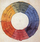
Complementary colors
For the mixing of colored light, Newton’s color wheelColor wheel
A color wheel or color circle is an abstract illustrative organization of color hues around a circle that shows relationships between primary colors, secondary colors, complementary colors, etc....
is often used to describe complementary colors, which are colors which cancel each other's hue to produce an achromatic (white, gray or black) light mixture. Newton offered as a conjecture that colors exactly opposite one another on the hue circle cancel out each other's hue; this concept was demonstrated more thoroughly in the 19th century.
A key assumption in Newton's hue circle was that the "fiery" or maximum saturated hues are located on the outer circumference of the circle, while achromatic white is at the center. Then the saturation of the mixture of two spectral hues was predicted by the straight line between them; the mixture of three colors was predicted by the "center of gravity" or centroid of three triangle points, and so on.
RYB color model
RYB is a historical set of colors used in subtractive color mixing, and is one commonly used set of primary colors...
, which is derived from paint mixtures, yellow mixed with violet, orange mixed with blue, or red mixed with green produces an equivalent gray and are the painter's complementary colors. These contrasts form the basis of Chevreul's law of color contrast: colors that appear together will be altered as if mixed with the complementary color of the other color. Thus, a piece of yellow fabric placed on a blue background will appear tinted orange, because orange is the complementary color to blue.
Unfortunately, the artists' primary colors are not the same as complementary colors defined by light mixtures. This discrepancy becomes important when color theory is applied across media. Digital color management uses a hue circle defined around the additive primary colors (the RGB color model
RGB color model
The RGB color model is an additive color model in which red, green, and blue light is added together in various ways to reproduce a broad array of colors...
), as the colors in a computer monitor are additive mixtures of light, not subtractive mixtures of paints.
One reason the artist's primary colors even work at all is that the imperfect pigments being used have sloped absorption curves, and thus change color with concentration. A pigment that is pure red at high concentrations can behave more like magenta at low concentrations. This allows it to make purples that would otherwise be impossible. Likewise, a blue that is ultramarine at high concentrations appears cyan at low concentrations, allowing it to be used to mix green. Chromium red pigments can appear orange, and then yellow, as the concentration is reduced. It is even possible to mix very low concentrations of the blue mentioned and the chromium red to get a greenish color. This works much better with oil colors than it does with water colors and dyes.
So the old primaries depend on sloped absorption curves and pigment leakages to work, while the new scientifically derived ones depend solely on controlling the amount of absorption in certain parts of the spectrum.
Another reason the correct primary colors were not used by early artists is that they were not available as durable pigments. Modern methods in chemistry were needed to produce them.
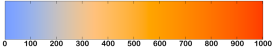
Warm vs. cool colors
The distinction between warm and cool colors has been important since at least the late 18th century . It is generally not remarked in modern color science or colorimetry in reference to painting, but is still used in design practices today. The contrast, as traced by etymologies in the Oxford English DictionaryOxford English Dictionary
The Oxford English Dictionary , published by the Oxford University Press, is the self-styled premier dictionary of the English language. Two fully bound print editions of the OED have been published under its current name, in 1928 and 1989. The first edition was published in twelve volumes , and...
, seems related to the observed contrast in landscape light, between the "warm" colors associated with daylight or sunset and the "cool" colors associated with a gray or overcast day. Warm colors are often said to be hues from red through yellow, browns and tans included; cool colors are often said to be the hues from blue green through blue violet, most grays included. There is historical disagreement about the colors that anchor the polarity, but 19th century sources put the peak contrast between red orange and greenish blue.
Color theory has ascribed perceptual and psychological effects to this contrast. Warm colors are said to advance or appear more active in a painting, while cool colors tend to recede; used in interior design or fashion, warm colors are said to arouse or stimulate the viewer, while cool colors calm and relax. Most of these effects, to the extent they are real, can be attributed to the higher saturation and lighter value of warm pigments in contrast to cool pigments. Thus, brown is a dark, unsaturated warm color that few people think of as visually active or psychologically arousing.
Compare the traditional warm–cool association of color with the color temperature
Color temperature
Color temperature is a characteristic of visible light that has important applications in lighting, photography, videography, publishing, manufacturing, astrophysics, and other fields. The color temperature of a light source is the temperature of an ideal black-body radiator that radiates light of...
of a theoretical radiating black body
Black body
A black body is an idealized physical body that absorbs all incident electromagnetic radiation. Because of this perfect absorptivity at all wavelengths, a black body is also the best possible emitter of thermal radiation, which it radiates incandescently in a characteristic, continuous spectrum...
, where the association of color with temperature is reversed. For instance, the hottest star
Star
A star is a massive, luminous sphere of plasma held together by gravity. At the end of its lifetime, a star can also contain a proportion of degenerate matter. The nearest star to Earth is the Sun, which is the source of most of the energy on Earth...
s radiate blue light (i.e., with shorter wavelength and higher frequency) and the coolest radiate red.
Achromatic colors
Any color that lacks strong chromatic content is said to be unsaturated, achromatic, or near neutral. Pure achromatic colors include black, white and all grays; near neutrals include browns, tans, pastels and darker colors. Near neutrals can be of any hue or lightness.Neutrals are obtained by mixing pure colors with either white,black or grey, or by mixing two complementary colors. In color theory, neutral colors are colors easily modified by adjacent more saturated colors and they appear to take on the hue complementary to the saturated color. Next to a bright red couch, a gray wall will appear distinctly greenish.
Black and white have long been known to combine well with almost any other colors; black increases the apparent saturation or brightness of colors paired with it, and white shows off all hues to equal effect.
Tints and shades
When mixing colored light (additive color models), the achromatic mixture of spectrally balanced red, green and blue (RGB) is always white, not gray or black. When we mix colorants, such as the pigments in paint mixtures, a color is produced which is always darker and lower in chroma, or saturation, than the parent colors. This moves the mixed color toward a neutral color—a gray or near-black. Lights are made brighter or dimmer by adjusting their brightness, or energy level; in painting, lightness is adjusted through mixture with white, black or a color's complement.It is common among some painters to darken a paint color by adding black paint—producing colors called shades—or lighten a color by adding white—producing colors called tints. However it is not always the best way for representational painting, as an unfortunate result is for colors to also shift in hue. For instance, darkening a color by adding black can cause colors such as yellows, reds and oranges, to shift toward the greenish or bluish part of the spectrum. Lightening a color by adding white can cause a shift towards blue when mixed with reds and oranges. Another practice when darkening a color is to use its opposite, or complementary, color (e.g. purplish-red added to yellowish-green) in order to neutralize it without a shift in hue, and darken it if the additive color is darker than the parent color. When lightening a color this hue shift can be corrected with the addition of a small amount of an adjacent color to bring the hue of the mixture back in line with the parent color (e.g. adding a small amount of orange to a mixture of red and white will correct the tendency of this mixture to shift slightly towards the blue end of the spectrum).
Split primary colors
In paintingPainting
Painting is the practice of applying paint, pigment, color or other medium to a surface . The application of the medium is commonly applied to the base with a brush but other objects can be used. In art, the term painting describes both the act and the result of the action. However, painting is...
and other visual arts, two-dimensional color wheel
Color wheel
A color wheel or color circle is an abstract illustrative organization of color hues around a circle that shows relationships between primary colors, secondary colors, complementary colors, etc....
s or three-dimensional color solid
Color solid
A color solid is the three-dimensional representation of a color model, an analog of the two-dimensional color wheel. The added spatial dimension allows a color solid to depict an added dimension of color variation...
s are used as tools to teach beginners the essential relationships between colors. The organization of colors in a particular color model depends on the purpose of that model: some models show relationships based on Human color perception
Color vision
Color vision is the capacity of an organism or machine to distinguish objects based on the wavelengths of the light they reflect, emit, or transmit...
, whereas others are based on the color mixing properties of a particular medium such as a computer display or set of paints.
This system is still popular among contemporary painters, as it is basically a simplified version of Newton's geometrical rule that colors closer together on the hue circle will produce more vibrant mixtures. However, with the range of contemporary paints available, many artists simply add more paints to their palette as desired for a variety of practical reasons. For example, they may add a scarlet, purple and/or green paint to expand the mixable gamut
Gamut
In color reproduction, including computer graphics and photography, the gamut, or color gamut , is a certain complete subset of colors. The most common usage refers to the subset of colors which can be accurately represented in a given circumstance, such as within a given color space or by a...
; and they include one or more dark colors (especially "earth" colors such as yellow ochre or burnt sienna) simply because they are convenient to have premixed. Printers commonly augment a CYMK palette with spot
Spot color
In offset printing, a spot color is any color generated by an ink that is printed using a single run.The widely spread offset-printing process is composed of four spot colors: Cyan, Magenta, Yellow, and Key commonly referred to as CMYK...
(trademark specific) ink colors.
Color harmony and color meaning
It has been suggested that "Colors seen together to produce a pleasing affective response are said to be in harmony". However, color harmony is a somewhat misleading notion in that responses to color can be influenced by a range of different factors including individual differences (age, gender, etc.); cultural and social differences; as well as contextual, temporal and perceptual factors. The following conceptual model illustrates this approach to color harmony:Wherein color harmony is a function (f) of the interaction between color/s (Col 1, 2, 3, …, n) and the factors that influence positive aesthetic response to color: individual differences (ID) such as age, gender, personality and affective state; cultural experiences (CE), the prevailing context (CX) which includes setting and ambient lighting; intervening perceptual effects (P) and the effects of time (T) in terms of prevailing social trends.
In addition, given that humans can perceive over 2.8 million different hues, it has been suggested that the number of possible color combinations is virtually infinite thereby implying that predictive color harmony formulae are fundamentally unsound. Despite this, many color theorists have devised formulae, principles or guidelines for color combination with the aim being to predict or specify positive aesthetic response or 'color harmony'. Color wheel models have often been used as a basis for color combination principles or guidelines and for defining relationships between colors. Some theorists and artists believe juxtapositions of complementary color will produce strong contrast, a sense of visual tension as well as 'color harmony'; while others believe juxtapositions of analogous colors will elicit positive aesthetic response. Color combination guidelines suggest that colors next to each other on the color wheel model (analogous colors) tend to produce a single-hued or monochromatic color experience and some theorists also refer to these as 'simple harmonies'. In addition, split complementary color schemes usually depict a range of analogous hues plus a key complementary color. A triadic color scheme adopts any three colors approximately equidistant around a color wheel model. Feisner and Mahnke are among a number of authors who provide color combination guidelines in greater detail.
Color combination formulae and principles may provide some guidance but have limited practical application. This is because of the influence of contextual, perceptual and temporal factors which will influence how color/s are perceived in any given situation, setting or context. Such formulae and principles may be useful in fashion, interior and graphic design, but much depends on the tastes, lifestyle and cultural norms of the viewer or consumer.
As early as the ancient Greek philosophers, many theorists have devised color associations and linked particular connotative meanings to specific colors. However, connotative color associations and color symbolism tends to be culture-bound and may also vary across different contexts and circumstances. For example, red has many different connotative and symbolic meanings from exciting, arousing, sensual, romantic and feminine; to a symbol of good luck; and also acts as a signal of danger. Such color associations tend to be learned and do not necessarily hold irrespective of individual and cultural differences or contextual, temporal or perceptual factors. It is important to note that while color symbolism and color associations exist, their existence does not provide evidential support for color psychology or claims that color has therapeutic properties.
Current status
Color theory has not developed an explicit explanation of how specific media affect color appearance: colors have always been defined in the abstract, and whether the colors were inkInk
Ink is a liquid or paste that contains pigments and/or dyes and is used to color a surface to produce an image, text, or design. Ink is used for drawing and/or writing with a pen, brush, or quill...
s or paint
Paint
Paint is any liquid, liquefiable, or mastic composition which after application to a substrate in a thin layer is converted to an opaque solid film. One may also consider the digital mimicry thereof...
s, oil
Oil paint
Oil paint is a type of slow-drying paint that consists of particles of pigment suspended in a drying oil, commonly linseed oil. The viscosity of the paint may be modified by the addition of a solvent such as turpentine or white spirit, and varnish may be added to increase the glossiness of the...
s or watercolor
Watercolor painting
Watercolor or watercolour , also aquarelle from French, is a painting method. A watercolor is the medium or the resulting artwork in which the paints are made of pigments suspended in a water-soluble vehicle...
s, transparencies or reflecting print
Photographic printing
Photographic printing is the process of producing a final image on paper for viewing, using chemically sensitized paper. The paper is exposed to a photographic negative, a positive transparency , or a digital image file projected using an enlarger or digital exposure unit such as a LightJet printer...
s, computer display
Computer display
A monitor or display is an electronic visual display for computers. The monitor comprises the display device, circuitry, and an enclosure...
s or movie theater
Movie theater
A movie theater, cinema, movie house, picture theater, film theater is a venue, usually a building, for viewing motion pictures ....
s, was not considered especially relevant. Josef Albers
Josef Albers
Josef Albers was a German-born American artist and educator whose work, both in Europe and in the United States, formed the basis of some of the most influential and far-reaching art education programs of the 20th century....
investigated the effects of relative contrast and color saturation on the illusion of transparency, but this is an exception to the rule.
See also
- Charles Albert KeeleyCharles Albert KeeleyCharles Albert Keeley was a British inventor, amateur scientist, entertainer and pioneering colour expert. He is most famous for his 'Colour Conundrum' parlour game, and is considered by many to be one of Victorian Britain's most significant colour theorists.-Performance Work:Inspired by the work...
- Color mixingColor mixingThere are two types of color mixing: Additive and Subtractive. In both cases there are three primary colors, three secondary colors , and one tertiary color made from all three primary colors.-Additive Mixing:Additive mixing of colors generally involves mixing colors of light...
- Additive colorAdditive colorAn additive color model involves light emitted directly from a source or illuminant of some sort. The additive reproduction process usually uses red, green and blue light to produce the other colors. Combining one of these additive primary colors with another in equal amounts produces the...
- Subtractive colorSubtractive colorA subtractive color model explains the mixing of paints, dyes, inks, and natural colorants to create a full range of colors, each caused by subtracting some wavelengths of light and reflecting the others...
- Theory of paintingTheory of paintingThe idea of founding a theory of painting after the model of music theory, was famously suggested by Goethe in 1807, and gained much regard among the avant-garde artists of 1920s, the Weimar culture period, like Paul Klee.-From Goethe to Klee:...
External links
- Color Theory Tutorial by Worqx
- Handprint.com : Color - a comprehensive site about color perception, color psychology, color theory, and color mixing
- Color Theory in Landscape Design
- The Dimensions of Colour - color theory for artists using digital/ traditional media
- Color Thesaurus World's Largest Database of Color Names
- Stanford University CS 178 interactive Flash demo introducing trichromatic color theory.