

Canons of page construction
Encyclopedia

Book design
Book design is the art of incorporating the content, style, format, design, and sequence of the various components of a book into a coherent whole....
used to describe the ways that page proportions, margins and type areas (print spaces) of books are constructed.
The notion of canons, or laws of form, of book page construction was popularized by Jan Tschichold
Jan Tschichold
Jan Tschichold was a typographer, book designer, teacher and writer.-Life:Tschichold was the son of a provincial signwriter, and he was trained in calligraphy...
in the mid to late twentieth century, based on the work of J. A. van de Graaf, Raúl M. Rosarivo, Hans Kayser, and others. Tschichold wrote “Though largely forgotten today, methods and rules upon which it is impossible to improve have been developed for centuries. To produce perfect books these rules have to be brought to life and applied.” Kayser's 1946 Ein harmonikaler Teilungskanon had earlier used the term canon in this context.
Typographers and book designers apply these principles to this day, with variations related to the availability of standardized paper sizes, and the diverse types of commercially printed
Printing press
A printing press is a device for applying pressure to an inked surface resting upon a print medium , thereby transferring the ink...
books.
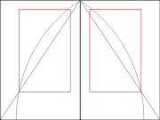
Van de Graaf canon

Book design
Book design is the art of incorporating the content, style, format, design, and sequence of the various components of a book into a coherent whole....
to divide a page in pleasing proportions. This canon is also known as the "secret canon" used in many medieval manuscripts and incunabula.
The geometrical solution of the construction of Van de Graaf's canon, which works for any page width:height ratio, enables the book designer to position the text body in a specific area of the page. Using the canon, the proportions are maintained while creating pleasing and functional margins of size 1/9 and 2/9 of the page size. The resulting inside margin is one-half of the outside margin, and of proportions 2:3:4:6 (inner:top:outer:bottom) when the page proportion is 2:3 (more generally 1:R:2:2R for page proportion 1:R). This method was discovered by Van de Graaf, and used by Tschichold and other contemporary designers; they speculate that it may be older.
The page proportions vary, but most commonly used is the 2:3 proportion. Tschichold writes "For purposes of better comparison I have based his figure on a page proportion of 2:3, which Van de Graaf does not use." In this canon the text area and page size are of same proportions, and the height of the text area equals the page width. This canon was popularized by Jan Tschichold
Jan Tschichold
Jan Tschichold was a typographer, book designer, teacher and writer.-Life:Tschichold was the son of a provincial signwriter, and he was trained in calligraphy...
in his book The Form of the Book.
Robert Bringhurst, in his The Elements of Typographic Style, asserts that the proportions that are useful for the shapes of pages are equally useful in shaping and positioning the textblock. This was often the case in medieval books, although later on in the Renaissance, typographers preferred to apply a more polyphonic page in which the proportions of page and textblock would differ.
Golden canon

Interpretation of Rosarivo
Raúl RosarivoRaúl Rosarivo
Raúl Mario Rosarivo , born in Buenos Aires, Argentina, was a typographer, researcher, designer, poet, painter and illustrator, known for his work in the analysis of the Gutenberg Bibles...
analyzed Renaissance books with the help of a drafting compass
Compass (drafting)
A compass or pair of compasses is a technical drawing instrument that can be used for inscribing circles or arcs. As dividers, they can also be used as a tool to measure distances, in particular on maps...
and a ruler, and concluded in his Divina proporción tipográfica ("Typographical Divine Proportion", first published in 1947) that Gutenberg, Peter Schöffer
Peter Schöffer
Peter Schöffer or Petrus Schoeffer was an early German printer, who studied in Paris and worked as a manuscript copyist in 1451 before apprenticing with Johannes Gutenberg and joining Johann Fust, a goldsmith, lawyer, and money lender.-Life and works:Working for Fust, Schöffer was the principal...
, Nicolaus Jenson and others had applied the golden canon of page construction in their works. According to Rosarivo, his work and assertion that Gutenberg used the "golden number" 2:3, or "secret number" as he called it, to establish the harmonic relationships between the diverse parts of a work, was analyzed by experts at the Gutenberg Museum and re-published in the Gutenberg-Jahrbuch
Gutenberg-Jahrbuch
The Gutenberg-Jahrbuch is an annual periodical publication covering the history of printing and the book. Its focus is on incunables, early printing, and the life and work of Johannes Gutenberg, inventor of the modern printed book...
, its official magazine.
Ros Vicente points out that Rosarivo "demonstrates that Gutenberg had a module different from the well-known one of Luca Paccioli
Luca Pacioli
Fra Luca Bartolomeo de Pacioli was an Italian mathematician, Franciscan friar, collaborator with Leonardo da Vinci, and seminal contributor to the field now known as accounting...
" (the golden ratio
Golden ratio
In mathematics and the arts, two quantities are in the golden ratio if the ratio of the sum of the quantities to the larger quantity is equal to the ratio of the larger quantity to the smaller one. The golden ratio is an irrational mathematical constant, approximately 1.61803398874989...
).
Tschichold also interprets Rosarivo's golden number as 2:3, saying:
The figures he refers to are reproduced in combination here.
John Man's interpretation of Gutenberg
Historian John Man suggests that Gutenberg's Bible page was based on the golden ratioGolden ratio
In mathematics and the arts, two quantities are in the golden ratio if the ratio of the sum of the quantities to the larger quantity is equal to the ratio of the larger quantity to the smaller one. The golden ratio is an irrational mathematical constant, approximately 1.61803398874989...
(commonly approximated as the decimal 0.618 or the ratio 5:8), and that the printed area also had that shape. He quotes the dimensions of Gutenberg's half-folio Bible page as 30.7 x 44.5 cm, a ratio of 1:1.45, close to Rosarivo's golden 2:3 (1.5) but not to the golden ratio 1.618.
Tschichold and the golden section
Building on Rosarivo's work, contemporary experts in book design such as Tschichold and Richard Hendel assert as well that the page proportion of the golden section (21:34) has been used in book designBook design
Book design is the art of incorporating the content, style, format, design, and sequence of the various components of a book into a coherent whole....
, in manuscripts, and incunabula, mostly in those produced between 1550 and 1770. Hendel writes that since Gutenberg's time, books have been most often printed in an upright position, that conform loosely, if not precisely, to the golden ratio.
Convergent (continued fraction)
A convergent is one of a sequence of values obtained by evaluating successive truncations of a continued fraction The nth convergent is also known as the nth approximant of a continued fraction.-Representation of real numbers:...
s such as 2:3, 5:8, and 21:34.
Tschichold says that common ratios for page proportion used in book design include as 2:3, 1:√3, and the golden section.
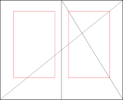
The image with circular arcs depicts the proportions in a medieval manuscript, that according to Tschichold feature a "Page proportion 2:3. Margin proportions 1:1:2:3. Text area in accord with the Golden Section. The lower outer corner of the text area is fixed by a diagonal as well." By accord with the golden section, he does not mean exactly equal to, which would conflict with the stated proportions.
Tschichold refers to a construction equivalent to van de Graaf's or Rosarivo's with a 2:3 page ratio as "the Golden Canon of book page construction as it was used during late Gothic times by the finest of scribes." For the canon with the arc construction, which yields a text area ratio closer to the golden ratio, he says "I abstracted from manuscripts that are older yet. While beautiful, it would hardly be useful today."
Of the different page proportions that such a canon can be applied to, he says "Book pages come in many proportions, i.e., relationships between width and height. Everybody knows, at least from hearsay, the proportion of the Golden Section, exactly 1:1.618. A ratio of 5:8 is no more than an approximation of the Golden Section. It would be difficult to maintain the same opinion about a ratio of 2:3."
Tschichold also expresses a preference for certain ratios over others: "The geometrically definable irrational page proportions like 1:1.618 (Golden Section
Golden ratio
In mathematics and the arts, two quantities are in the golden ratio if the ratio of the sum of the quantities to the larger quantity is equal to the ratio of the larger quantity to the smaller one. The golden ratio is an irrational mathematical constant, approximately 1.61803398874989...
), 1:√2, 1:√3, 1:√5, 1:1.538, and the simple rational proportions of 1:2, 2:3, 5:8 and 5:9 I call clear, intentional and definite. All others are unclear and accidental ratios. The difference between a clear and an unclear ratio, though frequently slight, is noticeable. ... Many books show none of the clear proportions, but accidental ones."
John Man's quoted Gutenberg page sizes are in a proportion not very close to the golden ratio, but Rosarivo's or van de Graaf's construction is applied by Tschichold to make a pleasing text area on pages of arbitrary proportions, even such accidental ones.
Current applications
Richard Hendel, associate director of the University of North Carolina PressUniversity of North Carolina Press
The University of North Carolina Press , founded in 1922, is a university press that is part of the University of North Carolina....
, describes book design as a craft with its own traditions and a relatively small body of accepted rules. The dust cover of his book, On Book Design, features the Van de Graaf canon.
Christopher Burke, in his book on German typographer Paul Renner
Paul Renner
Paul Renner was a typeface designer, most notably of Futura. He was born in Wernigerode, Germany and died in Hödingen....
, creator of the Futura
Futura (typeface)
In typography, Futura is a geometric sans-serif typeface designed in 1927 by Paul Renner. It is based on geometric shapes that became representative visual elements of the Bauhaus design style of 1919–1933...
typeface, described his views about page proportions:
Bringhurst describes a book page as a tangible proportion, which together with the textblock produce an antiphonal geometry, which has the capability to bind the reader to the book, or conversely put the reader's nerve on edge or drive the reader away.
Further reading
- Luca PacioliLuca PacioliFra Luca Bartolomeo de Pacioli was an Italian mathematician, Franciscan friar, collaborator with Leonardo da Vinci, and seminal contributor to the field now known as accounting...
, De Divina Proportione (1509) (the originator of the excitement over the golden ratio) - Lehmann-Haupt, Hellmut, Five Centuries of Book Design: A Survey of Styles in the Columbia Library, Columbia University, (1931)